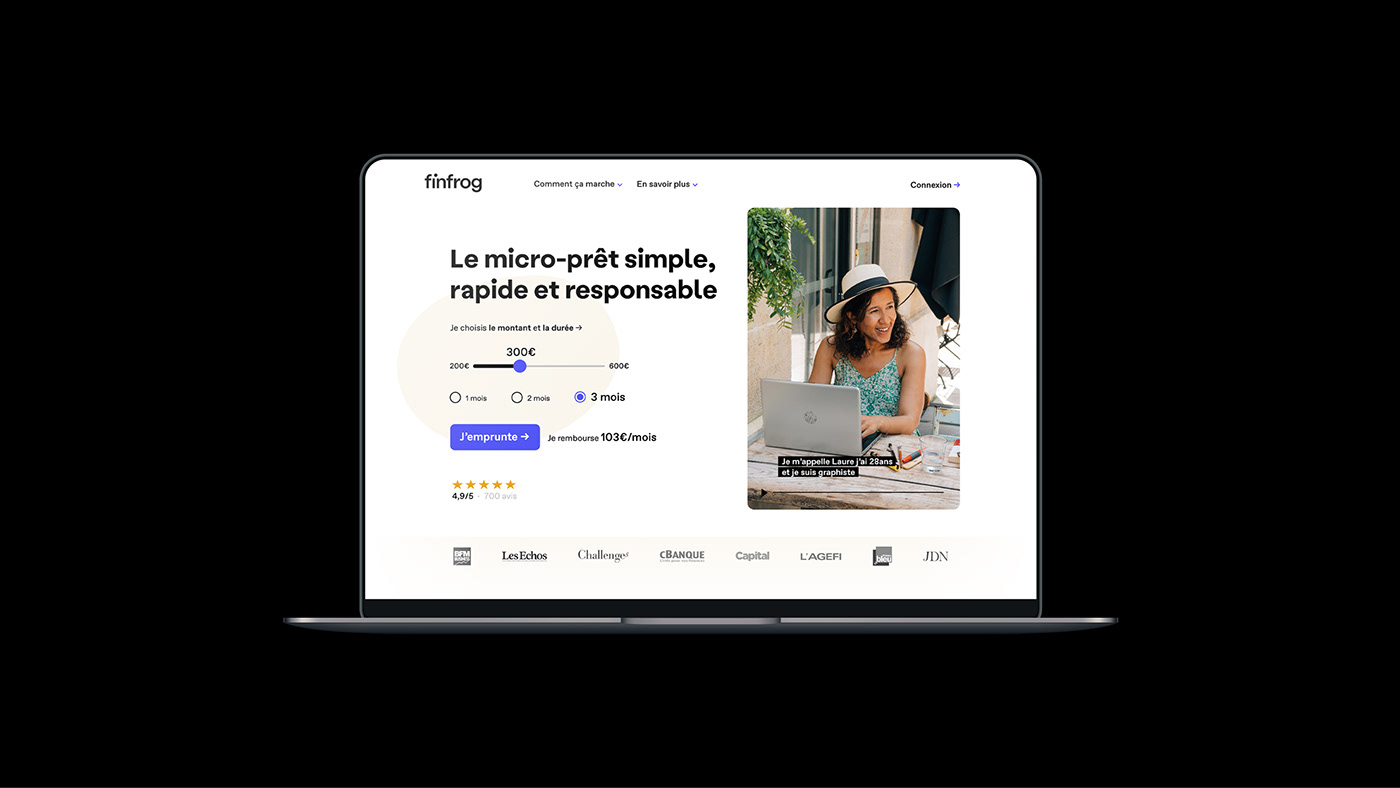
Finfrog is a mobile microcredit platform.
After two years of activity, the product has become clearer, notebook is developing, the will to carry their service through a design that reflects their new ambitions and technology has become essential.
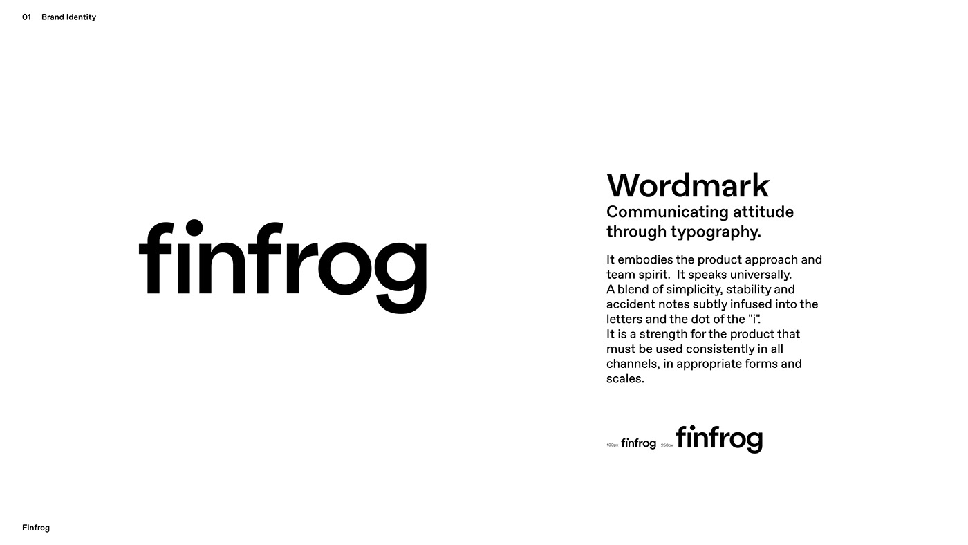
The identity must be part of a complete system that includes brand volume, tone, iconography, colours, typography and user experience.
The identity must be part of a complete system that includes brand volume, tone, iconography, colours, typography and user experience.
With this new identity, they want to establish their image and stand out from the micro-credit market with a human, accessible and transparent approach and a simple, fast product.
Universal, it has to be understood and read by all by creating a coherence and consistency of the brand through the points of contact.
Universal, it has to be understood and read by all by creating a coherence and consistency of the brand through the points of contact.
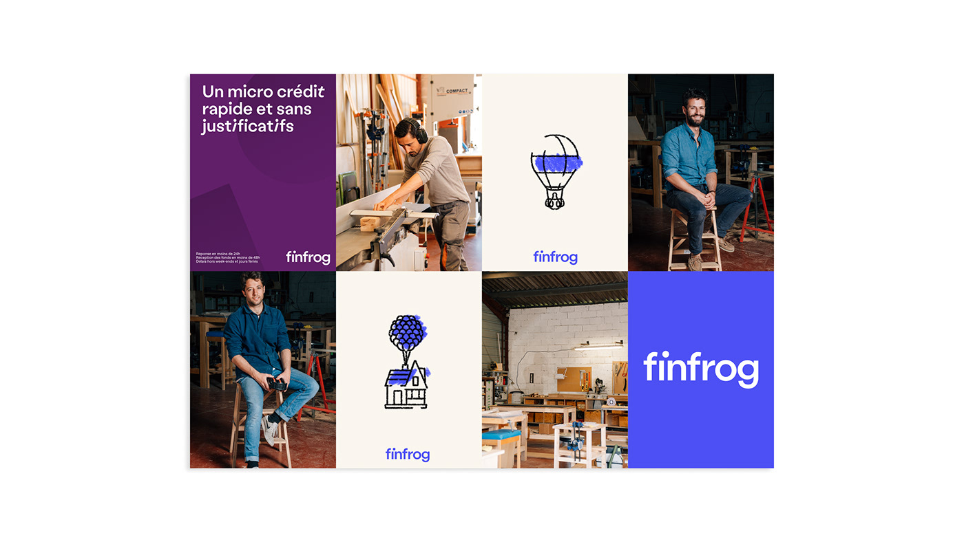
We have designed a people-centred identity, focus on our daily life and the problems we may encounter.
Team:
Art Direction: Bureau Nuits
Fesquet Julien
Pedeboscq Romain
Design: Bureau Nuits
Illustration: Galmand Valentin
Motion: Ulmet Benjamin


Display Typography
Sans-serif human feeling
The mixture of formal notes from the archetypal Swiss grotesque archetypes and deliberately unbalanced strokes makes the text seem to be giving way.
at its own weight; with letters resembling real objects, falling or leaning against each other.
at its own weight; with letters resembling real objects, falling or leaning against each other.
Labor Typography
Tech-feel
Favorit is a simple low contrast grotesque that combines a rigid design with subtle quirks and a humorous touch.