


Visual Identity
Kalil Advocacia
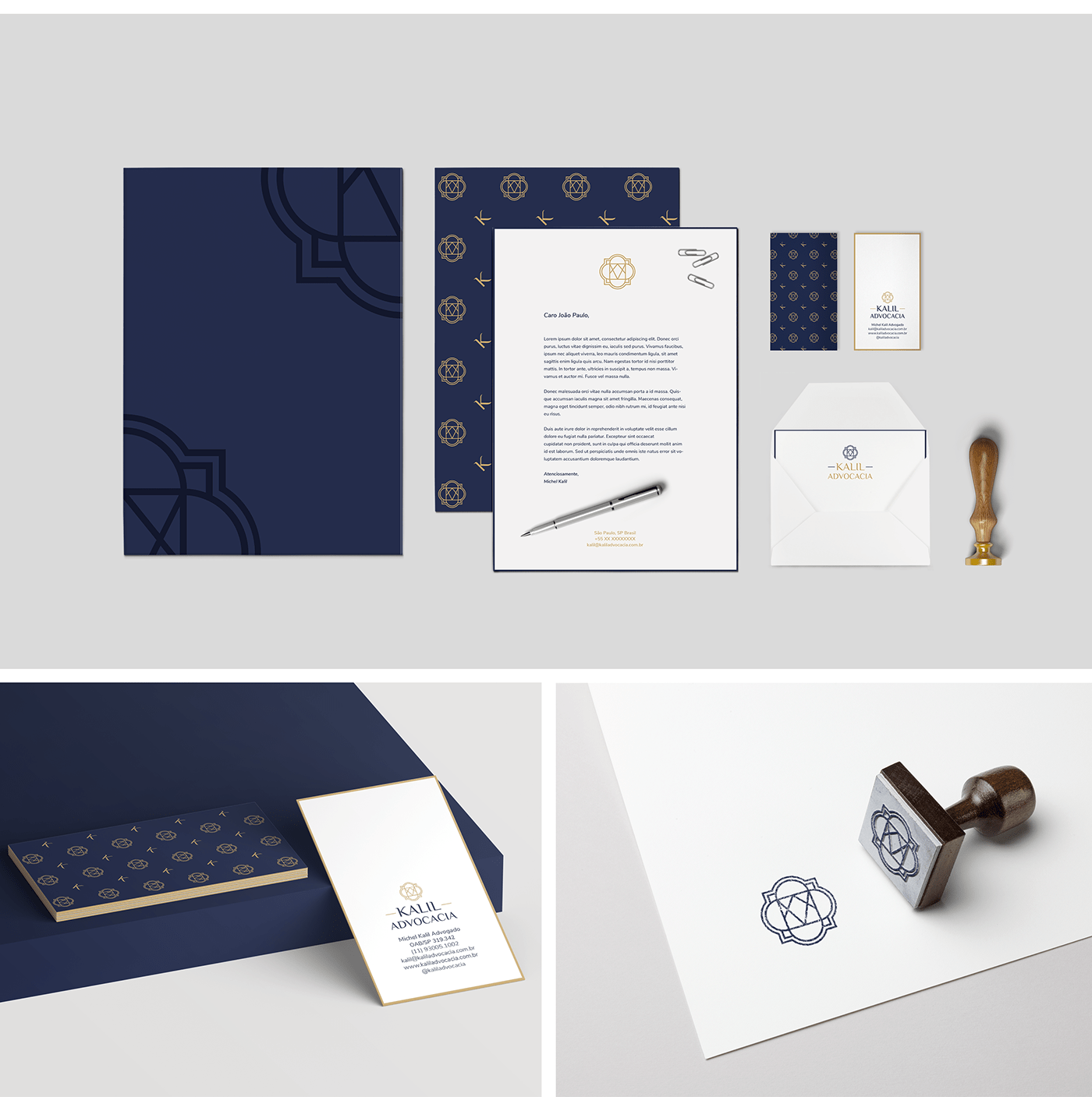
Advocacy today is an area where customer confidence needs to be gained through tradition and, at the same time, stand out through reinvention. The Kalil Advocacia brand carries characteristics taken from the established concept: at the same time contrast and balance between tradition and modernity.
Kalil Advocacia visual identity has an integrated logo, which is the junction of a typographic logo with an icon.
The initial objective of creating the icon was to develop a seal, fixing the whole idea of elegance and tradition present in the brand concept. For this, as a result, we have the combination of the name Michel Kalil initials + the circle, which represents the balance.
The initial objective of creating the icon was to develop a seal, fixing the whole idea of elegance and tradition present in the brand concept. For this, as a result, we have the combination of the name Michel Kalil initials + the circle, which represents the balance.
In addition to the signatures and the icon, the visual identity has an elegant color palette, a typographic family, and a pattern created exclusively for the brand.
Client / Michel Kalil
Project Type / Visual Identity
Place / São Paulo, Brazil
Year / 2019


In addition to the visual identity applications in printed materials, such as the business card, materials for social media have also been developed. Some of these materials are posts and stories for the Instagram platform and Facebook page cover.


