This is a three-day Infographic Workshop taught by Nick Felton, the data visualization designer, and the assignment is to visualize one kind of data from a section of Sunday New York Times on or choice.
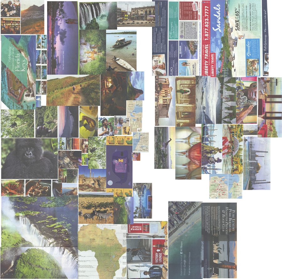
I did the color study for the travel section of New York Times. I cropped the images out, generated the major color swatches and then analysised the distribution of the HBS values of the colors.