
Three directions explored for the branding design of a new program (currently on hold) at Condé Nast.
Project done at W/— Projects, Inc led by Jiminie Ha and art directed by Fahad AlHunaif.
In collaboration with Laura Coombs.
Project done at W/— Projects, Inc led by Jiminie Ha and art directed by Fahad AlHunaif.
In collaboration with Laura Coombs.
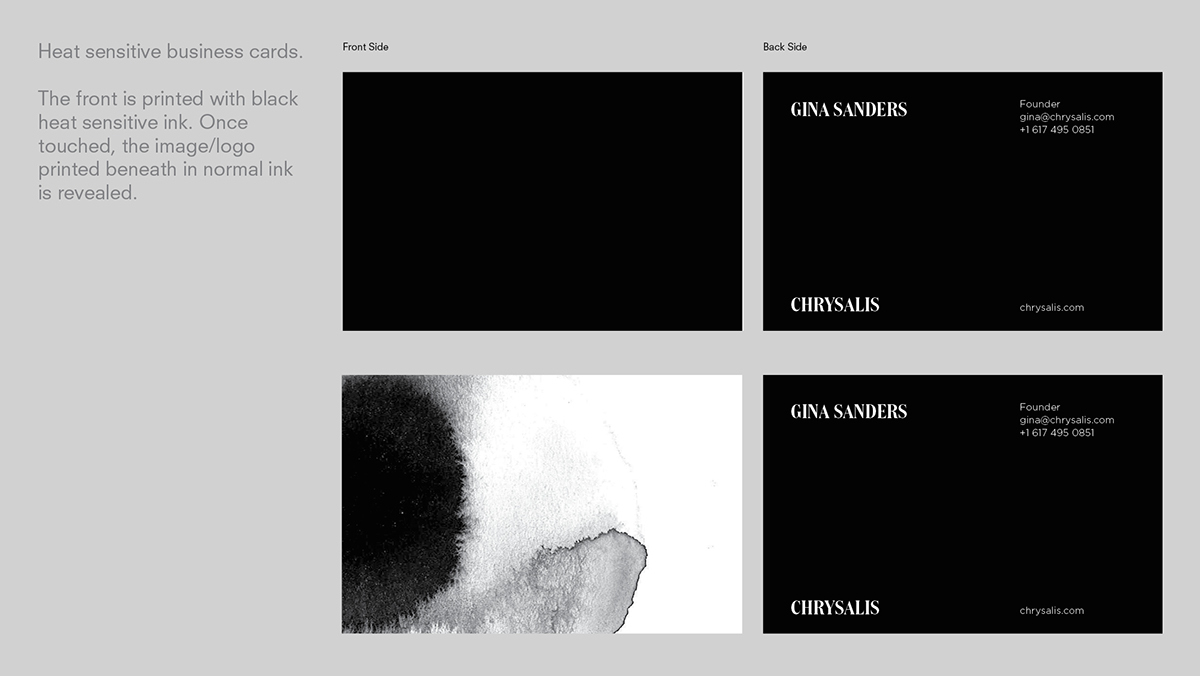
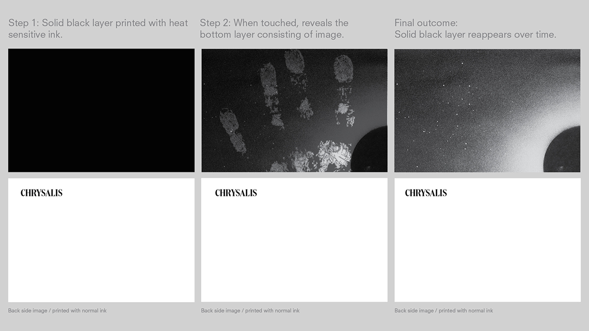
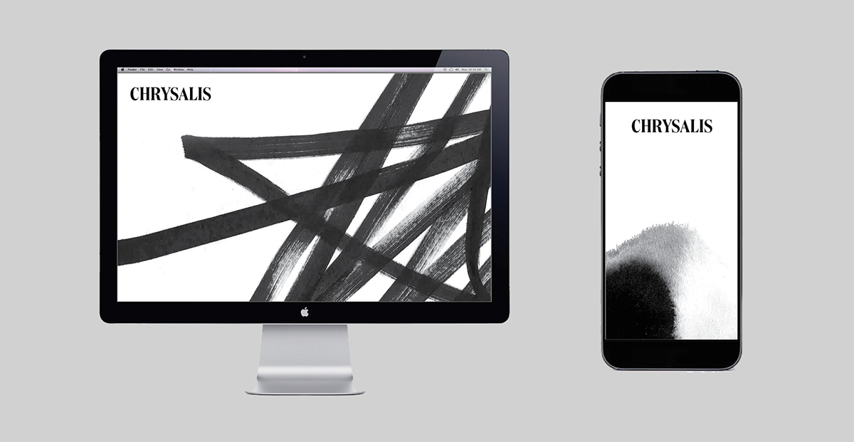
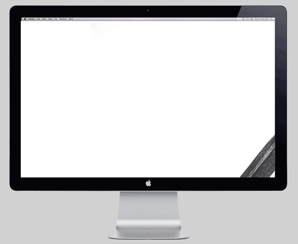
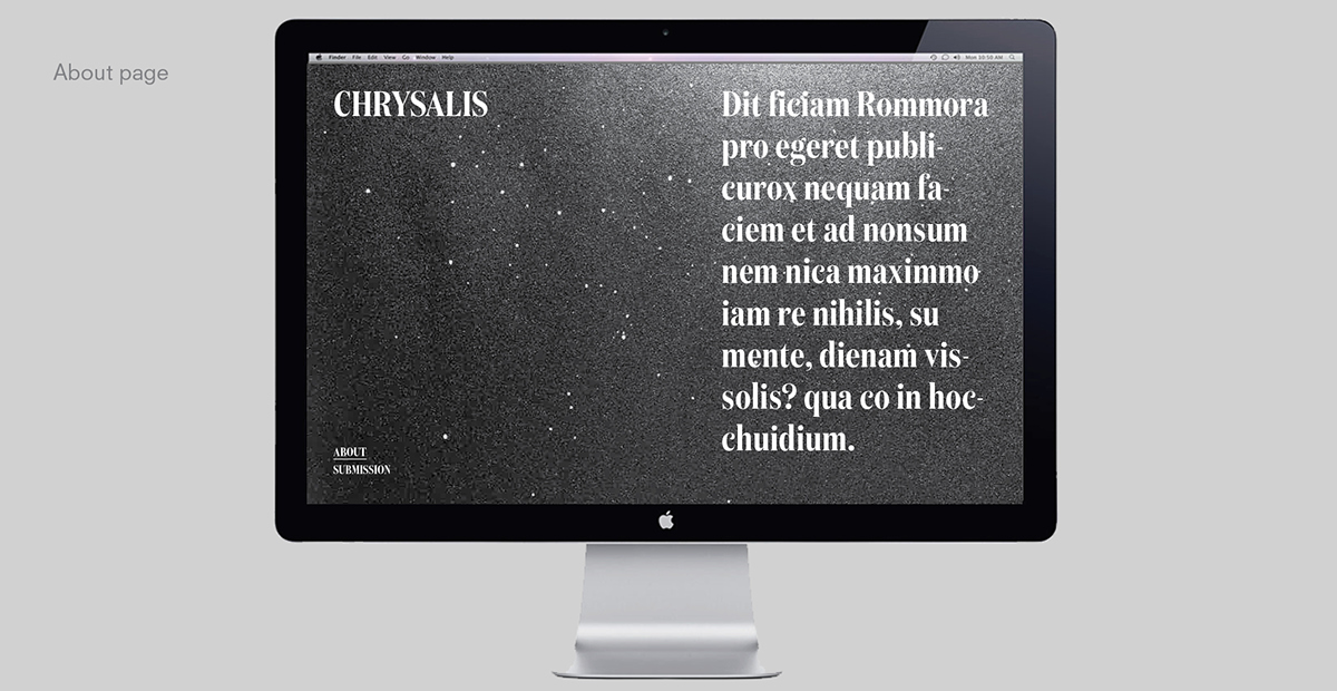
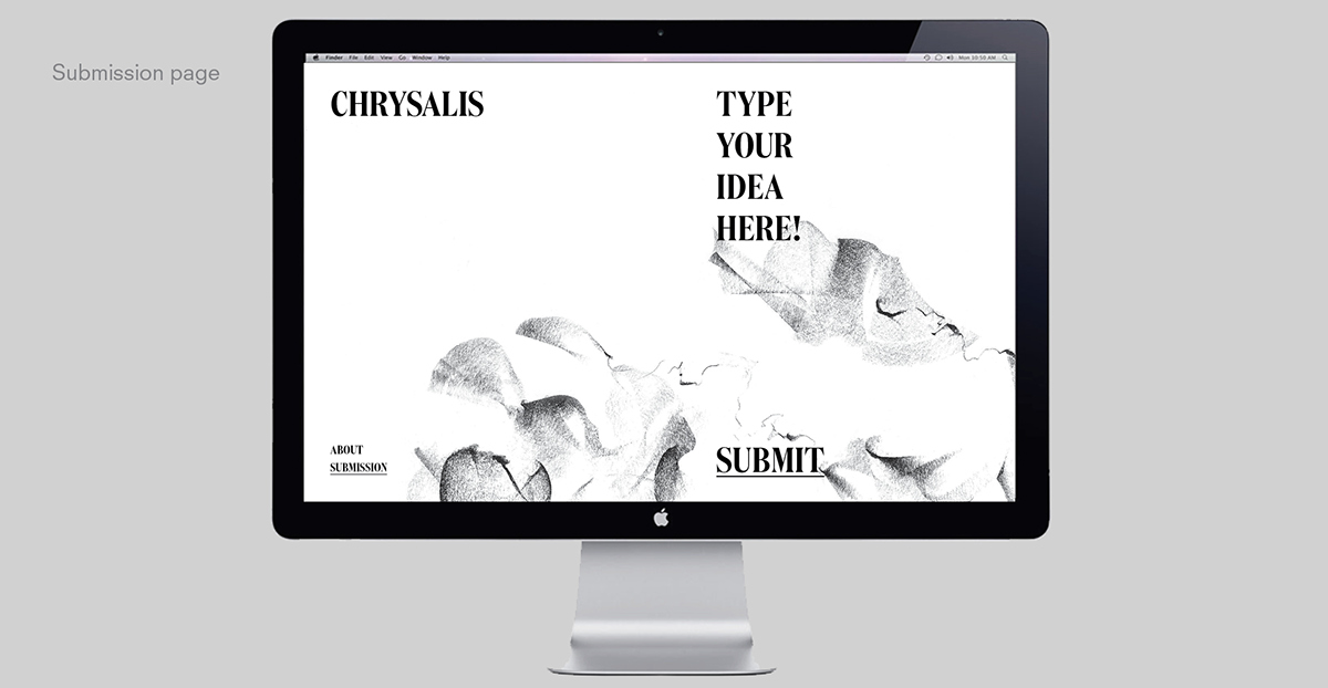
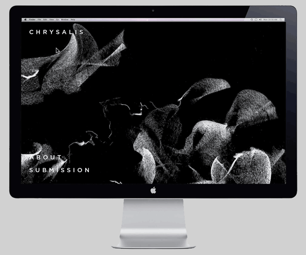
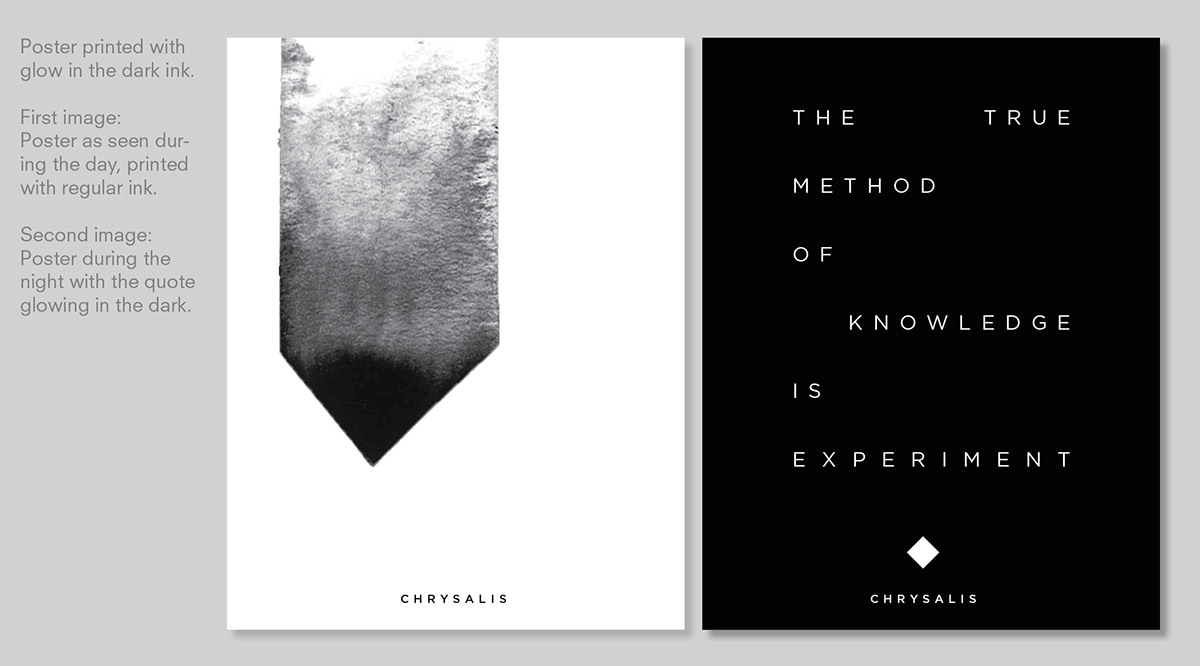
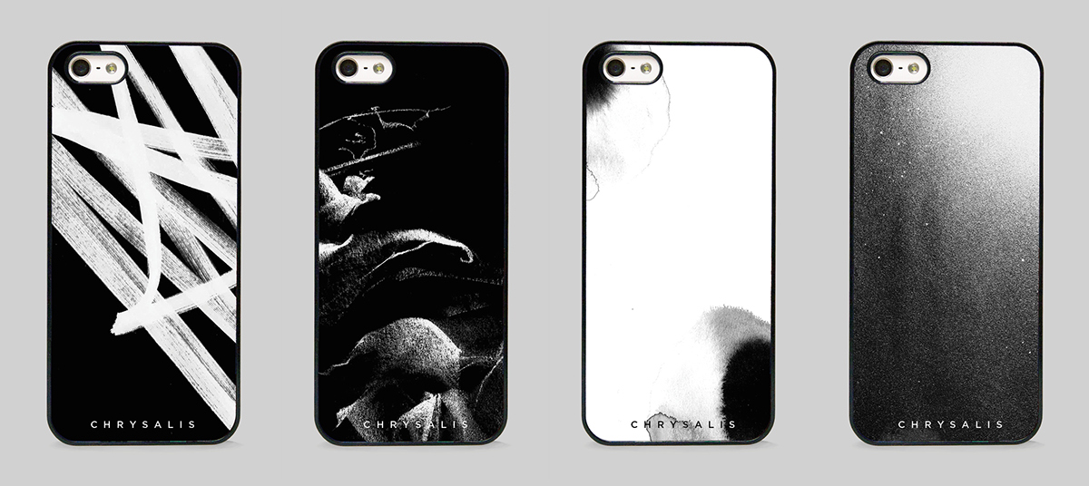
Direction 1 — Metamorphosis
In this direction, a variety of mediums were used to create a set of abstract visuals. The poetry and movement within these visuals encourages the creativity and ever evolving thinking of future entrepreneurs within Condé Nast.


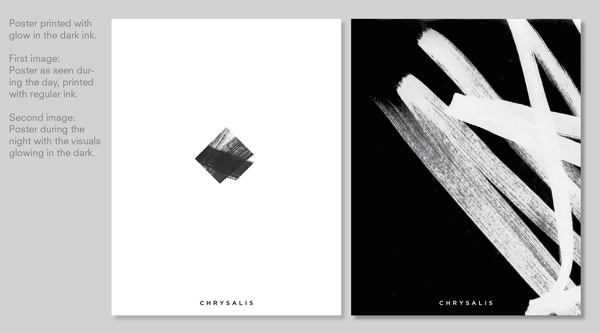
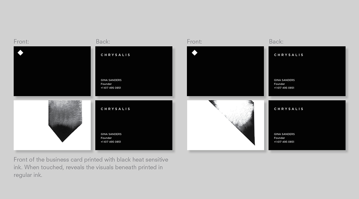
Direction 2 — Diamond
The signature square of the Condé Nast marque was rotated 45 degrees to create the Crysalis Diamond.
The abstract visuals change within the form of the identity, representing the flexibility and creativity within Chrysalis.
The abstract visuals change within the form of the identity, representing the flexibility and creativity within Chrysalis.


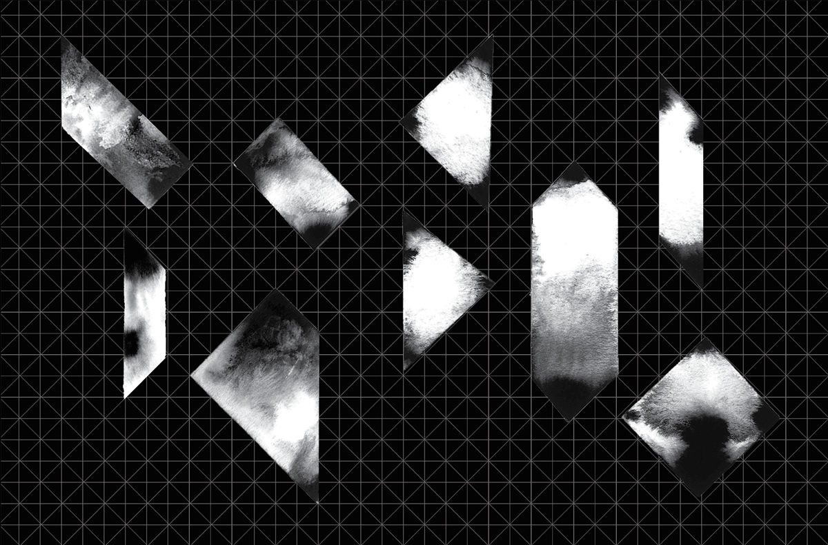
Direction 3 — Chrystaline
In this direction, a grid was created based on the Chrysalis Diamond from which a multitude of shapes could be generated and derived to represent the flexibility within Chrysalis. The shapes are able to come together to create an identifying marque for Chrysalis to show both diversity and unity.


Thank you for viewing!


