about brand
A small brand, deeply rooted in the realm of streetwear with a pronounced focus on athleticism, goes beyond the conventional boundaries of sportswear. Our mission is to deliver garments and accessories that transcend singular utility, embodying versatility at its finest. Consider, for instance, our high-performance training shorts – meticulously crafted not merely for runners but seamlessly adaptable to cyclists, fitness enthusiasts, and those seeking everyday comfort.
Under the banner of "Paradigm," we draw inspiration from the profound notion of a paradigm shift – a transformative change in perspective. Our creations invite you to see and experience things differently, providing a canvas for your unique interpretation. Embrace the blend of style and functionality, as we redefine the ordinary and encourage you to approach fashion and activewear with a fresh mindset. Join us in embracing the extraordinary within the everyday.
solution
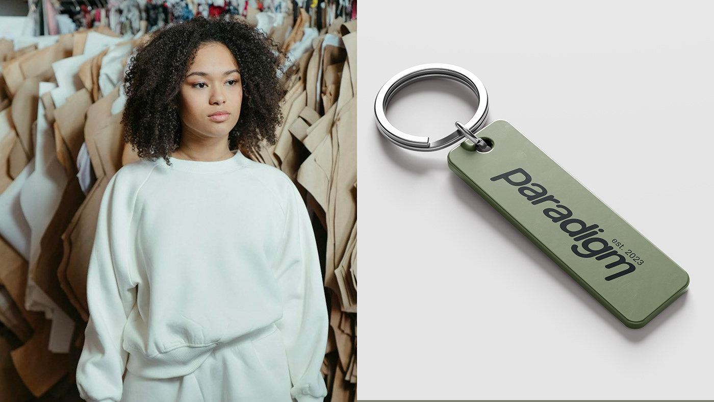
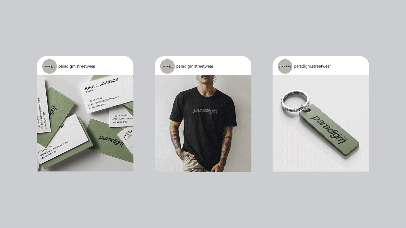
Font for the logo has been drawn from scratch to highlight brand uniqueness. Letters are in lowercase, this makes logo friendly. Shape of letters is rounded for softness, ease, comfort and freedom. This is how people should feel in paradigm clothes. Also, the font is a bit slanted, this reflects movement and references active lifestyle. Letter m creates logical and composition completeness. This detail attracts attention, and makes it stand out among competitors.
Color palette is from wishes. White and black makes brand look expensive and of high quality, cream and grey point to comfort and relaxation. Addition (alternative) colors: olive, they make brand to look fresh.
design by Maria Famenka
@mashaflamenko_design
december 2023