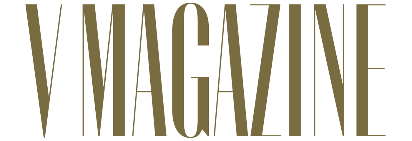
Why are there so few high-contrast sans serif typefaces? It’s tricky to make them feel natural, especially in the lowercase. V magazine commissioned an all-capitals style to differentiate their brand. I brought their well-conceived concept to fruition in a range of optical sizes, supporting dazzling 207-point headlines, sturdy 17-point decks, and everything in between.
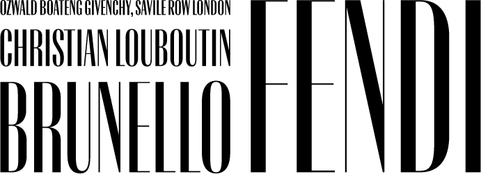

In-use examples
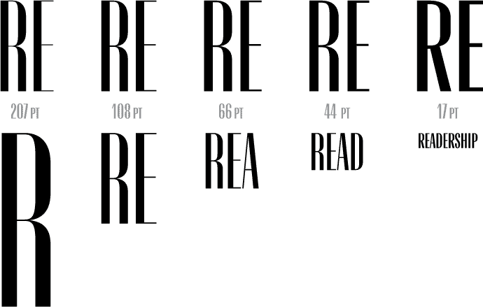
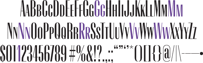
Demonstration of optical size font styles
