For years I’ve gaped in awe at the hand-carved lettering that wraps the 1919 facade of Saint Bartholomew’s Church in Midtown Manhattan. The building’s architect, Bertram Goodhue, also designed the typeface Cheltenham, and his typographic sensibility is clearly evident in this lettering. So I was delighted when The Original Champions of Design asked me to design a series of logotypes based on this source, for their rebranding of the church. Their versatile identity system marries old with new, providing a unified voice for the church’s many departments and activities.
The St. Bart’s branding was awarded in the Type Directors Club’s TDC32 competition and named both best in show and judge’s pick in the 2011 Brand New Awards. See the full design system on OCD’s site.
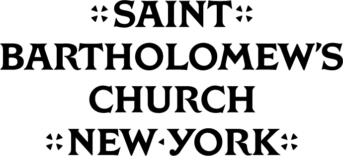
formal mark

informal mark
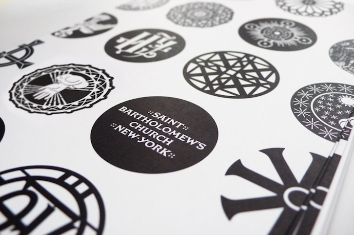
medallions in use in OCD’s design system
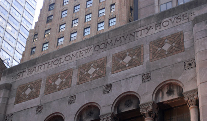
original inscription at Saint Bartholomew’s Church
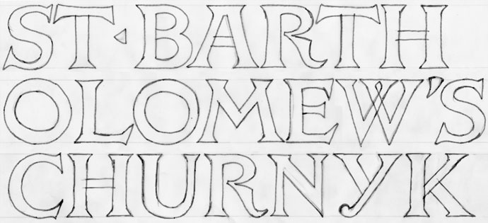
my initial tracings from photographs of the carvings
