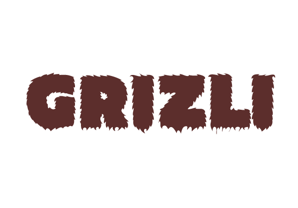
Grizli
Visual identity
A logo for a new Croatian marketing/pr agency run by three experienced communications specialists. After working in big agencies, they decided to start their own company, utilizing their skills in a more alternative ways (i.e. guerilla, internet), etc. They asked for a strong, original mark that would separate them from the usual, highly polished, corporate logos of other agencies.
We focused on their powerful name - GRIZLI, which is a Croatian word for grizzly bear. The name was perfect: the large (and probably hairy) owners visually reminded us of bears, and they were hungry for success.
Since there are tons of logos featuring bears, and not wanting our logo to look like a sports team, we focused on the bear metaphor: bear is large (hence the heavy font), hairy and brown. Dark brown color was also a good choice because GRIZLI could own it - no other marketing firm in Croatia uses it.
This wonderful hairy font was designed by Matt Ritchie (http://cargocollective.com/matt)
Designed with pride by M∞M.
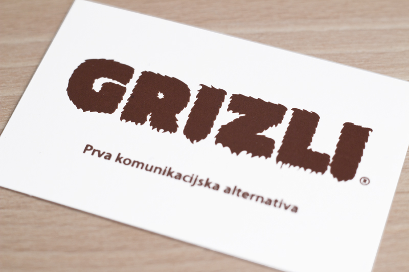
Business Card, front

Business Card, back

A4 Paper Folder
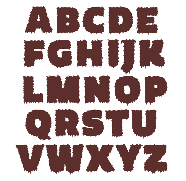
Hairy type by Matt Ritchie
Simple logo animation, with sound (sorry about the color, it's off)