Didino Olive Oil
Visual identity, packaging design. Designed in 2012.
Visual identity, packaging design. Designed in 2012.
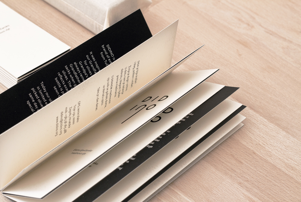
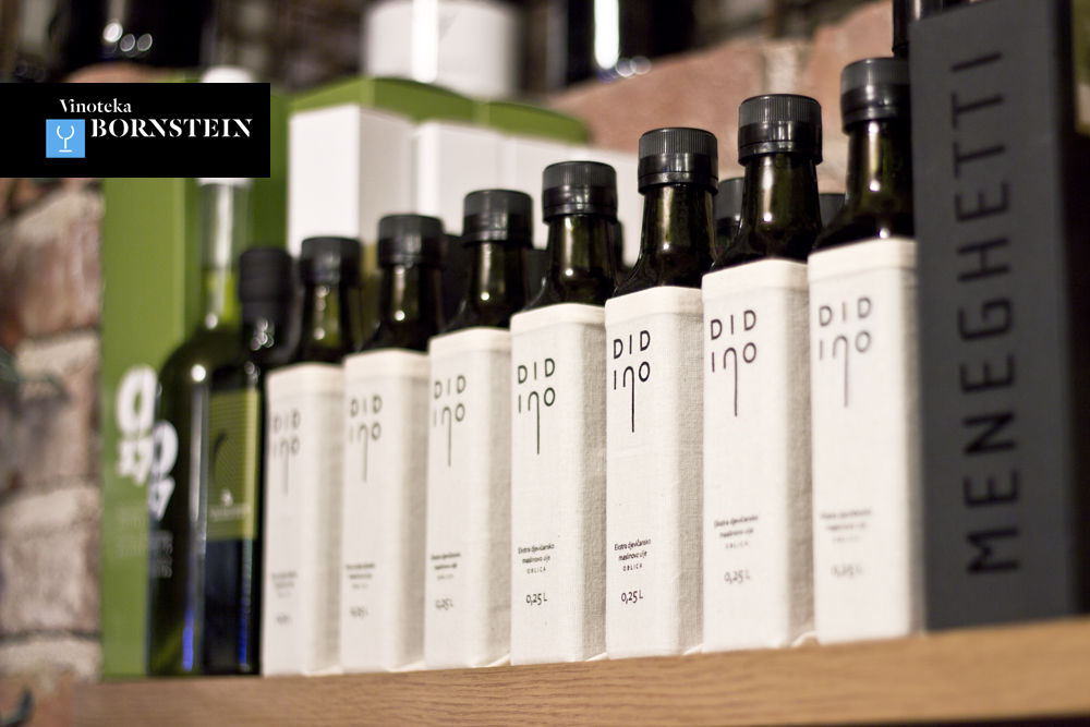
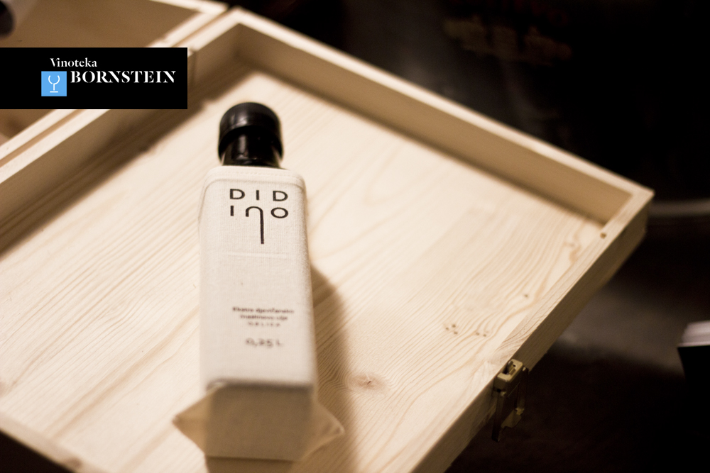
When our friend told us she wanted to brand her grandfather's olive oil, we knew it would be a wonderful project. The extra-virgin olive oil was produced in a limited edition and the smaller number of bottles allowed for more production options.
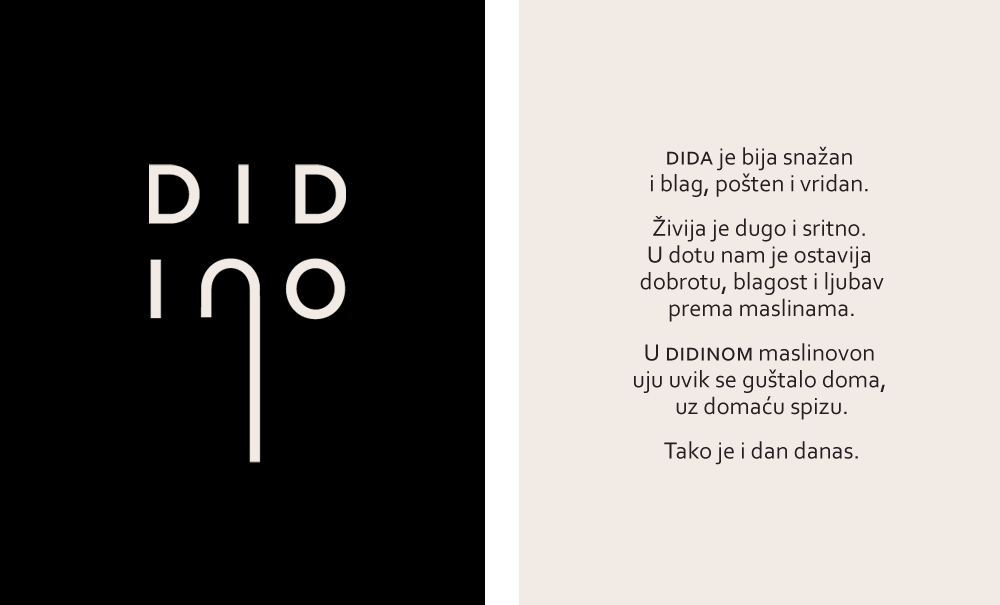
She named the oil DIDINO (Grandpa's), and within the beautiful, sentimental story about him and his olive orchard, she talked about the large jute sacks he would carry when going to collect the olives.
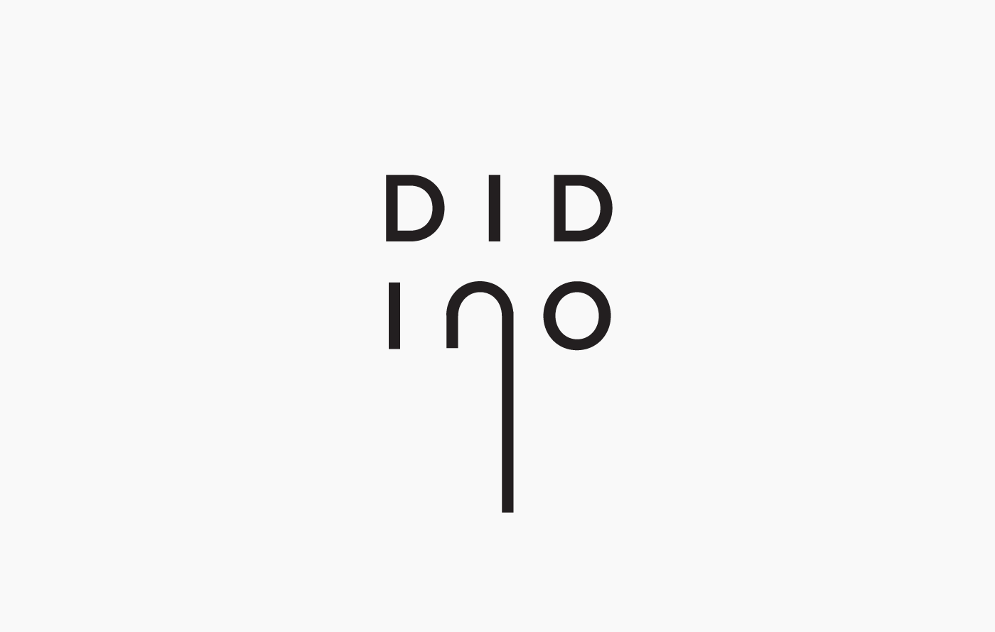
The design was silkscreened onto a textile that reminded of jute material, and sewn into a custom sack for the bottle, which also protects the oil from the sun. The logo is based on the grandpa's walking cane, but also has a flowing, oily feel to it due to the elongated letter "n". On the back is a brief story about her grandfather and his orchard.
http://www.thedieline.com/blog/2012/9/7/didino.html
http://www.packagingoftheworld.com/2015/11/didino-olive-oil.html
http://www.trendhunter.com/trends/didino-olive-oil-packaging
Agency: Manasteriotti DS
Art direction and design: Igor Manasteriotti, Mia Marić
Naming consultant: Petra Despot


In 2014 Didino was accepted to Bornstein, Croatia's oldest and finest vinotheque.

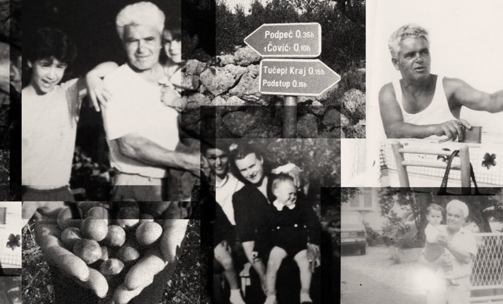
Grandpa and his granddaughters, who revived his olive orchard and started Didino brand.
Featured on: