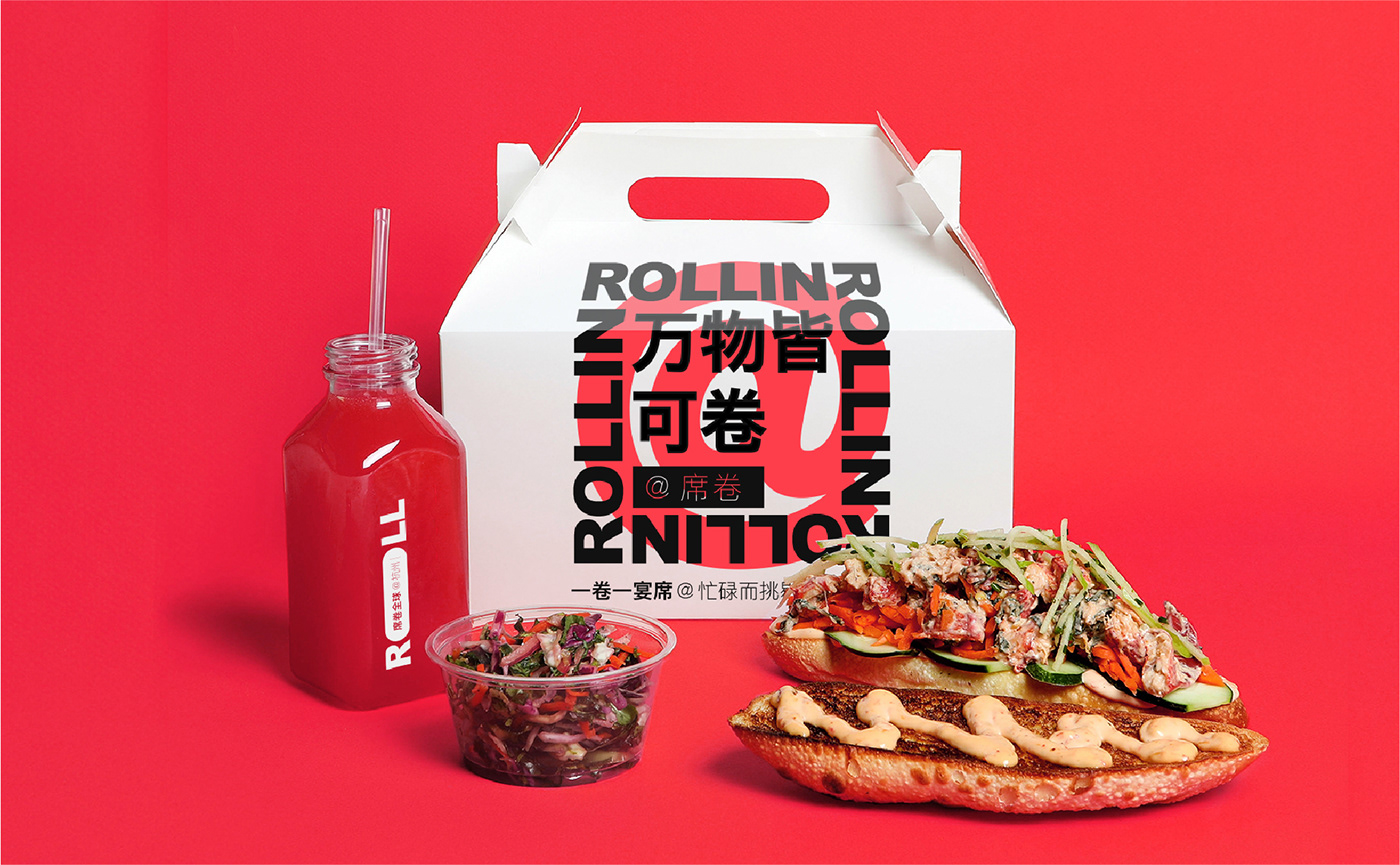
The following is a branding project for a food roll restaurant based in Hangzhou, China.
We managed to Craft our client a super symbol: @As a Commonly used symbol on the internet, @ visualizes the shape of a food roll.
We imagined the letter "a" could represent food ingredients.
Just like how everybody makes a food roll, collecting ingredients and rolling them up, then we get a nice and delicious letter @.
we mean to draw an analogy between the rolling transformation and our product attributes under the brand.
Meanwhile we think @ carries social gene itslef, which not only gives our brand planety room to be creative with in terms of future brand interaction an communication, but also helps the brand penatrate into customers' life. We're not to create a brandnew symbol,
whereas to occupy a cognition our customer already have in mind.


We do use @ a lot in life.
@ our family in groupchat, @ friends in our post, @ strangers on twitter...
Somtimes we urge to @ somebody else, and also want to get @ by the other.
Somehow we connect with one another online via this one simple and ordinary symbol.
ROLL UP @ you: treate yourself a tasty roll, you've earned it.