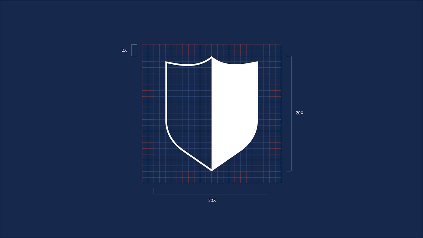
The system of icons is inspired to Campari's custom typography redesigned
by Philipp Herrmann. The sharp lines of these letters derived from lettering of early century Campari Advertising.
The same use of curves and shapes and the seek of the same balance between solids and voids make the icons blend perfectly with the original branding.