- 2019
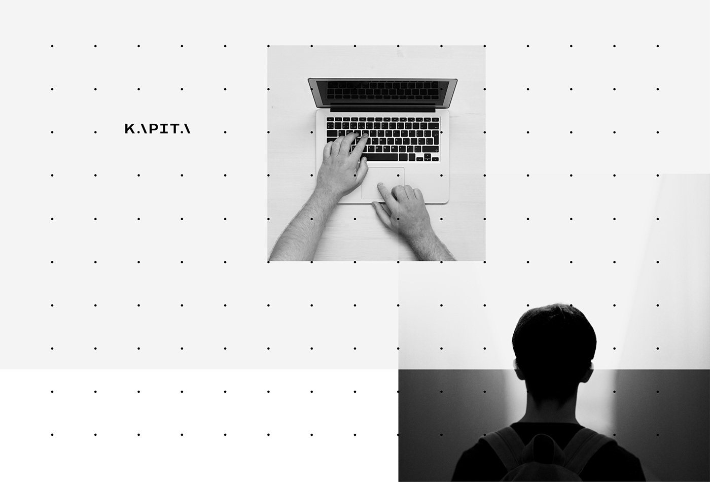
KAPITA
THE PROJECT
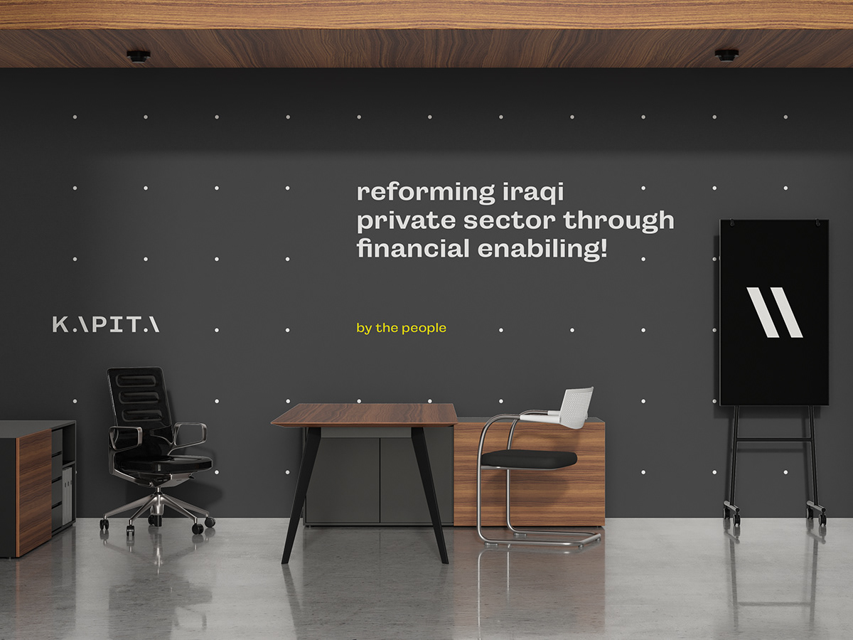
Developing a new brand identity for KAPITA; A business hub focused on developing the private sector in Iraq – The Brand's motto is "Invest Better".
OUR APPROACH
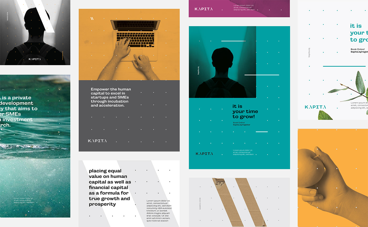
Business incubators are dedicated to providing the right services and structure behind the successful development of startups. This critical and important phase in the process later becomes the catalyst for regional and even national economic development. The concept for the KAPITA brand stems out of idea that placing equal value on human capital as well as financial capital as a formula for true growth and prosperity.
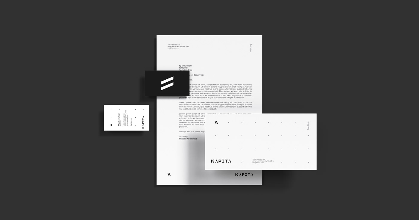
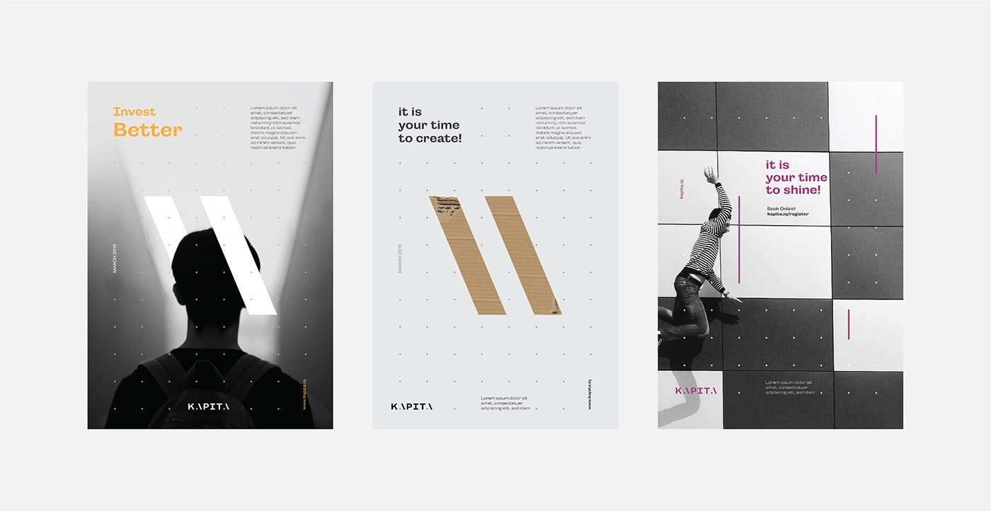
Naming, Brand Identity, Print Design

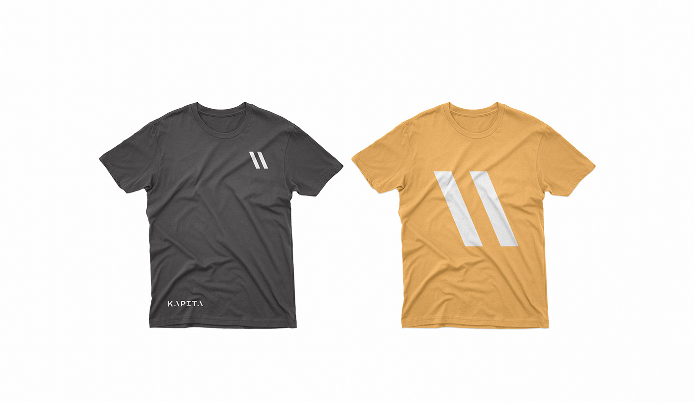
THE ViSUAL INTERPRETATION
The bold, clean, modern sans-serif typeface serves as the base structure from which the two “A” letter formations develop a strong diagonal line. Innovative, risk-taking and bold, the two “A” formations come together to form a mark resembling an equal sign. Much like the complexity of a mathematical equation, the visual statement is not for all, but the few who have the vision and capacity to see potential. The type lockup and the symbol work together to provide the structure for showcasing KAPITA’s main point of communication: its success through its people and its capital.
By maintaining a visual language with this simple and powerful concept, KAPITA will be able to develop a culture on its own. With a clear focus on accelerating growth, building investments, and rebuilding the mindsets of young entrepreneurs, KAPITA becomes the leader in Iraq’s future development.