

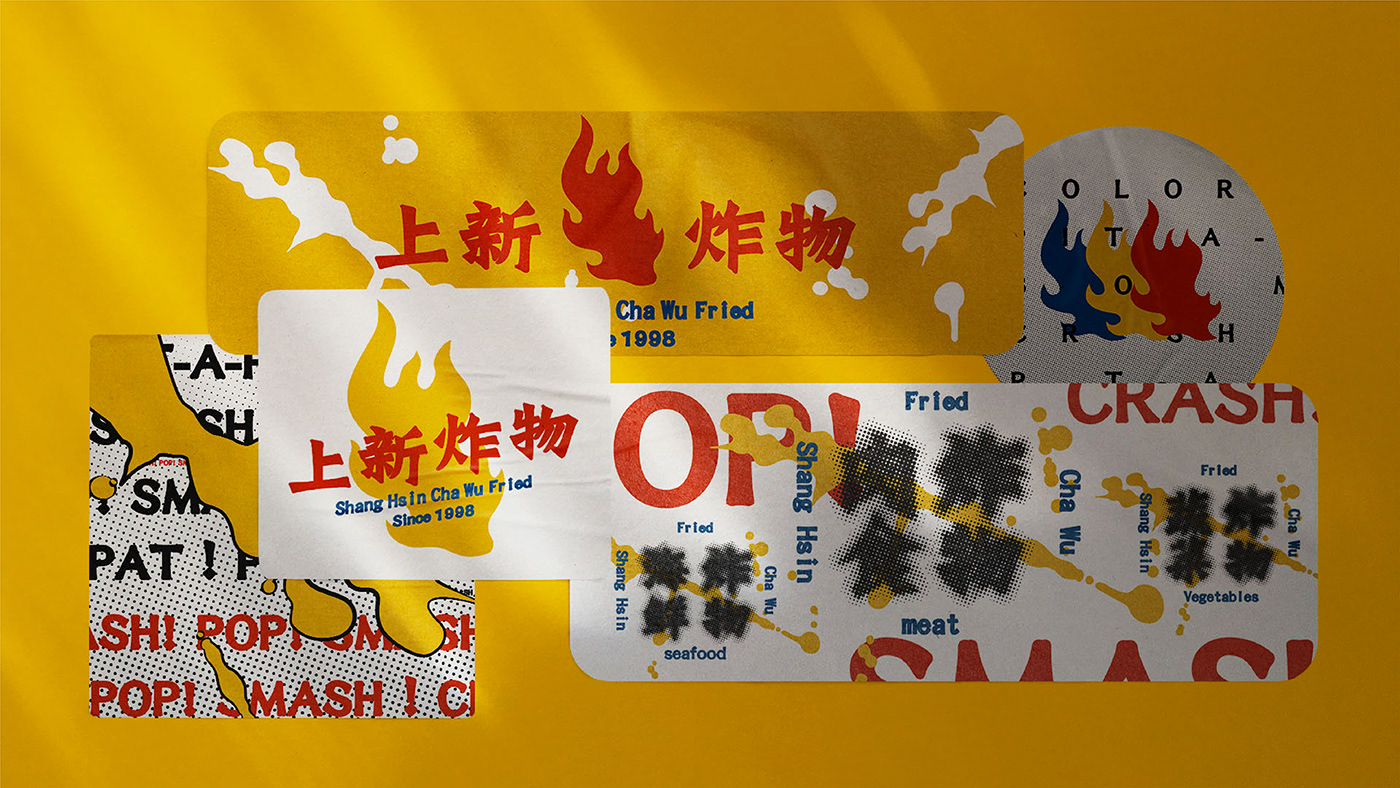

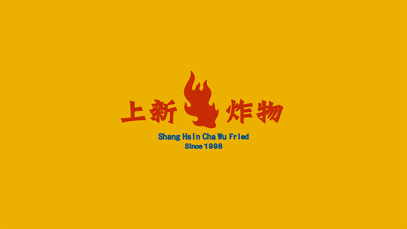
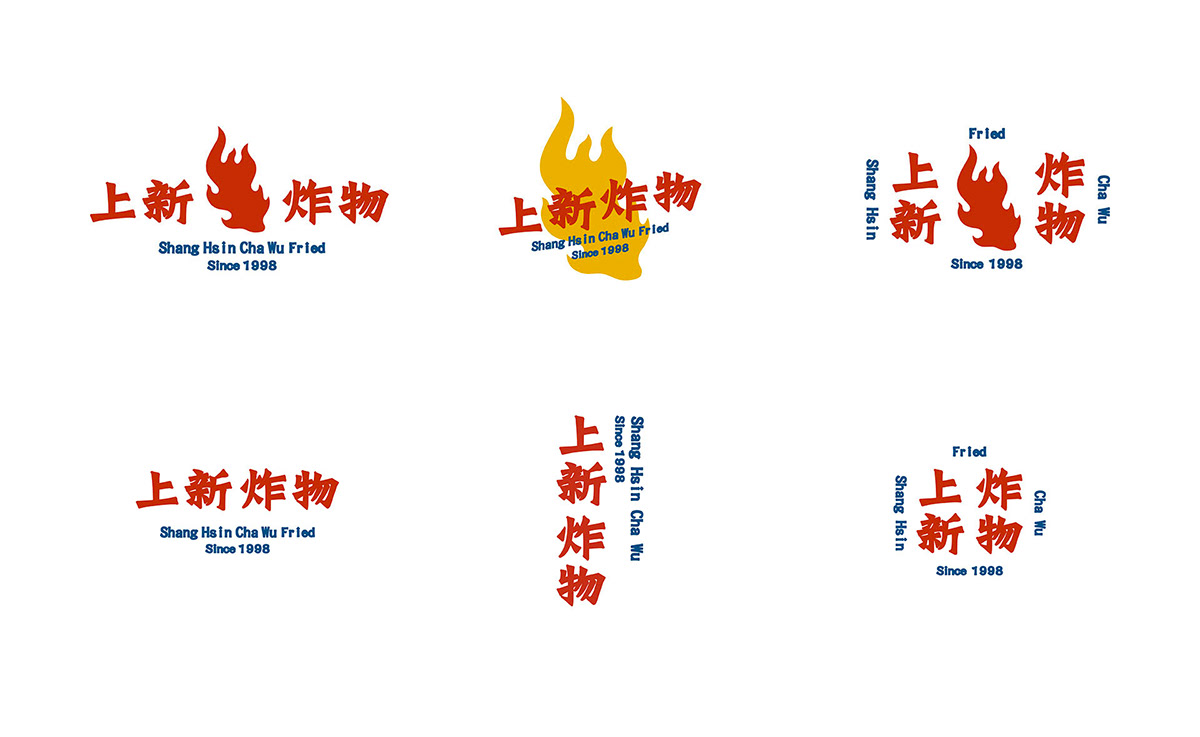
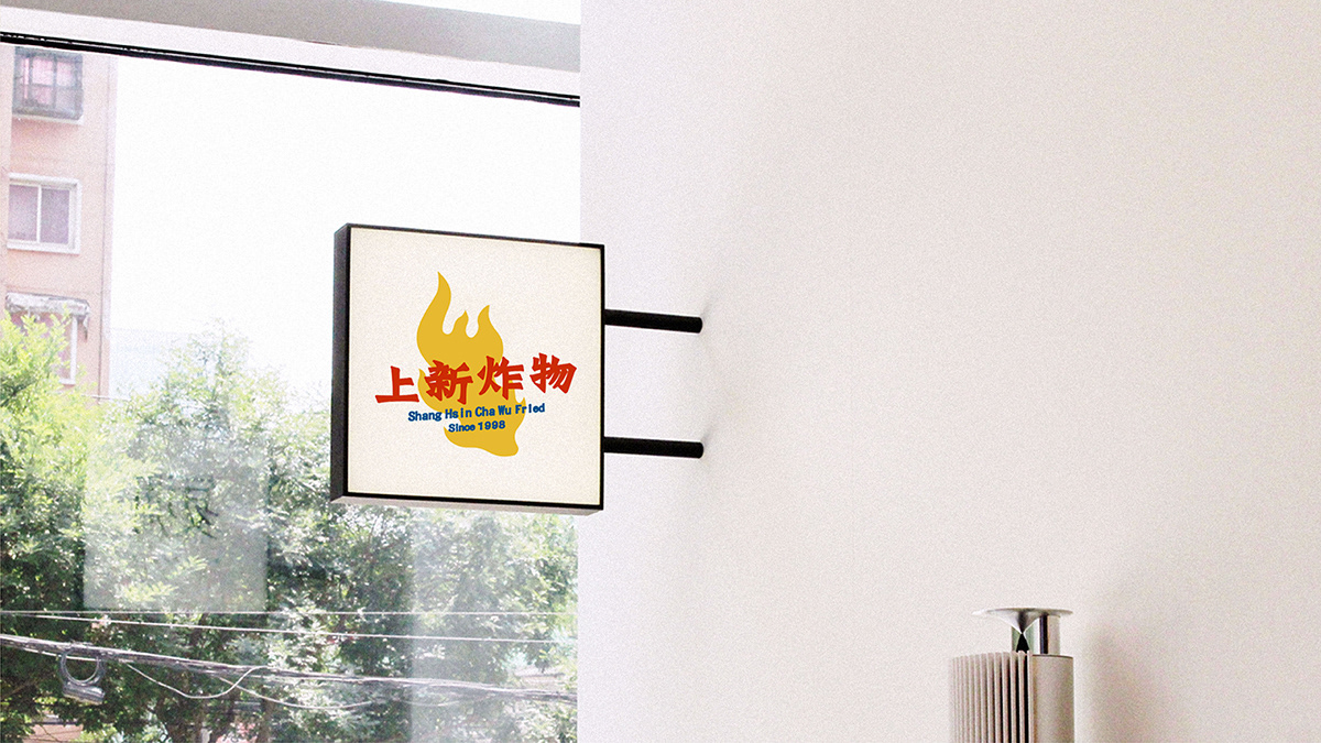
上新炸物是一个主打外卖业务的炸物餐饮品牌。通过前期的市场调研,锁定学生、白领等年轻客群于下午茶、宵夜等非正餐时段对小食的需求。希望在一众类似商家中,突出品牌的独特形象。也因此特别着重 Logo在饿了么、美团等外卖平台上的展示效果。
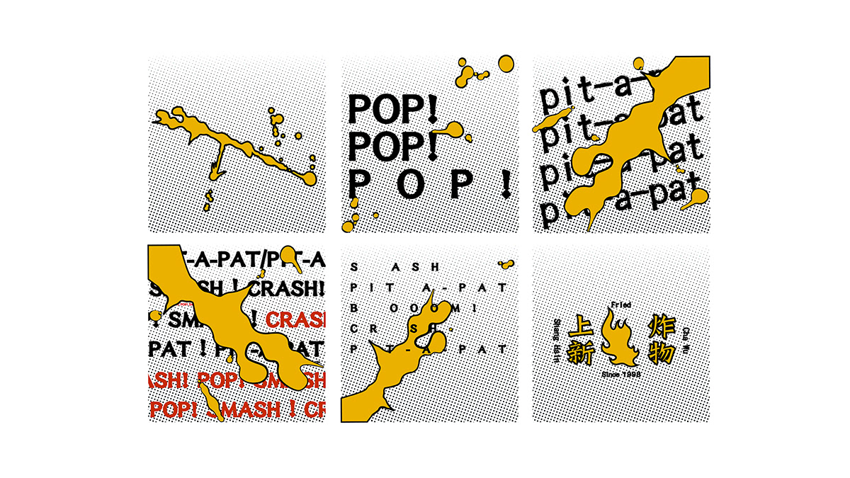
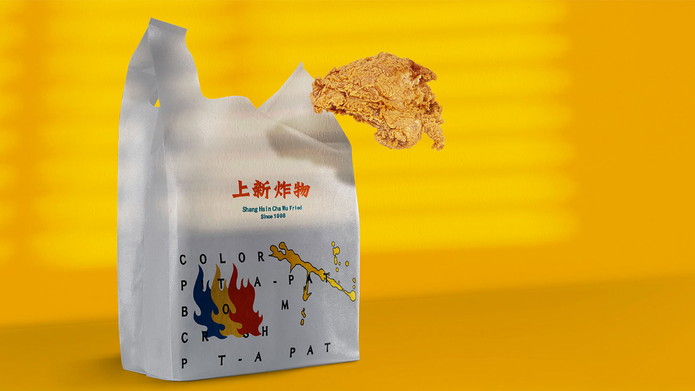
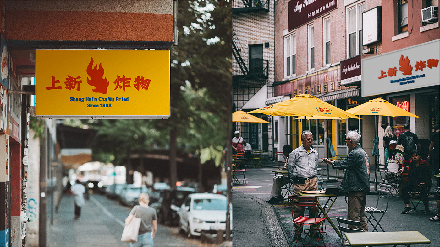
在视觉风格方面,上新炸物希望融入复古摩登、新旧香港招牌的繁华老式都会感。最终出山选择以模仿香港霓虹灯的文字排版,并多次修改品牌核心的 “一把火” 图样,完成此次的设计。延伸图样与物料则运用网点、泼墨、口号等漫画式元素,营造生动丰富的视觉效果。既纳入上述展示效果的考量、融入时下年轻人的潮流趣味感,同时传递了品牌对食材与手法的高度追求,将市井文化的精髓沉淀,形塑具有质感与深度、焕然一新的品牌体验。
Shang Hsin Cha Wu, meaning 'the newly fried', is a brand for fried street food that first started in NYC's Chinatown in the 90s. The client wishes to have an identity that best expresses the brand's pop modern spirit and its history. We integrate a retrospective metropolitan style with a pop culture touch. We suggest our client to adopt the Wade-Giles spelling instead of the standard Pinyin to amplify Shang Hsin Cha Wu's cultural heritage.


Shang Hsin Cha Wu
Design Direction: Jessie N.
Senior Designers: Wayne H. Jaxson D.
3D and rederning Designer: Junnan D.
3D and rederning Designer: Junnan D.
Motion Graphic Designer: Sprite Y.
Thank You!


