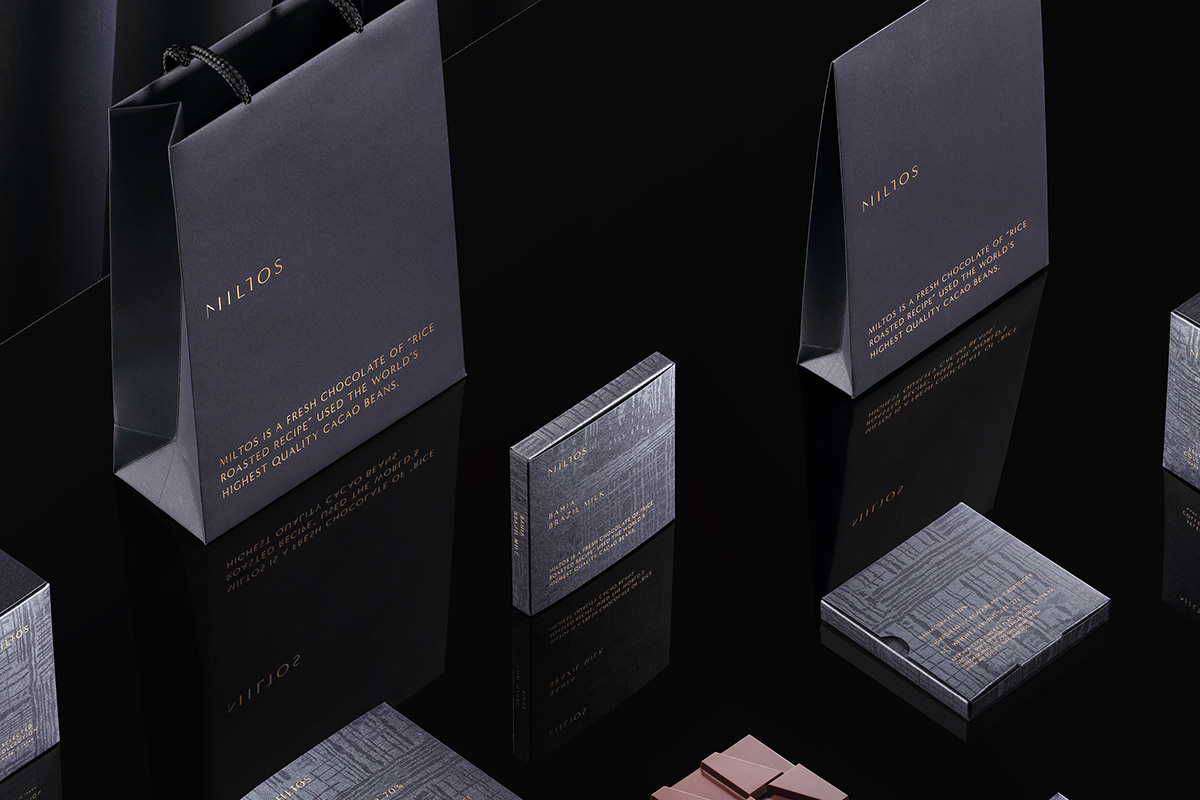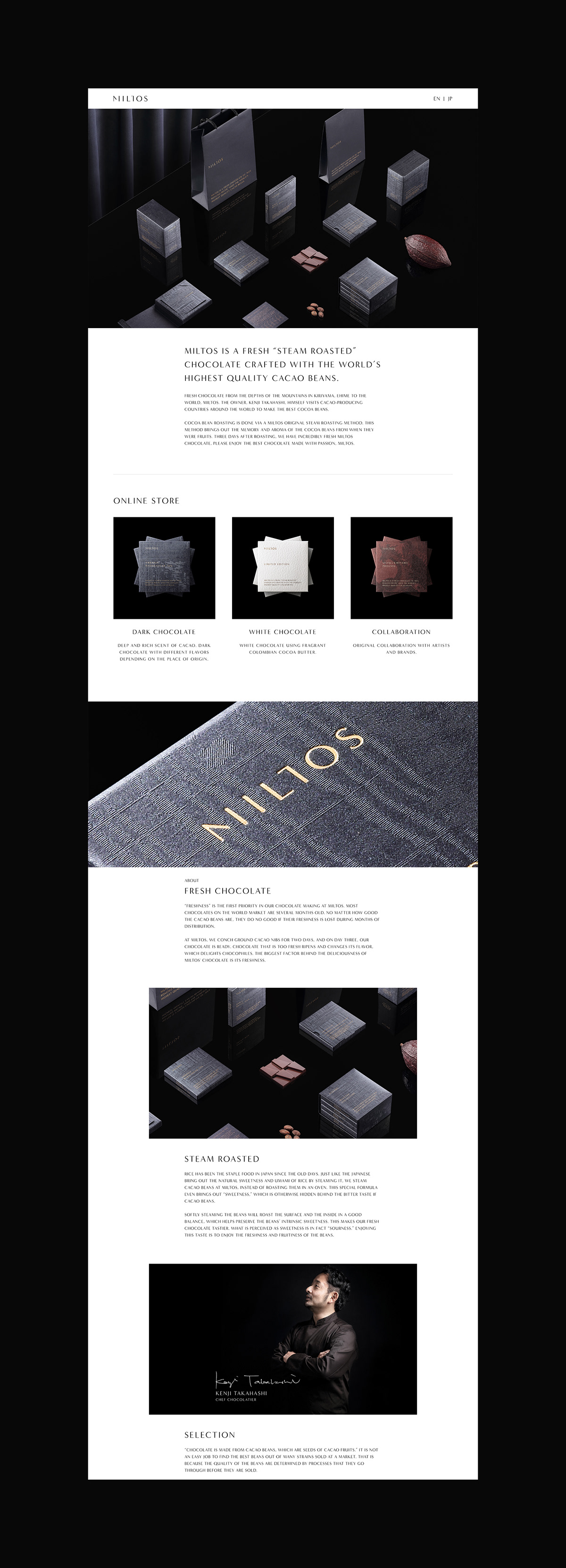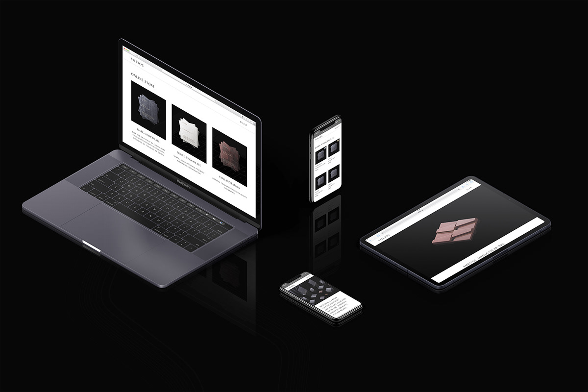
We have done total production including the branding, package design, web design, naming, etc. of MILTOS, which sends fresh chocolate from deep in the mountains of Ehime, Japan to the world.
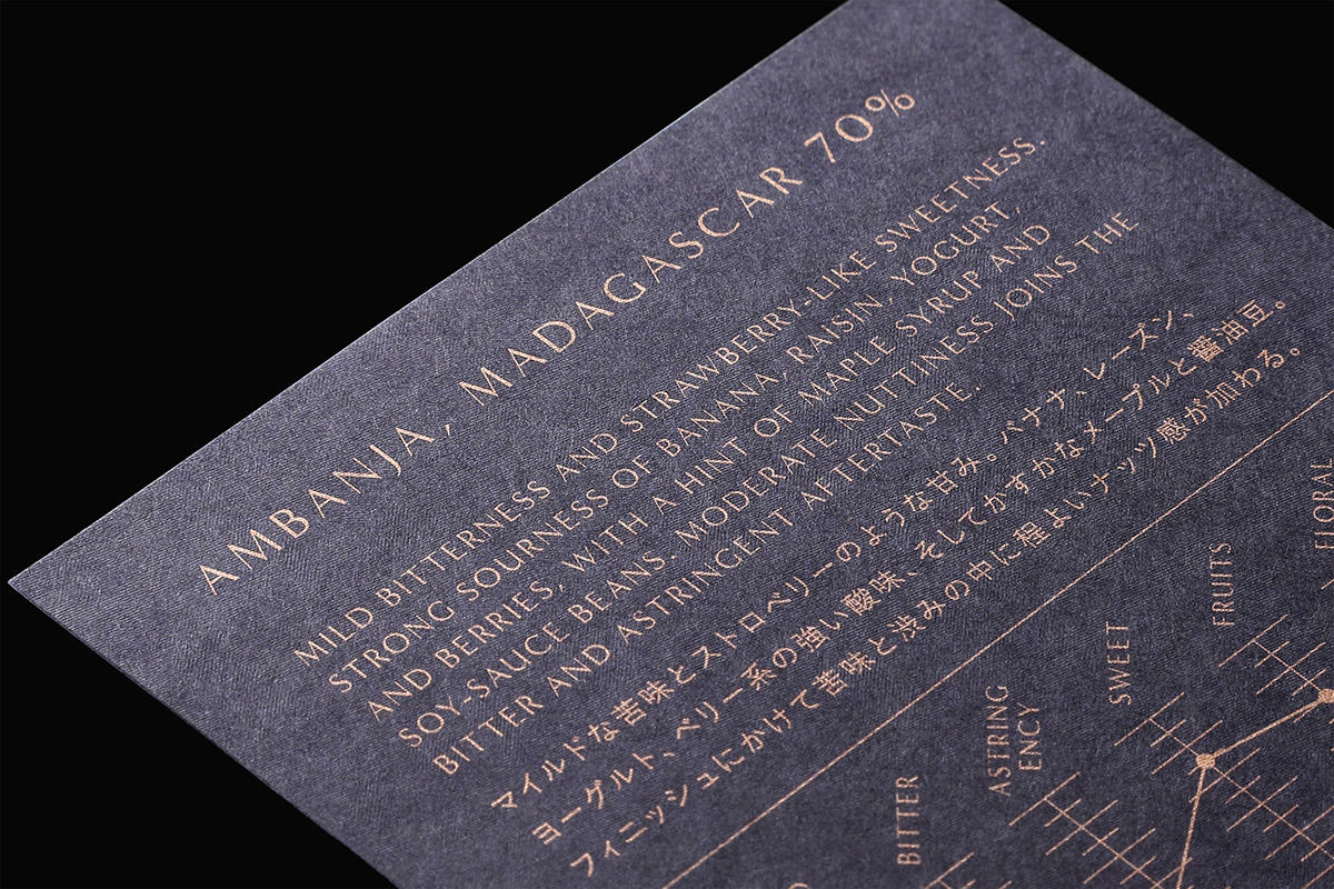
Kenji Takahashi, the owner himself visits cacao producing countries around the world to control the quality of the cacao beans from cacao cultivation to harvesting, fermenting, and drying. Similar to how Japanese people "boil" rice to bring out the sweetness, cacao beans are roasted similar to "boiling" by the original steam roasting method to maximize the cacao flavor. 3 days after roasting and completing the chocolate it is sold in stores to avoid oxidation, which is one of the biggest factors that can affect the chocolate's flavor.
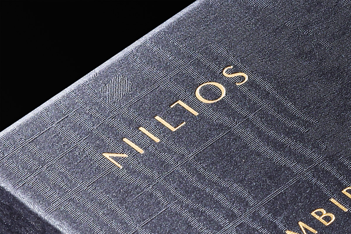
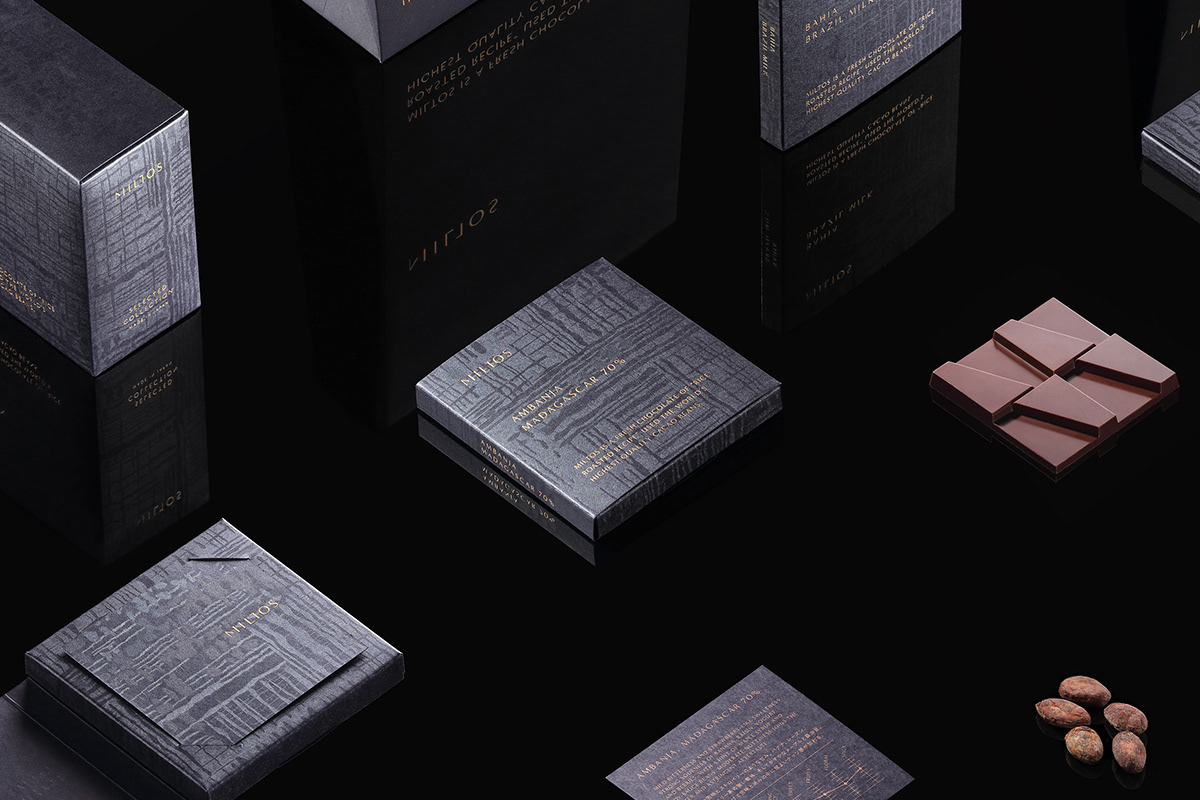
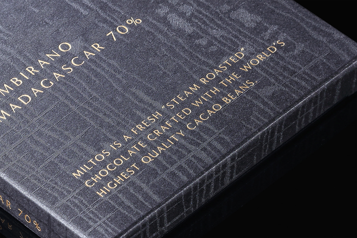
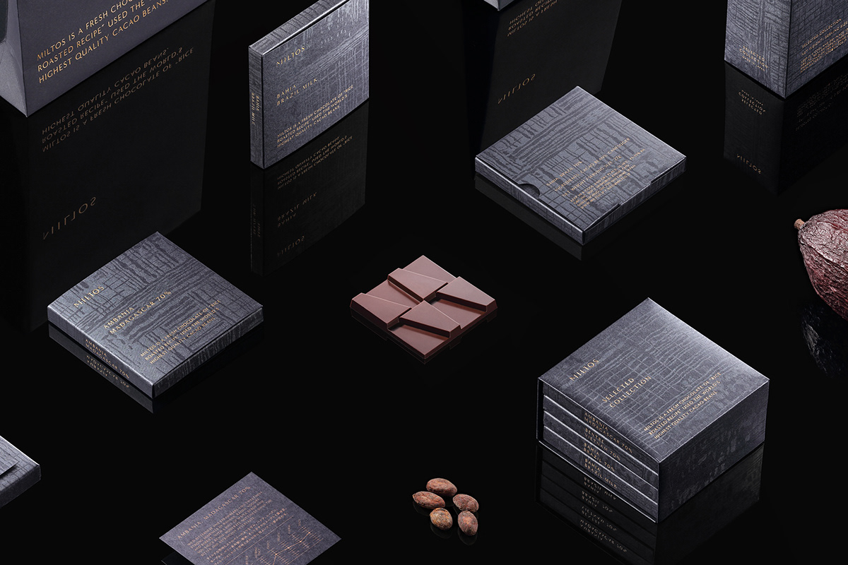
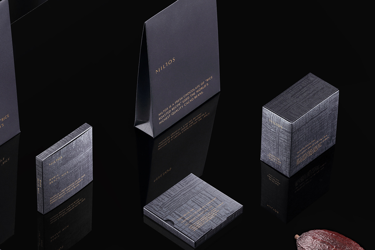
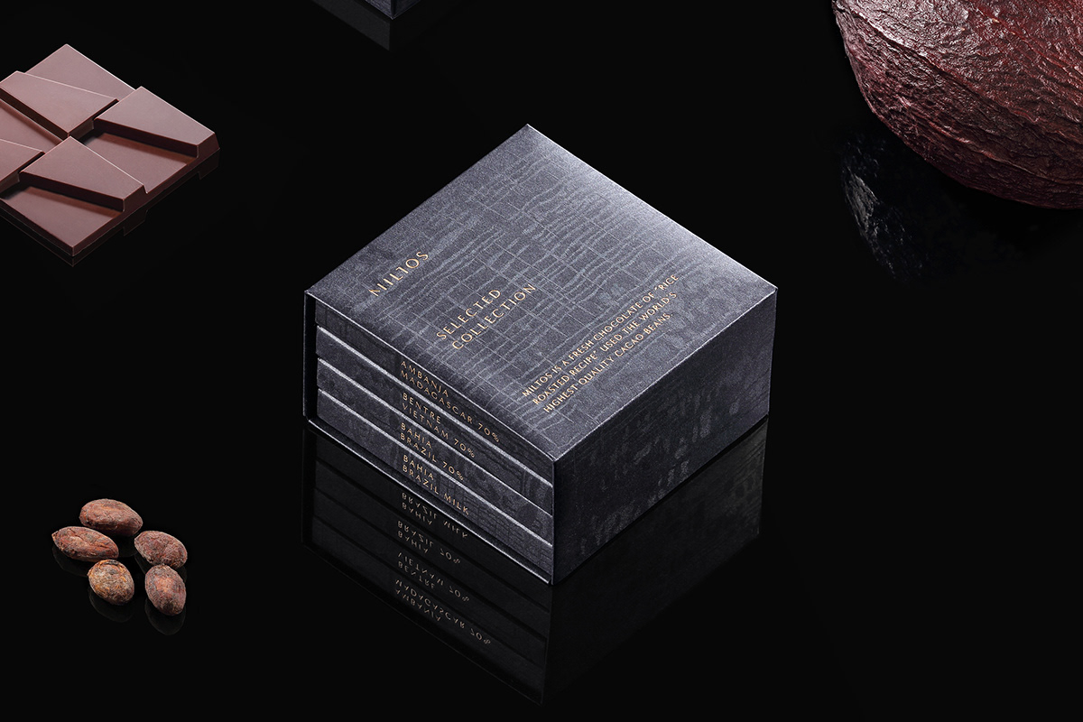
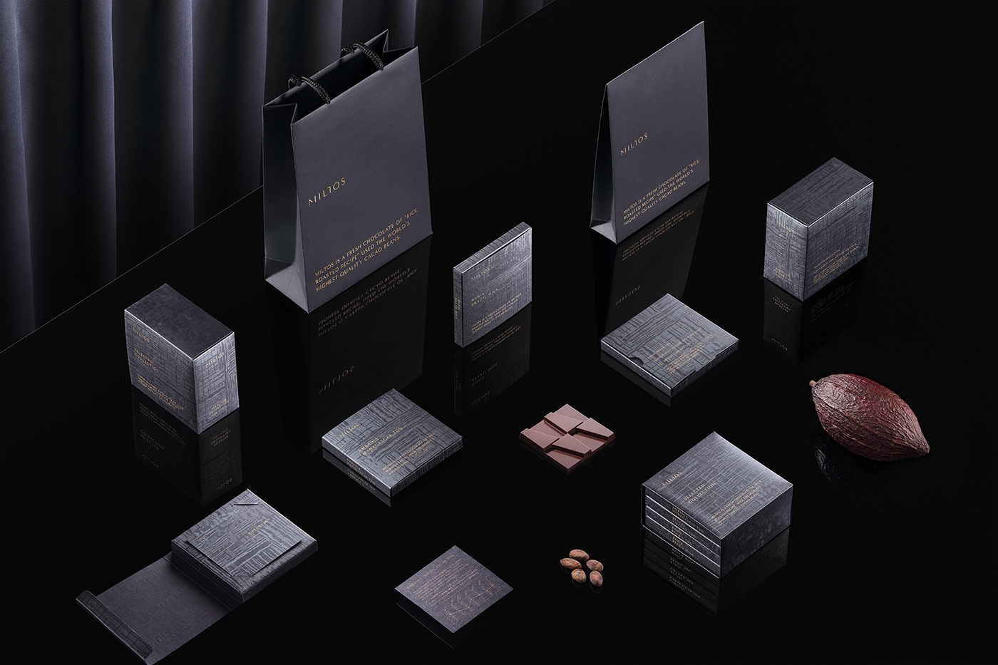
To create an attractive brand philosophy associated with maximizing the original flavor of cacao, and using keywords like fragrance and aroma, we formed the identity of "perfume-like chocolate." It is cooked to bring about a gentle layered chocolate that feels like it is melting in your mouth like silk. The package has a texture that seems to glimmer with its silky pattern.
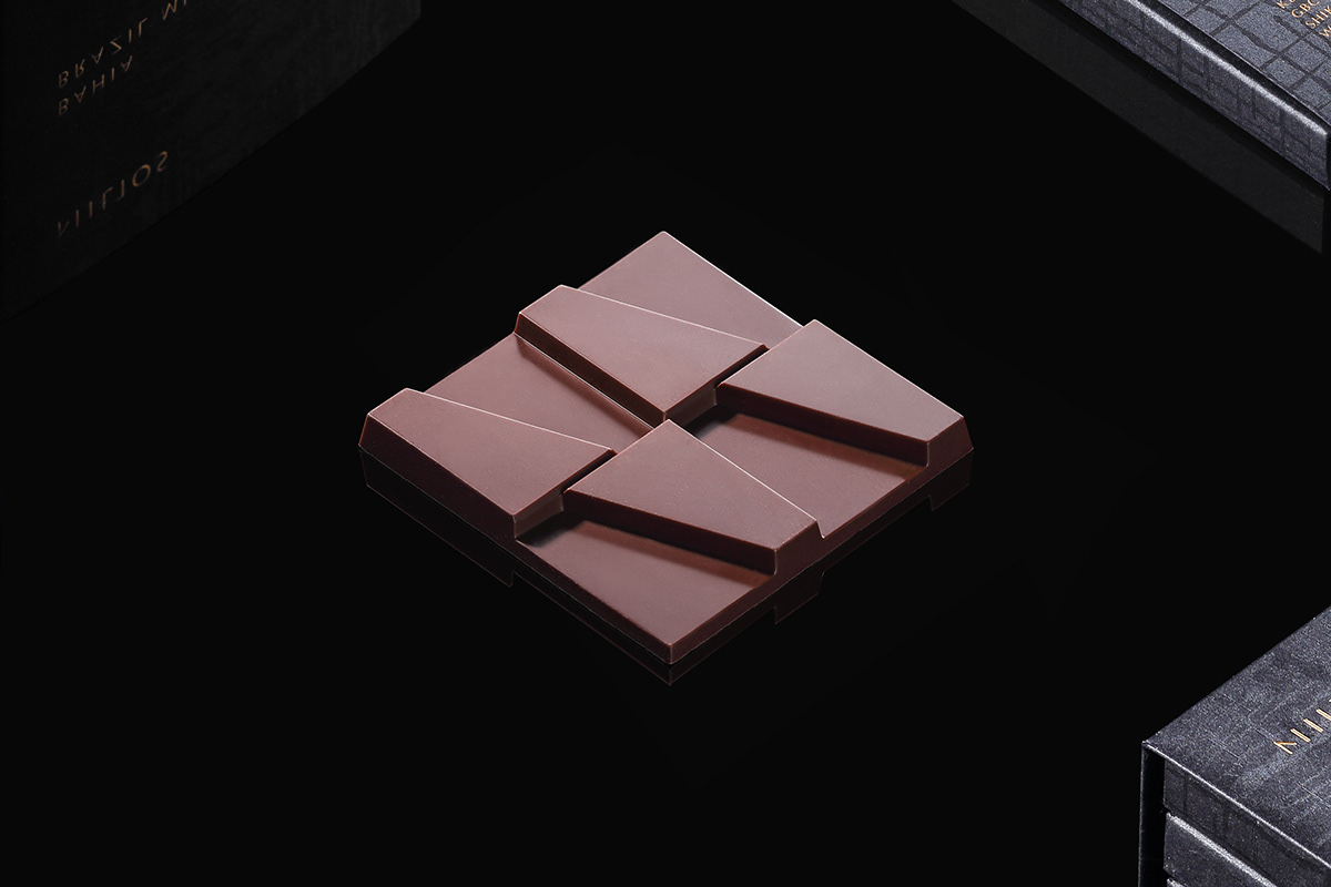
The chocolate has the brand name "M" as a motif and draws inspiration from "3D structures like modern architecture," which clashes with the idea of "food." This is a kind of playfulness used to surprise the viewer. Also, thanks to the double thickness provided, you are able to enjoy a fragrant aroma and a rich mouth melting flavor.
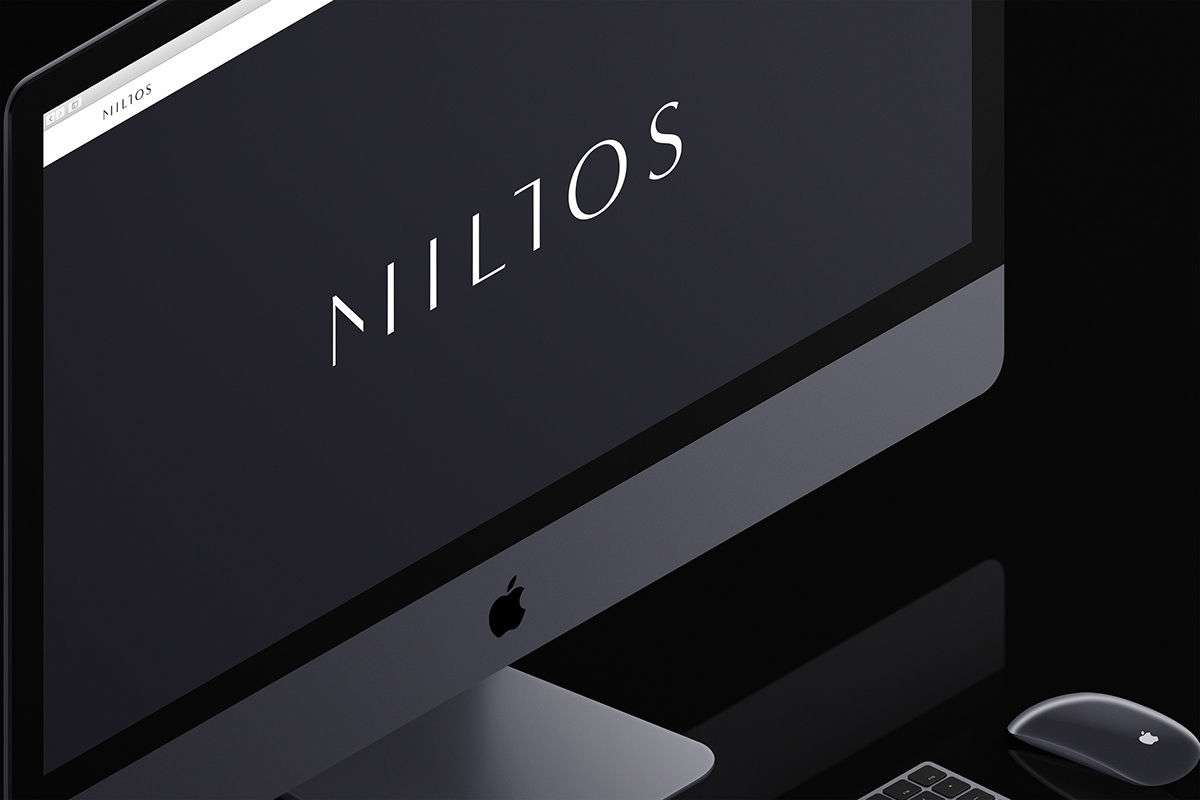
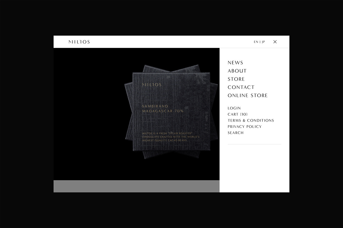
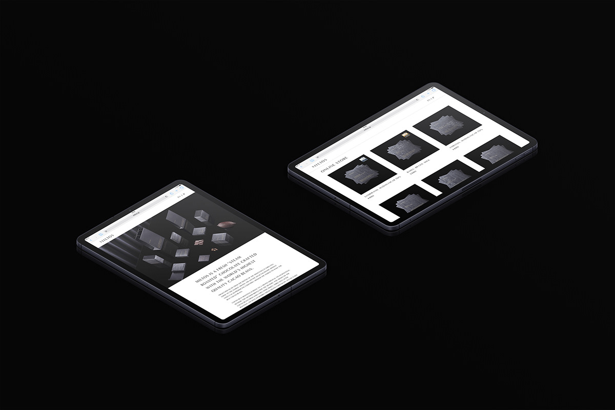
We have perfected a distinct brand identity, which combines elegance and minimalism while also being modern and luxurious.
愛媛の山奥、切山から世界へ向けてフレッシュチョコレートを発信するMILTOSのブランディング、パッケージデザイン、ウェブデザイン、ネーミングなどをトータルプロデュース。
オーナーの高橋賢次氏自ら世界中のカカオ生産国を訪ね、カカオの栽培、収穫、発酵、乾燥に至るまでカカオ豆の品質をコントロール。日本人がお米を「炊く」ことで甘味を引き出したように、独自のスチームロースト製法でカカオ豆を「炊く」ように焙煎することでカカオの旨味を最大限引き出す。カカオが風味を損なう最大の理由の一つである酸化を抑えるため、焙煎から三日後にはチョコレートが完成し、店頭に並ぶ。
カカオが持つ本来の旨味や風味を最大限活かそうとするブランド哲学に感銘を受け、香りや芳香と言ったキーワードから連想される「香水のようなチョコレート」というアイデンティティを形成した。淡く、優しく包み込むようなチョコレートの口溶けはシルク生地を想わせる。パッケージのテクスチャには様々に煌めきを発する、シルク模様を纏わせた。
チョコレートはブランドネームの「M」をモティーフとし、「食べ物」という発想とは対極にある「現代建築のような立体的な構造」からインスピレーションを得た。これは一種の遊び心であり、見る者を驚かせる。またチョコレートに二つの厚みを設けることで、香り高いアロマと濃厚な口溶けを楽しむことが出来る。
現代的でラグジュアリーでありながら、エレガンスとミニマリズムが融合する特徴的なブランドアイデンティティが完成した。