


BRTA Re-branding
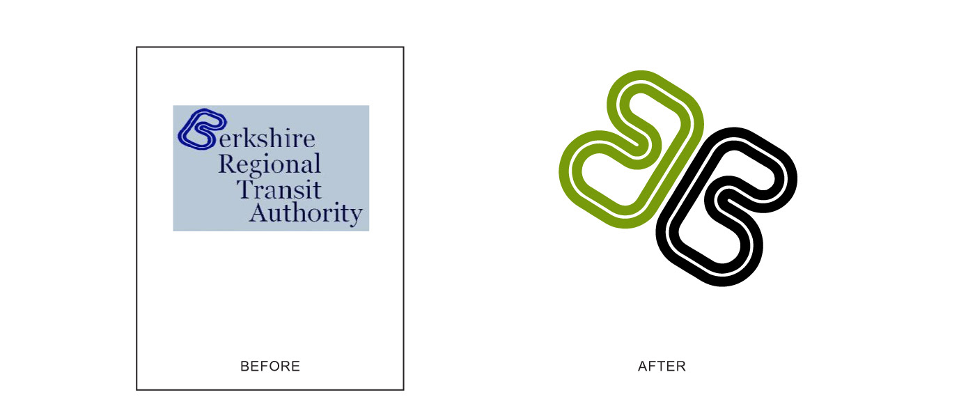
Berkshire Regional Transit Authority
Logo, FLEET AND ENVIRONMENTAL GRAPHICS
The Berkshire Regional Transit Authority wanted to re-brand, but they wanted to keep their roadway styled B. This challenge lead to inspiration. The B, when re-drawn and reflected, invokes a flying butterfly. A reference that highlights the environmental benefits of public transportation. This project included identity, fleet graphics and environmental graphics.
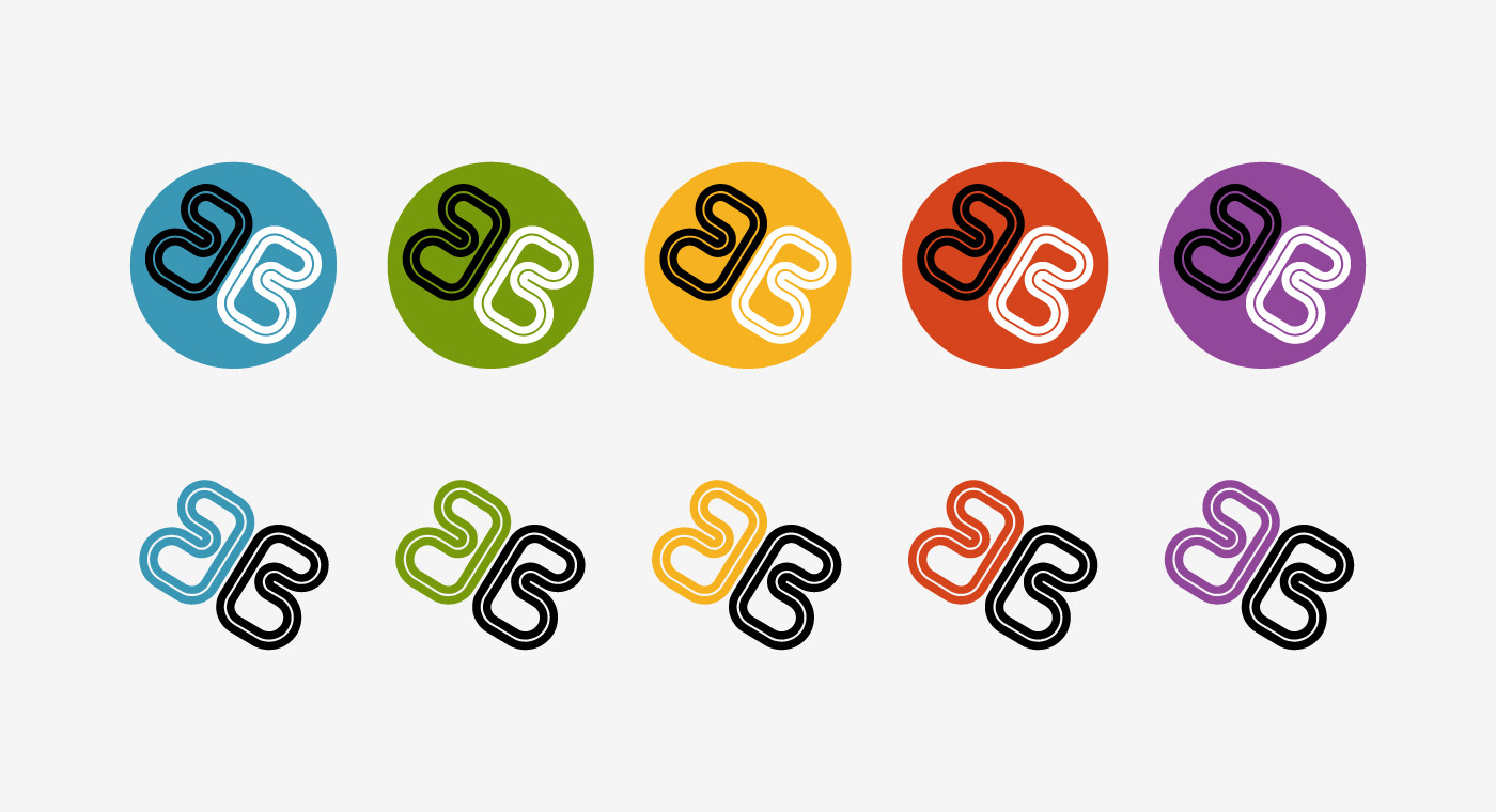
Different logo colors define the routes.

Branding was carried over into the terminal interior and exterior.
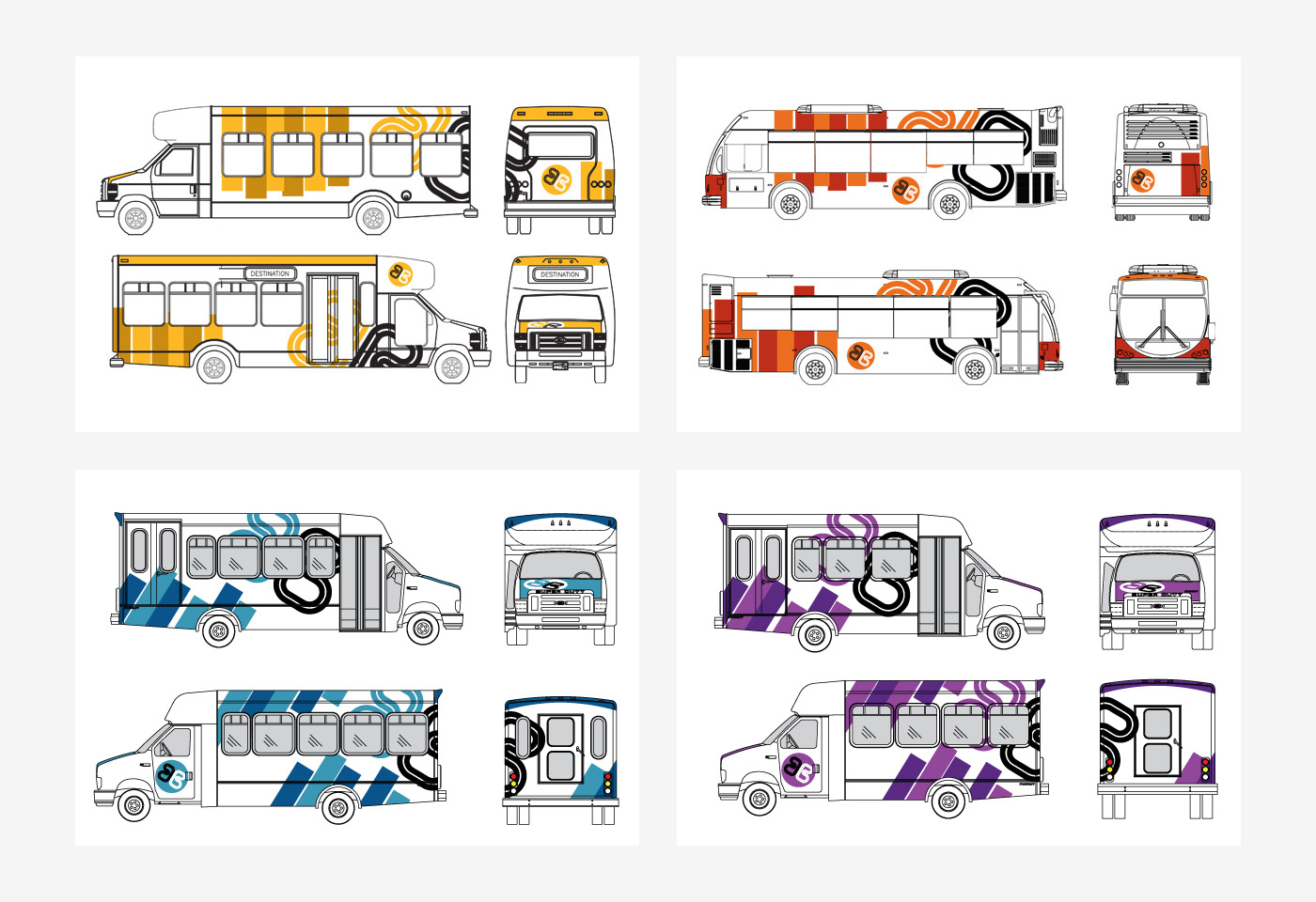
Vehicle graphics were customized for the variety of vehicles that service each route.

This project was completed for TSM Design, Springfield, MA


