

Not The Dorm
Website for student luxury apartments
Website for student luxury apartments
I completely redesigned this college property site, back to front, to coordinate with the 2005 print campaign, “Live Outside the Box”. The color palette of black with vivid accent colors and the button designs were heavily influenced by music web sites that would be popular with my target audience.
I incorporated several usability features, including disjointed rollovers and randomizing images. There’s plenty of eye candy here but the design is all about the branding and marketing objective of displaying each student property to its full advantage.
I incorporated several usability features, including disjointed rollovers and randomizing images. There’s plenty of eye candy here but the design is all about the branding and marketing objective of displaying each student property to its full advantage.
Home Page
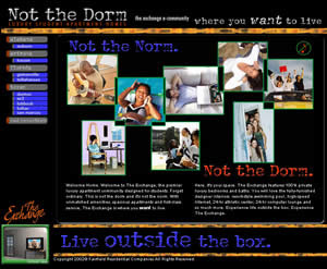
The home page at notthedorm.com has a main Flash component which includes music that runs for 18 seconds. Normally I don't recommend "splash" pages since they don't improve search engine stats for the home page (i.e. lack of html content)—plus most people won't wait for them to load. Here, the client believes that the Flash and music is important to the target audience of college students. In this instance, I agree. The tagline in blue on the bottom is a randomizing image that changes on each refresh. I allows the site to play through 10 different branding phrases.
The home page at notthedorm.com has a main Flash component which includes music that runs for 18 seconds. Normally I don't recommend "splash" pages since they don't improve search engine stats for the home page (i.e. lack of html content)—plus most people won't wait for them to load. Here, the client believes that the Flash and music is important to the target audience of college students. In this instance, I agree. The tagline in blue on the bottom is a randomizing image that changes on each refresh. I allows the site to play through 10 different branding phrases.
Property Home Page
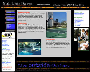
In addition to the tagline on the bottom, the staggered images on the right side also randomize with selected images from the "Live Outside the Box" theme.
In addition to the tagline on the bottom, the staggered images on the right side also randomize with selected images from the "Live Outside the Box" theme.

Amenities Page
Fitting a long list of property and apartment amenities on the screen was a challenge. I chose to incorporate a few cascading style sheet tricks to scroll the text within the center gray panel. If you go to the site and can't see the scroll bar effect, it's because your monitor is set at 800x600 or below. Sorry, you get routed to the low-res version. Time to upgrade!
Fitting a long list of property and apartment amenities on the screen was a challenge. I chose to incorporate a few cascading style sheet tricks to scroll the text within the center gray panel. If you go to the site and can't see the scroll bar effect, it's because your monitor is set at 800x600 or below. Sorry, you get routed to the low-res version. Time to upgrade!
Floorplan Page
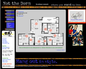
Disjointed rollover images added a nice touch to the floorplan pages. When the user scrolls over an orange circle on the floorplan image, an image of the actual room appears in the orange box on the upper right.
I also employed this effect for the community map. There the user scrolls over to view various property features, including the pool area, basketball courts and computer labs. I also added a floating layer effect to the orange box in this instance as the community maps tended to be very large and required the user to scroll down to view the bottom portion of the map.
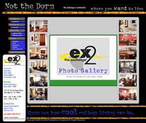
Photo Gallery Page
Disjointed rollover images worked so well for the floorplans and the community maps that I used them again to save the user from repetitive clicks to view enlargements of the property photos. Here when the user rolls over any of the thumbnails, an enlargement of that image appears in the center panel. This allows the user to view all 12 photos without leaving this page.
Disjointed rollover images worked so well for the floorplans and the community maps that I used them again to save the user from repetitive clicks to view enlargements of the property photos. Here when the user rolls over any of the thumbnails, an enlargement of that image appears in the center panel. This allows the user to view all 12 photos without leaving this page.


