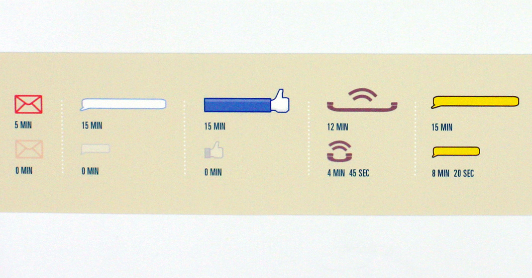
In this infographic diagram, I recorded my personal use of various kinds of media over a period of 14 consecutive days. The system in this diagram is broken down into types of media that I use for less than an hour and ones that span for longer duration. The duration for each type of media is proportionally measured and is shown with the length of each icons. For instance, most of the music icons are long because I listen to music a lot, whereas a lot of Line messenger icons are very short because I do not use it as much. Furthermore, the length of individual pages also vary depending upon total amount of time spent over two Mondays, two Tuesdays, etc.

Follow this link to see full-scale:
...

...

...

...


