


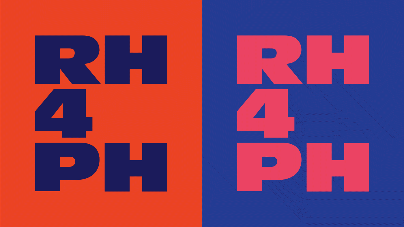
RH4PH: Reproductive Health for the Philippines
The starting point for a campaign identity addressing the need for proper & modern reproductive health for the Philippines.

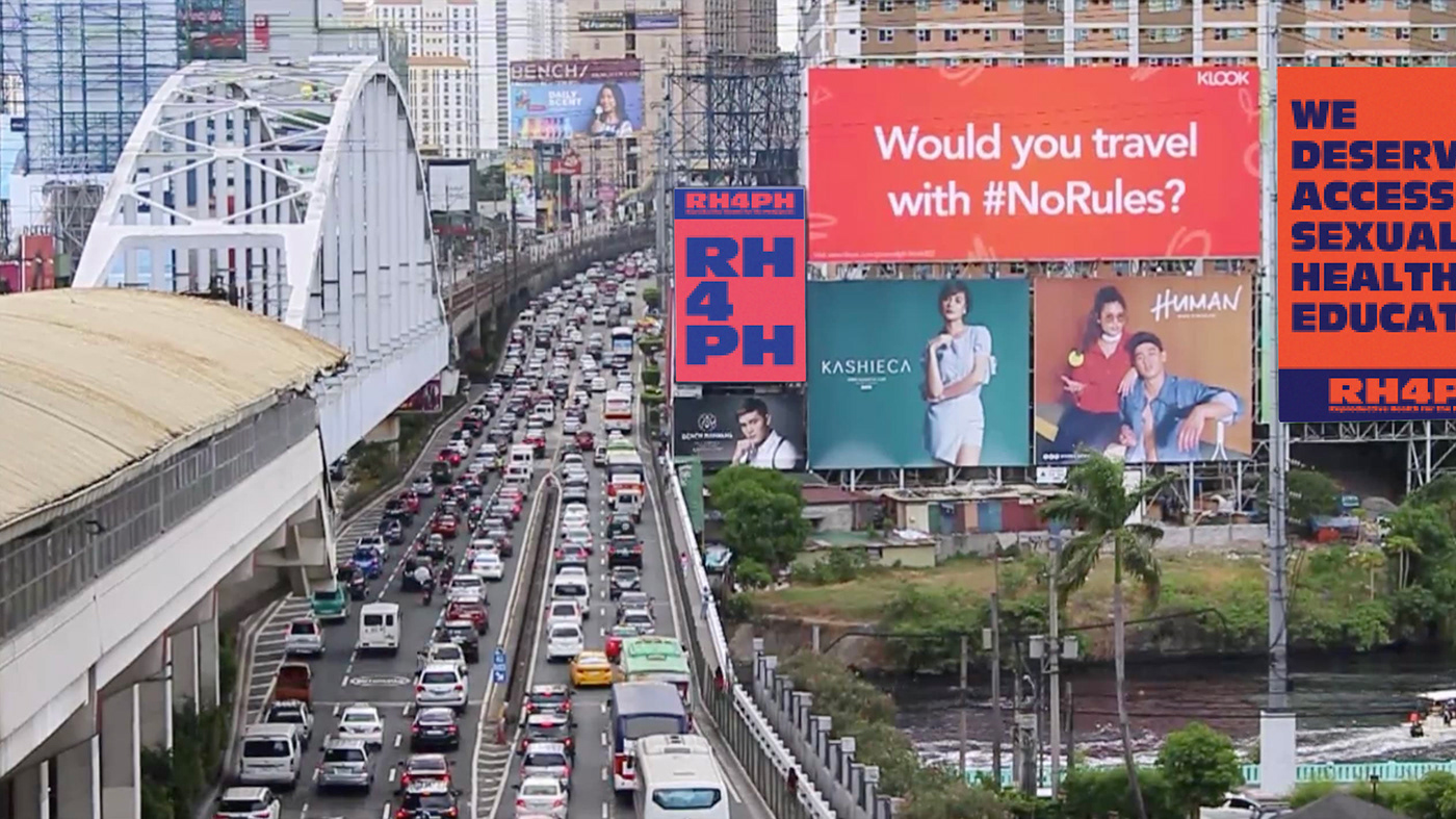
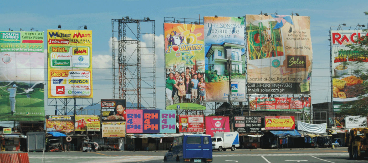
The campaign makes use of vibrant & contrasting—almost vibrating—colors to catch the attention of an everyday citizen in the bustling streets of Metro Manila, Philippines.
Metro Manila is flooded with billboards on every major highway and city, making it difficult to catch an individual's attention (seen in the photos below). The completely typographic and vibrant identity allows RH4PH to stand out as a campaign, and cause radical conversations around an important topic that many Filipinos face.


Context
The Philippines is an extremely Roman Catholic country, with a demographic of 86% Catholic. It is so deeply ingrained in Filipino culture that there is a very limited separation between Church and State. In effect, Reproductive Health is an issue that the country must face. The Philippines is one of the only countries to have increasing rates of HIV diagnoses, and an alarming rate of unintended pregnancies. Though the Reproductive Health Act was passed in 2012, not much has been done to improve the overall sexual education and health of Filipino citizens. This campaign aims to further push the bill into action, and continue dialogue surrounding this issue.
Campaign Goals
The campaign's target audience ranges from the young teens (~13 years old) to young adults (~30 years old). As teens begin to grow and learn more about sex, it becomes more imperative to inform them on various contraceptive options and family planning resources. This target audience heavily dictates the campaign's youthful & bold identity. The name "RH4PH" comes from the rather controversial bill, Responsible Parenthood and Reproductive Health Act. For years leading up to the final vote, citizens, friends, families, churches, and politicians were involved in tense debates either advocating for or against the bill. The bill is more commonly referred to as the RH (reproductive health) bill. "PH" comes from the local abbreviation for Philippines.

Antique Olive was chosen due to its bold, yet playful characteristics—fitting in perfectly into the goals of this campaign. To balance out this striking typeface, the thin and elegant Ogg is used to further complement and enhance the overall campaign identity.

The smaller posters above demonstrate how the campaign's language can be expanded to be more informative, and spread information on the overall benefits of the RH Bill.
The animation below demonstrates how these posters can begin to come alive with motion and further educate the public on the values of reproductive health.

I hope to someday pursue this campaign and push more discussions surrounding sexual and reproductive health in the Philippines.


