
Making digital photos look a little less terrible in Lightroom
After a long break and dissatisfaction with the images I was getting from digital cameras, I decided to start shooting film again this past year. It has been a great experience. I've learned to be a little more thoughtful about the shots I take and the biggest thing is that the tonality of the images just looks *right* without needed to do anything to the film scans.
Images from a digital camera look very flat with default settings which has you applying presets or adjusting colors and contrast in Lightroom, but it's very easy to go overboard and end up with harsh and unnatural looking images that are nothing like real life. The "film" presets I've tried (including paid ones) just seem to make the images look like a caricature of what people think film is supposed to look like.
I don't mind paying for film, waiting for it to be developed, and then scanning it and storing the film. At least it results in pleasing images 99% of the time without more time sitting at a computer.
But I'm planning on attending a workshop that requires the use of a digital camera, so that the students can review their images at the end of the day, so I decided to try and make peace with our digital overlords and see if it's possible to learn how to wrangle RAW files into something that looks neither too flat nor too vibrant and hyper-real. In the past, I've found it very hard to tone down the hyper-real look of digital colors without making the image desaturated.
In any case, I took a few shots at the same time with a film camera (Leica M6 w/Summicron 35mm) and a Fuji x100F. I took the Leica shots first and then immediately took the same shots with the Fuji using the same ISO, aperture, and shutter speed.
After adjusting the RAW files from the Fuji in Lightroom, I was able to match the look of film pretty closely. I wish it were as simple as applying a preset, but as I tried to copy the settings from one image to the next, I found that it didn't work very well. :(
In the end, there seems to be no substitute for learning the limits of believable contrast, color saturation, and black-points. Film happens to respond to light in such a way that you get a pretty pleasing result from a plain film scan. Sadly, digital sensors really do see things differently. As a result, digital photos often seem either flat and uninteresting or hyperreal and oversaturated. The data can definitely be converted to something more pleasing to the eye, but software hasn't *yet* made the leap to be able to truly fix our digital images for us... Although I'm sure it's a matter of time.
Anyway, here are the results. I recommend clicking on the first image to open the light-box and then using the arrow keys to move between images.

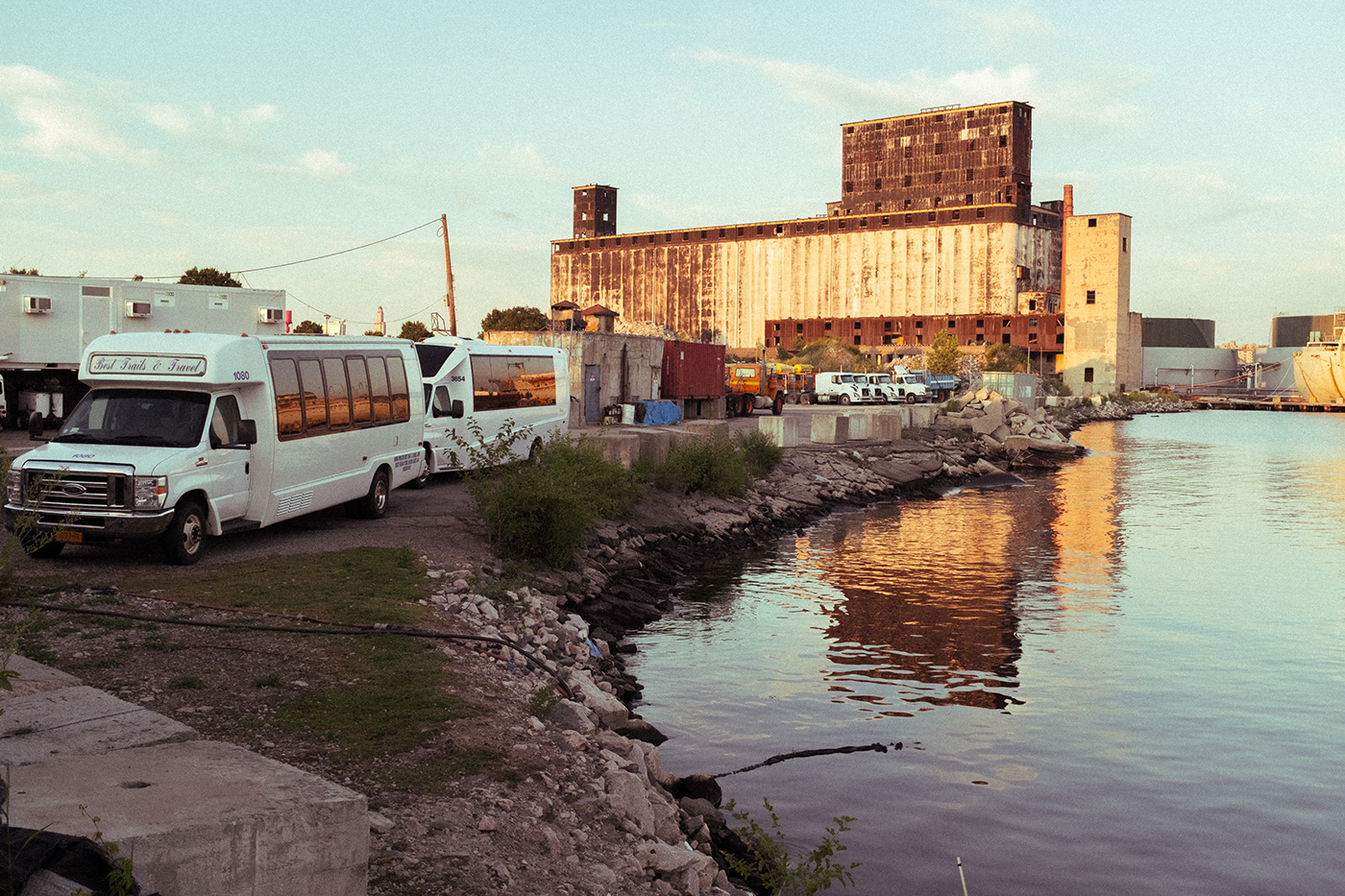
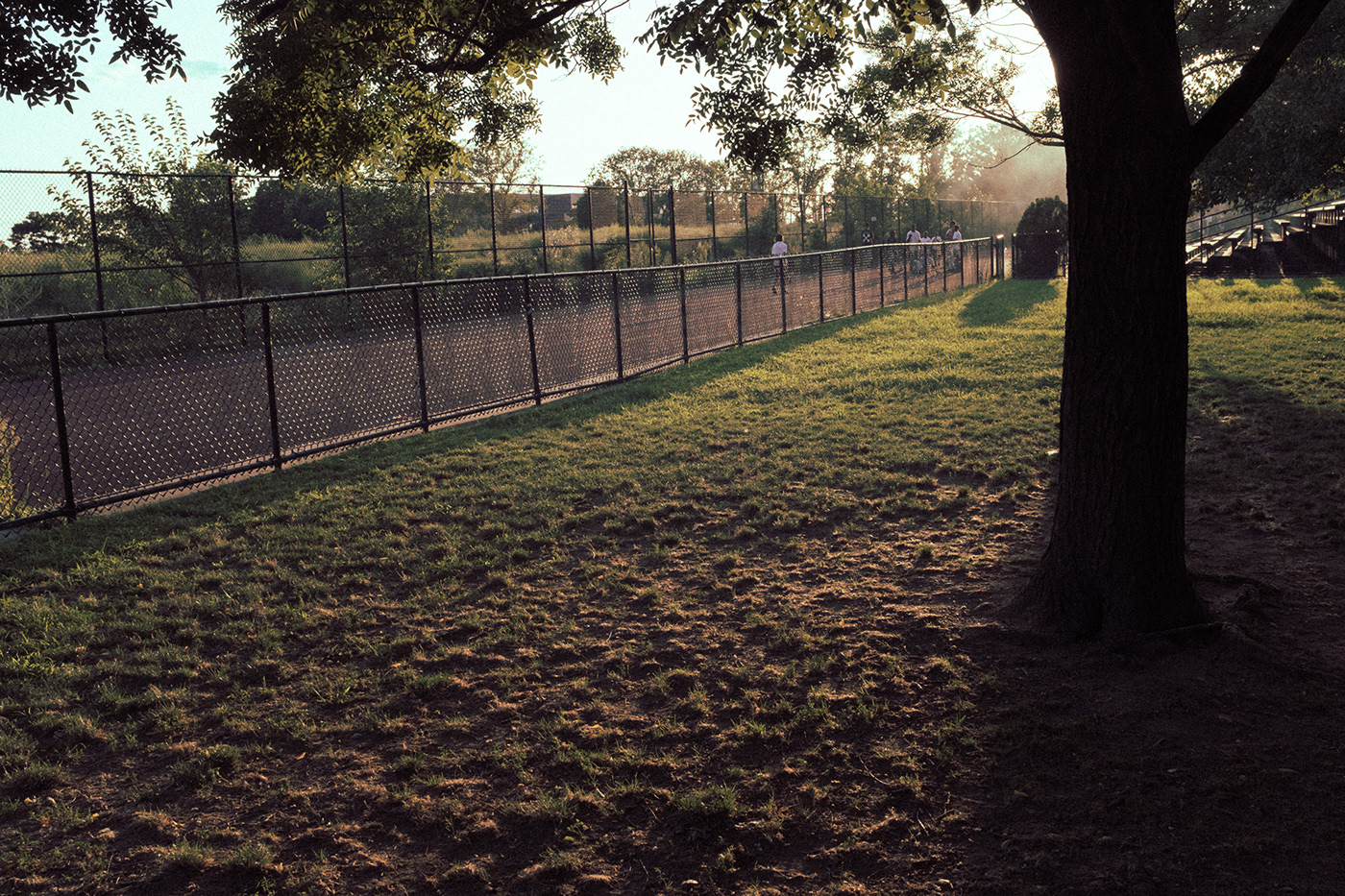
Kodak Portra 400 - scanned with default settings - auto white balance
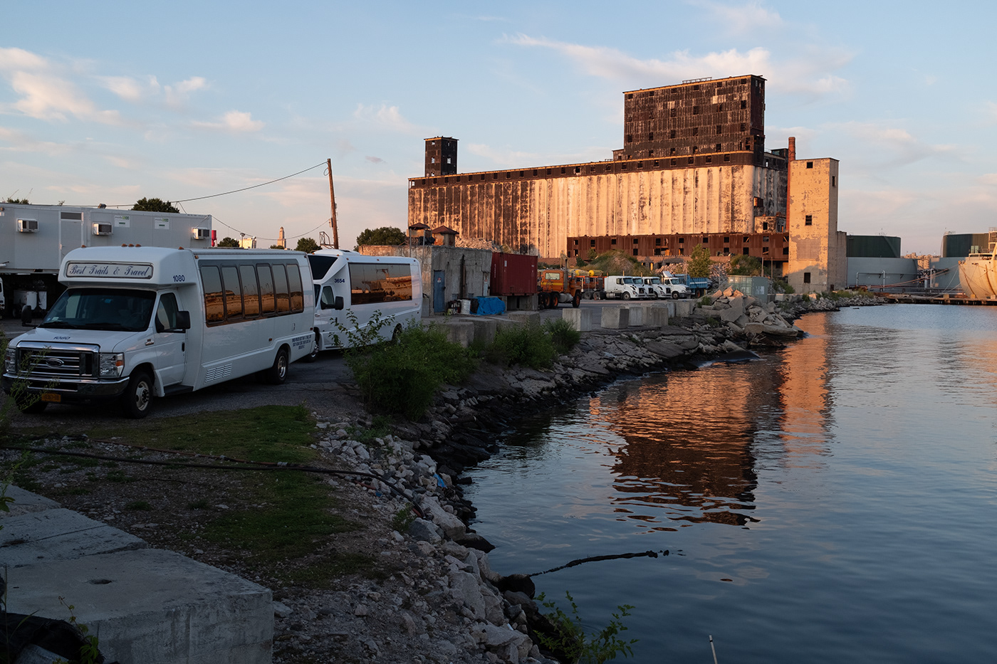
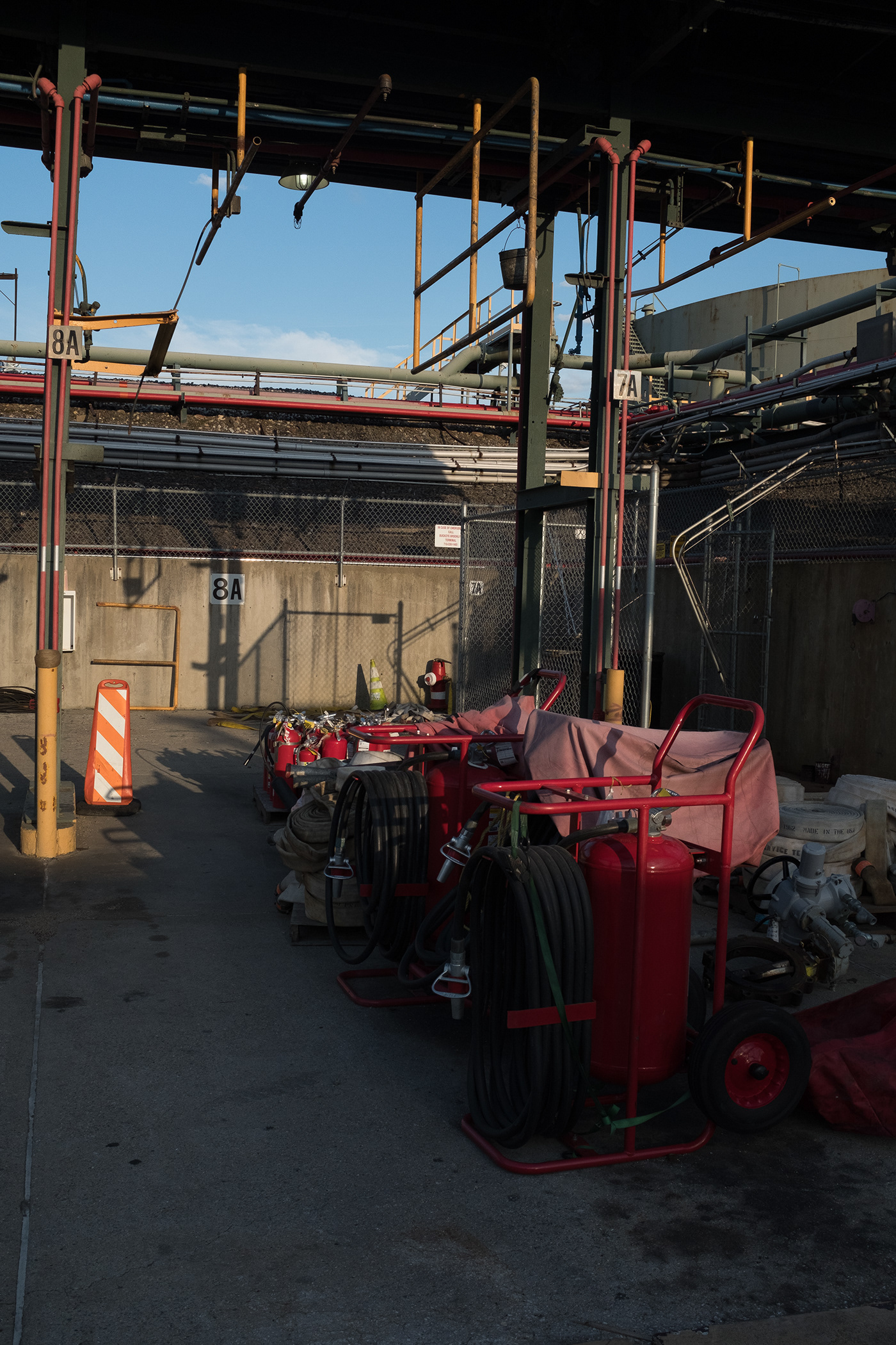
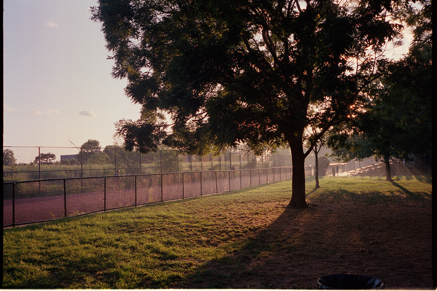
fuji x100f - default Lightroom settings

fuji x100f - fuji pro neg hi camera profile in Lightroom (same settings as pro neg hi film look with in-camera jpg files)
exposure: +0.80
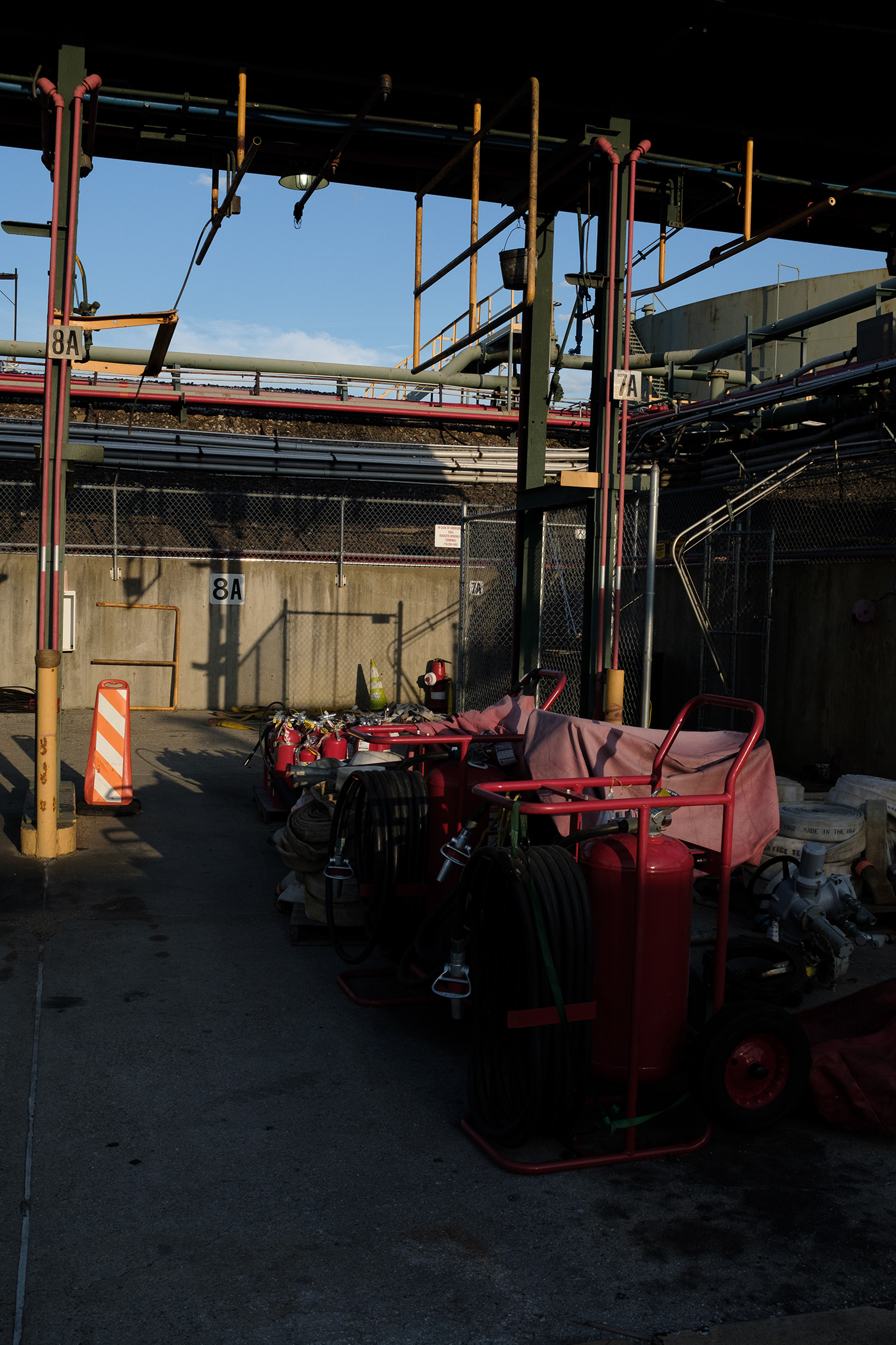
fuji x100f - Adobe Standard profile in Lightroom - curves modified to match portra 400 film scan

the original film scan again (for reference) - you can hit the forward and back arrows to see how close I got to the film color profile
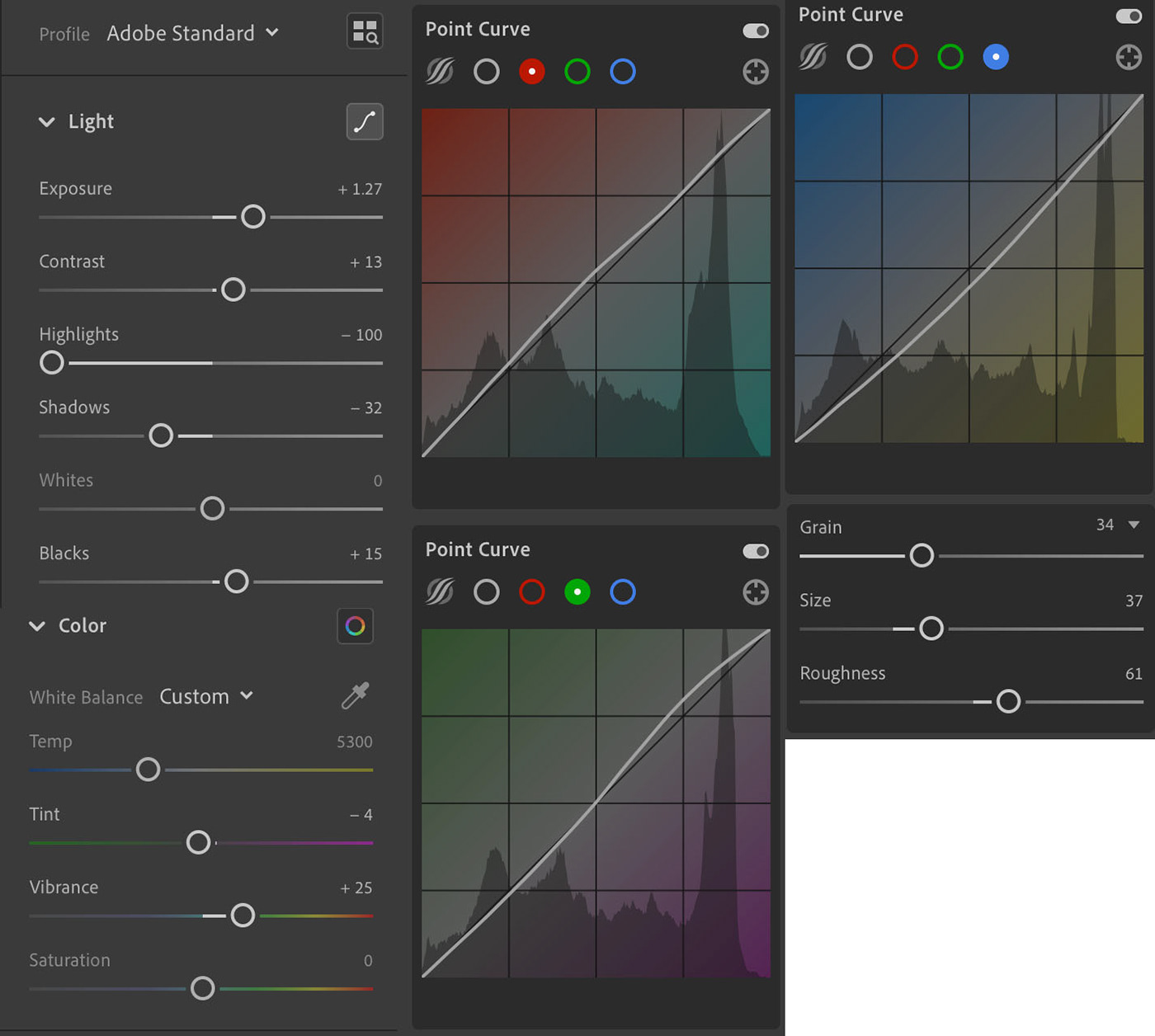
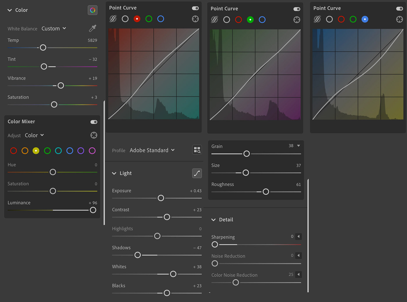
Fuji x100f - Lightroom settings for adjusted final image (abandoned factory)
Kodak Portra 400 - scanned with default settings - auto white balance
fuji x100f - default Lightroom settings
fuji x100f - fuji pro neg hi camera profile in Lightroom (same settings as pro neg hi film look with in-camera jpg files)

fuji x100f - Adobe Standard profile in Lightroom - curves modified to match portra 400 film scan

the original film scan again (for reference) - you can hit the forward and back arrows to see how close I got to the film color profile
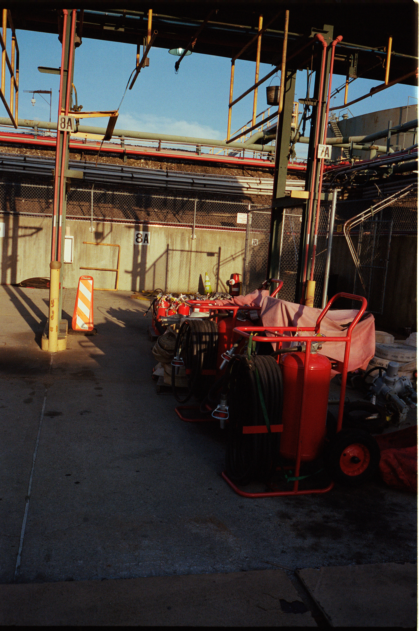
Fuji x100f - Lightroom settings for adjusted final image (red cannisters)
I couldn't quite get the reds to look right without throwing all of the other colors in the image off. This could probably be done, but I'm not quite sure how to do it yet. That said, I'd be very happy if the above image came out of the camera looking that way or if I could simply apply a preset to get that look... but again, even using the settings from the last image as a starting point, I spend another 30-45 minutes trying to get it just right and didn't quite get there with this image.

Kodak Portra 400 - scanned with default settings - auto white balance
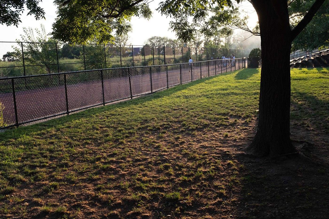
fuji x100f - Adobe Color profile in Lightroom
Adobe Color is one of the better presets that ships with Lightroom, but the greens in the grass are way over-the-top for my taste. The grass looks like it's glowing and the blacks are so black that it creates the effect of a black and white photo that has been colorized.
fuji x100f - Adobe Standard profile in Lightroom - curves modified to match portra 400 film scan
Here, I was able to use the preset I saved from the Expressway settings and I was most of the way there. Maybe about 5 minutes tweaking the blacks and colors.
the original film scan again (for reference) - you can hit the forward and back arrows to see how close I got to the film color profile

Kodak Portra 400 - scanned with default settings - auto white balance

fuji x100f - Adobe Color profile in Lightroom

fuji x100f - Adobe Standard profile in Lightroom - curves modified to match portra 400 film scan
Actually, it looks like I made a highlights a little too red (I was starting from the same settings as the other photos). Other than that, it's pretty close though.

the original film scan again (for reference)


