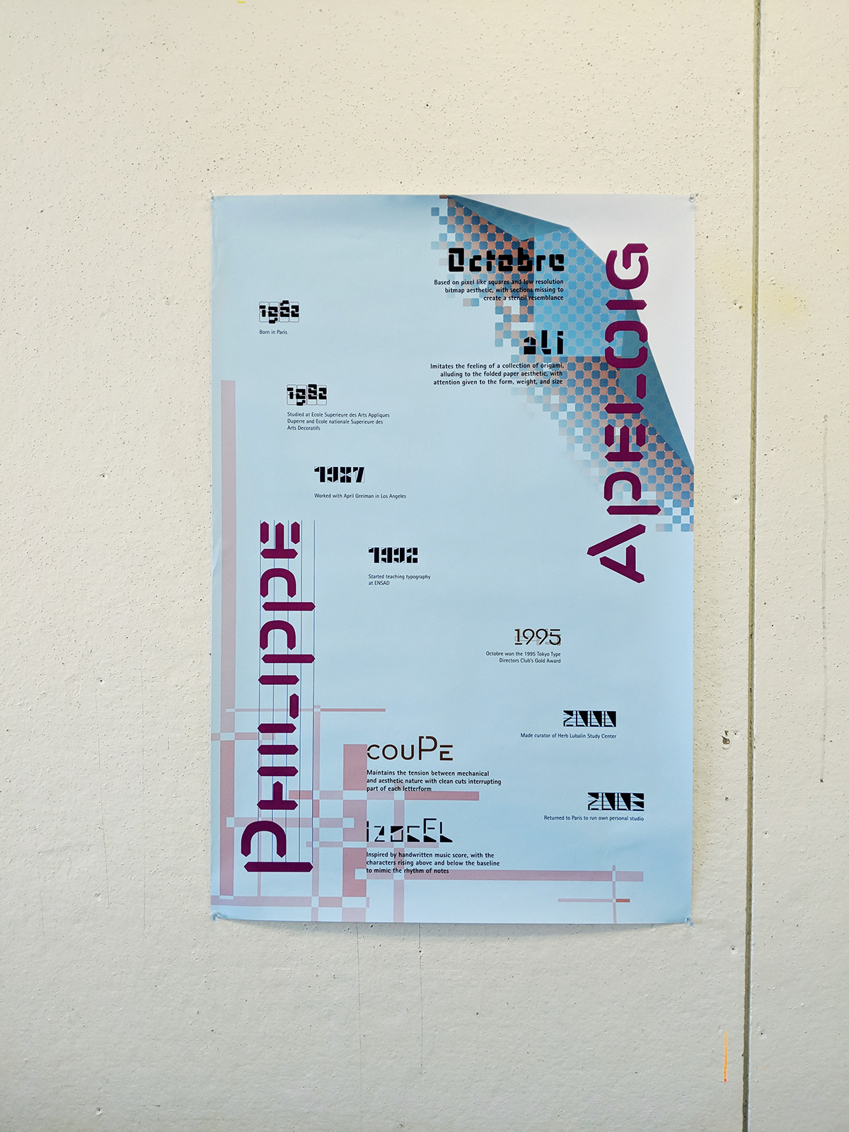
Philippe Apeloig is a typographer known for his creative typefaces that ride the line of being illegible. Each typeface has a story, an idea behind its form and appearance.
I strived to communicate his ideas through the design of these postcards. Each postcard is dedicated to a typeface, its design inspired by the Apeloig's inspiration for his own typeface. With Coupé, tension between mechanical and aesthetic; Izocel, the rhythmic nature of notes; Octobre, the low resolution, bitmap aesthetic; and finally Ali, the folding paper aesthetic of origami.
In the poster, I wanted to bring together all of the four typefaces into one complete unit, including the design of their inspiration. By leaving Philippe Apeloig's name in Abf Linéaire, one of Apeloig's more legible typefaces, and following a grid system, the four disparate designs from each postcard can be united into one complete poster.