Scala Poster
Typography 2. Lucy Hitchcock
Spring 2013
Spring 2013
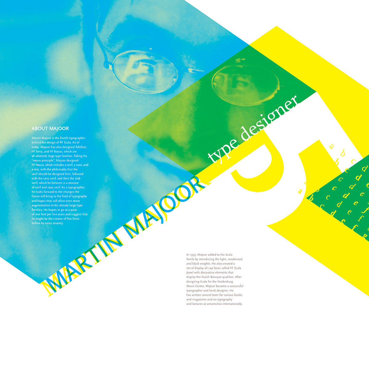
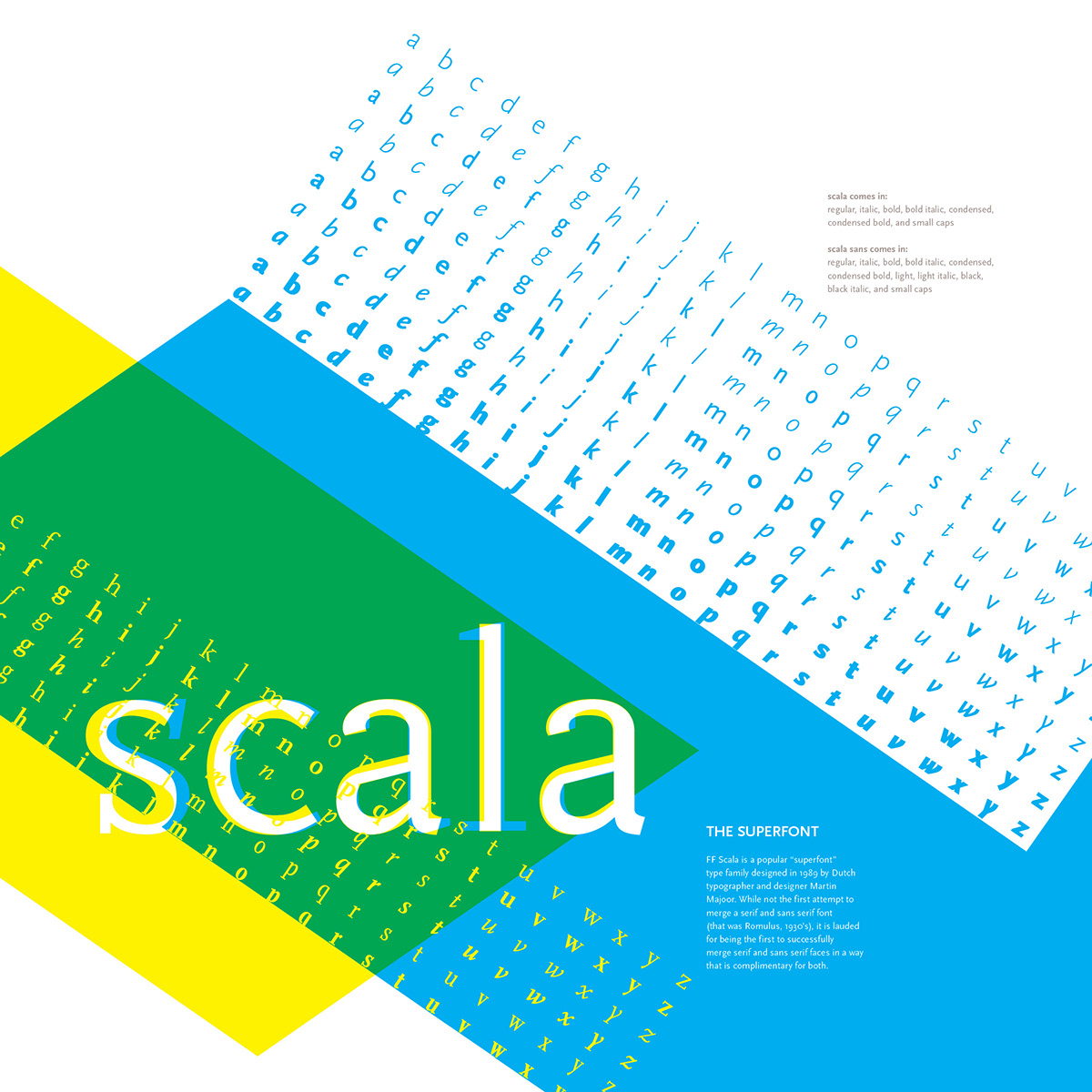
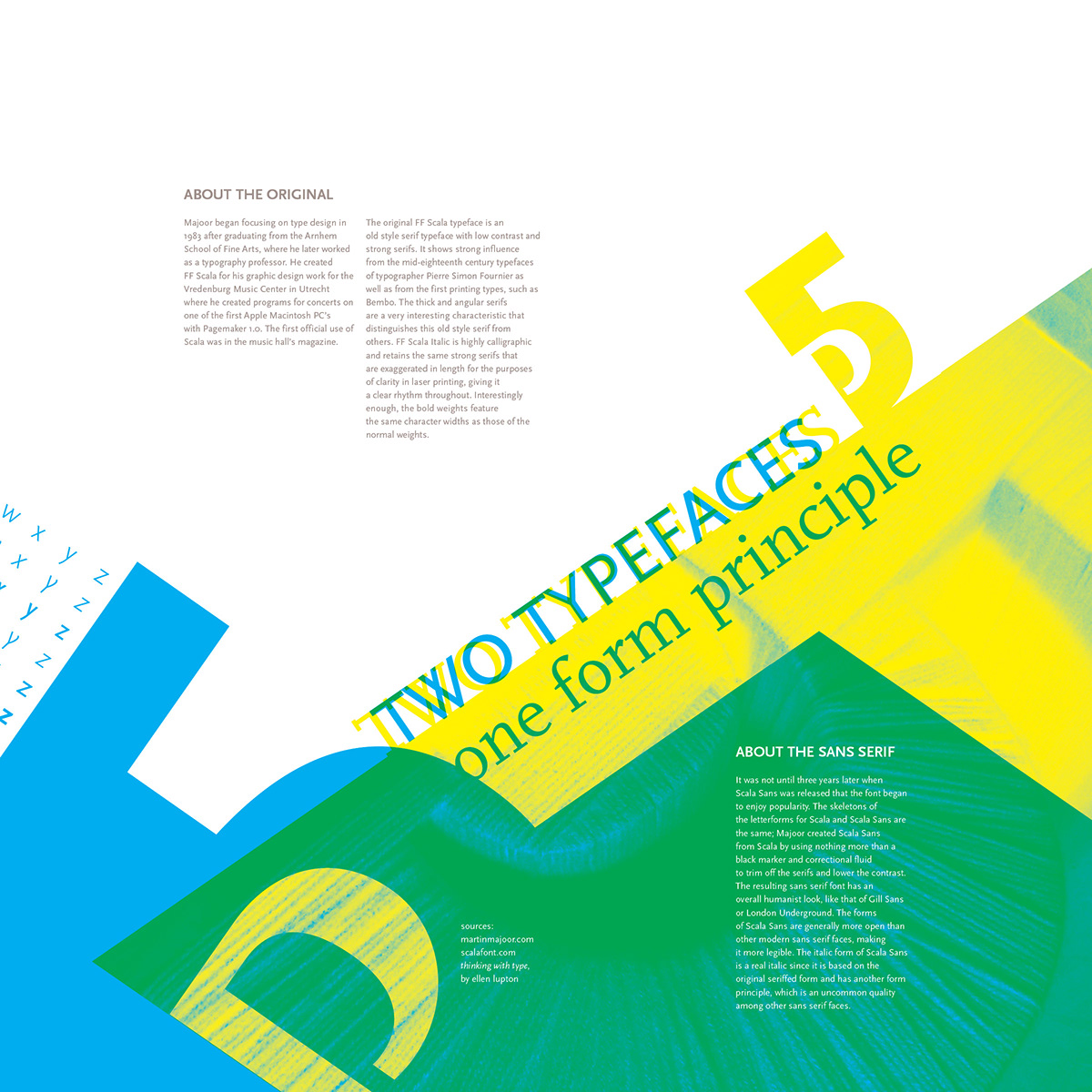
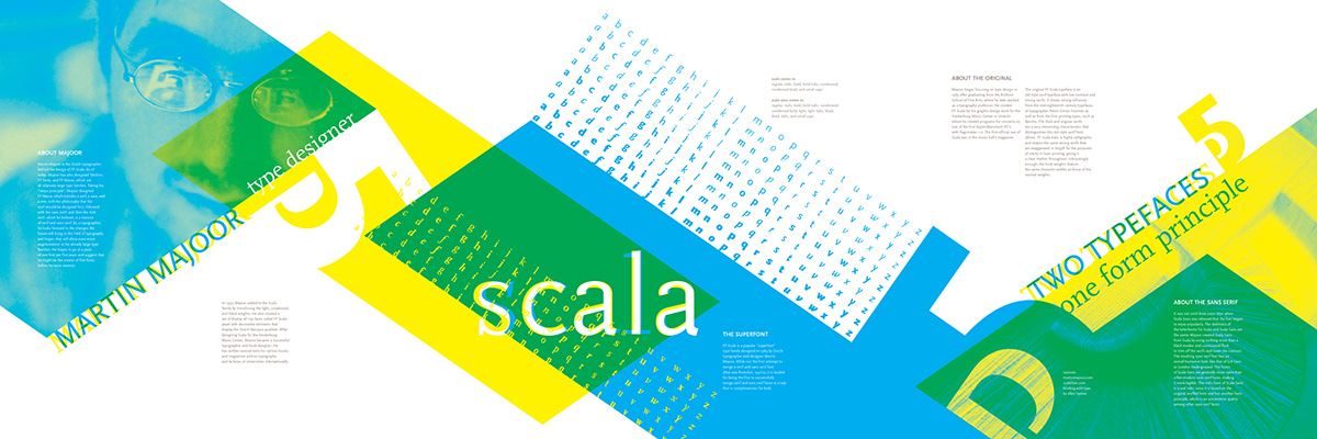
This exercise is the first part of a four part project dealing with detailed exploration of typographic characters and positive/negative space. The project called for the design of three 16x16 posters, the incorporation of a two dimensional lettermark made earlier in the semester, and the incorporation of a photo of a three dimensional version of that lettermark. I tried to illustrate the two sides of Scala (sans serif and serif) through the use of transparency and two simple process colors.