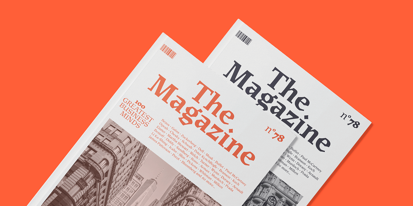
Sudtipos is very happy to announce the release of the Mexica, part of a serie of fonts designed by the master calligrapher, designer and illustrator Gabriel Martínez Meave from México.
—
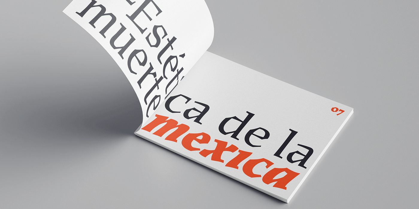
About Mexica.
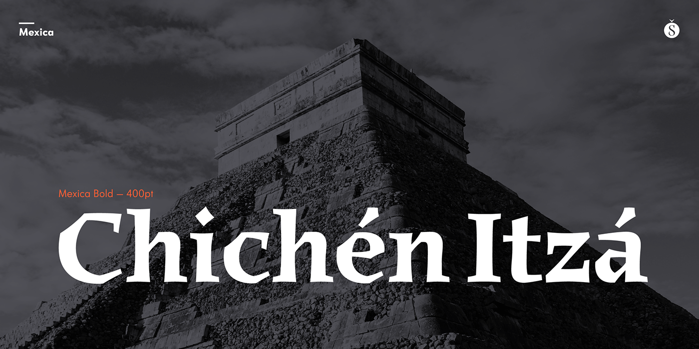
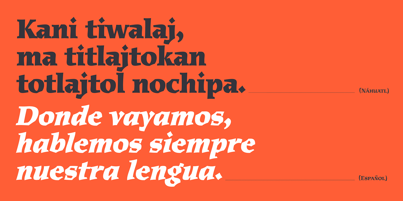
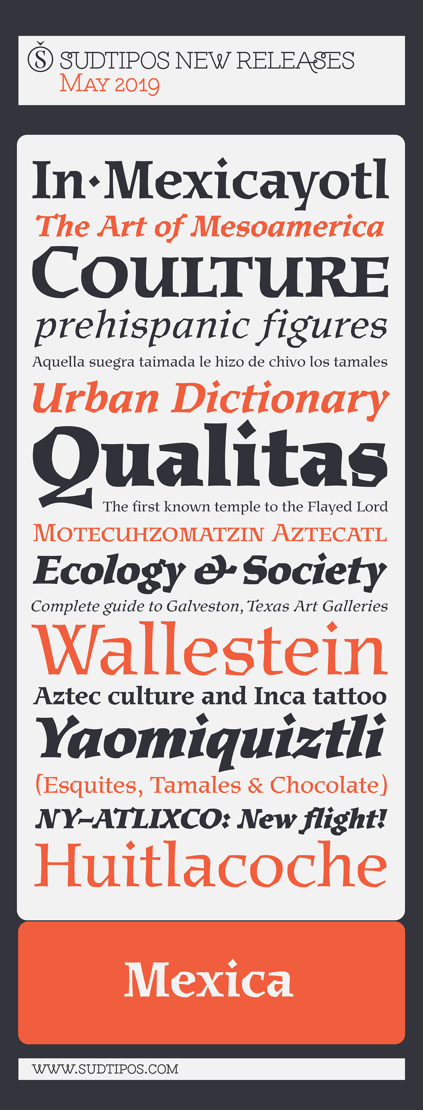
Mexica is a typographic tribute to Nahuatl, the tongue of the Toltecs and Aztecs, and the lingua franca of ancient Mexico. ‘Mexica’ is the latinized, feminine form of the word ‘Mexico’, and also the name of the inhabitants of this place: the Me-xic-cah.
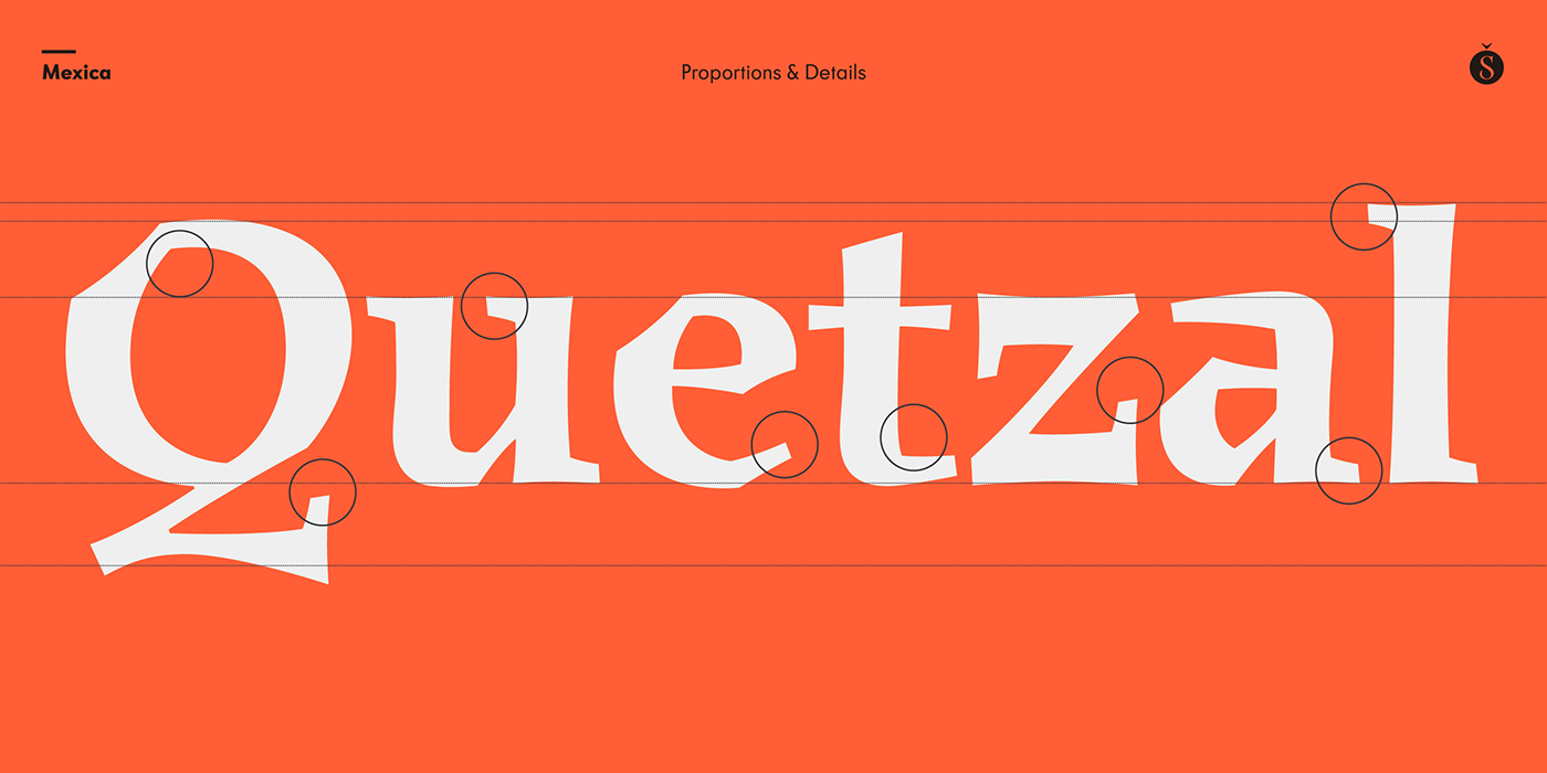
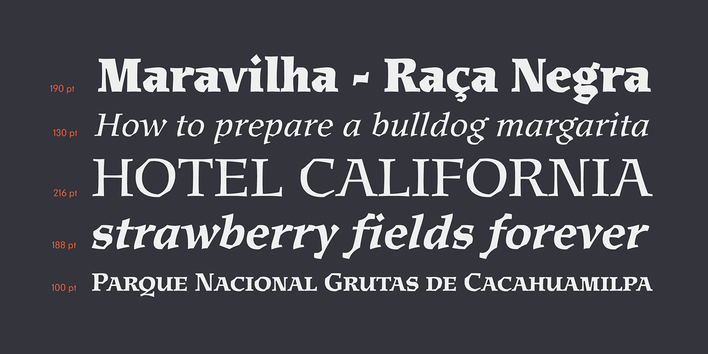
Nahuatl, when composed in the Roman alphabet, abounds in diagonal letter shapes: XYZ are ubiquitous in its classic orthography, just as KW are in its modern one. This angular, visual feature is increased by the absence of rounded letters like BDG that depict inexistent sounds in this millenarian tongue. Besides, Nahuatl is a polysynthetic language with a tendency to form very long words, giving the text a quite distinct appearance, unlike English, for instance, with its profusion of short words.
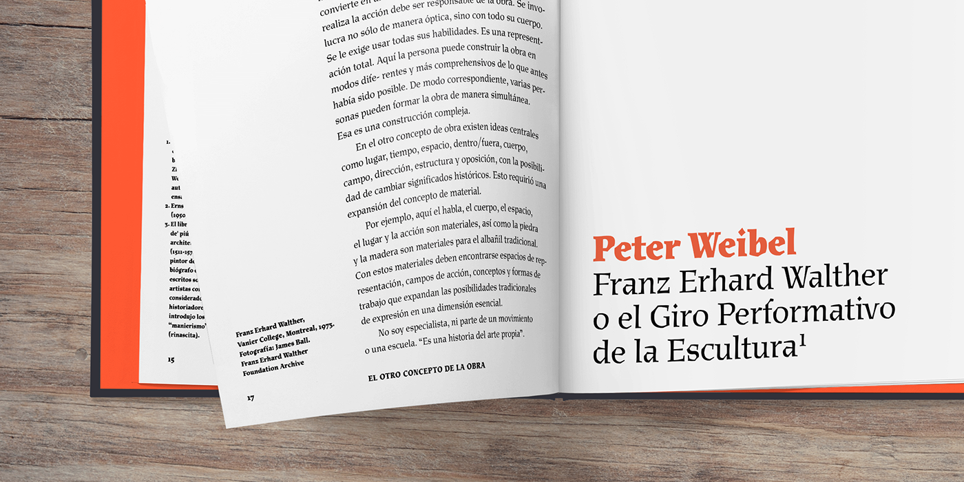
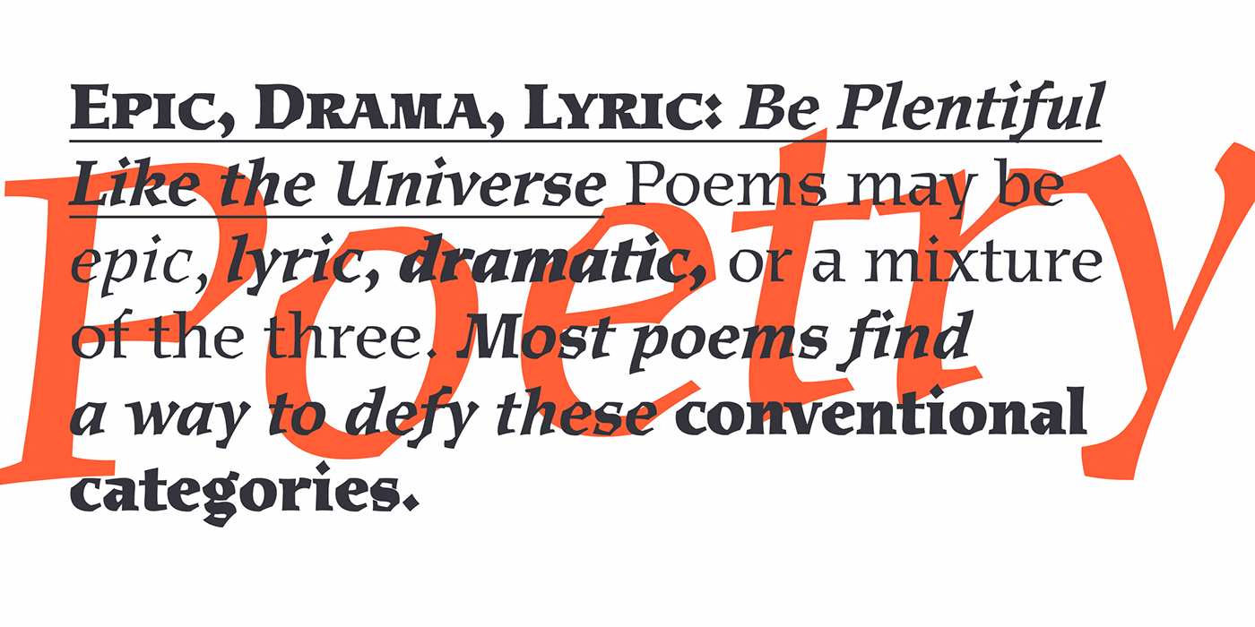
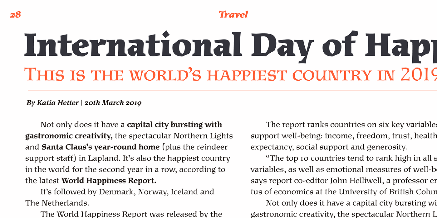
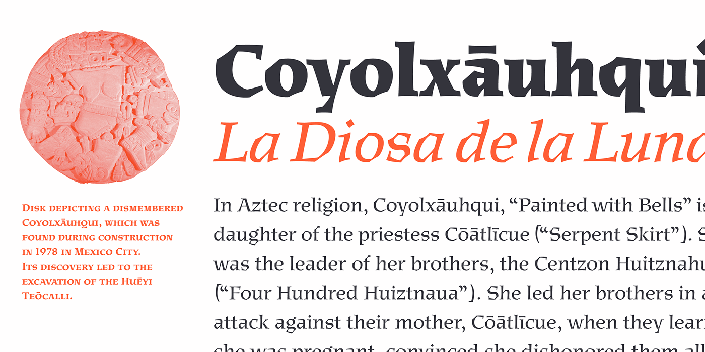
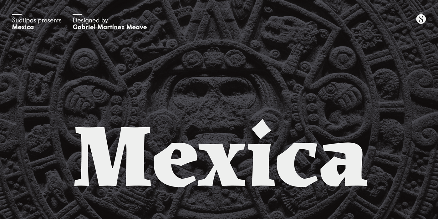
Mexica was designed to work and look fine in these local and global contexts, and to perform as well as a contemporary, daring, stylish serif type family, with several weights for text and display composition. Its structure and terminals —devoid almost completely of straight lines—are inspired by the art and architecture of ancient cities like Teotihuacan, Xochicalco and Tenochtitlan.
Available at Sudtipos.