
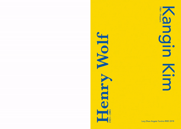
An accordion book that compares the work of two graphic designers, one historical one modern. Graphic design over the times has changed greatly, with the rise of technology and the internet. Henry Wolf and Kangin Kim both work in similar realms of company identity, with Wolf's focus on magazine covers and Kim's focus posters, postcards, and other types of branding. Aside from that, there aren't any other similarities between their works.
Wolf once said in an interview that he despised how the rise of technology has caused graphic designers to try to fit as much information in their design as possible, as he preferred a more simple, easy to understand approach to design. His work used many serif typefaces and was kept fairly simple. Yet, his designs were still very engaging, containing hidden gems that his audience would look forward to finding each issue.
Kim's work is more along the lines of busy, colorful, details, but in no way inferior to Wolf's work. Although his work encompasses many elements, the information still comes across in a clear way. His work comprises of mainly san serifs, something that fits very well with the Korean alphabet that is present in his work.
Through my own design, I worked their two styles together, having it clean and clear without compromising any information present on the page. Wolf's work is all in Baskerville while Kim's is in Avenir. Although many of the pages are packed with information, there are some sparse ones similar to Wolf's style that allow for some breathing room in a design packed full of information.


