


В данном логотипе я решил отразить как сочетание заглавных букв названия (UT), так и завуалировать мысль компании. Студия занимается по большей степени перманентным макияжем, а значит коррекцией той или иной части лица. И данное я отразил в ровной линии над буквой U. Цвет линии (фиолетовый) отражает роскошь, статус самой компании и её клиентов. Работая над данным проектом я сразу решил для себя, что хочу здесь создать некую игру...игру слов. И она получилась. В логотипе в первую очередь видим букву U, то есть сокращение от YOU и лишь потом видим букву T в негативном пространстве. И в фирменном стиле я отразил это в игре слов. На визитке U can call me , на входной двери в студию U can enter, а на различных рекламных плакатах вариации могут быть различны до бесконечности: U make me beautifu, U give me happy и прочее, на сколько позволяет фантазия. В данных текстах вместо буквы U вставляется сам логотип и фразы при этом обретают двойной смысл. Вот такая игра. Данный ход привлекает внимание клиентов и прививает их лояльность компании.
_______________________________________________________________________
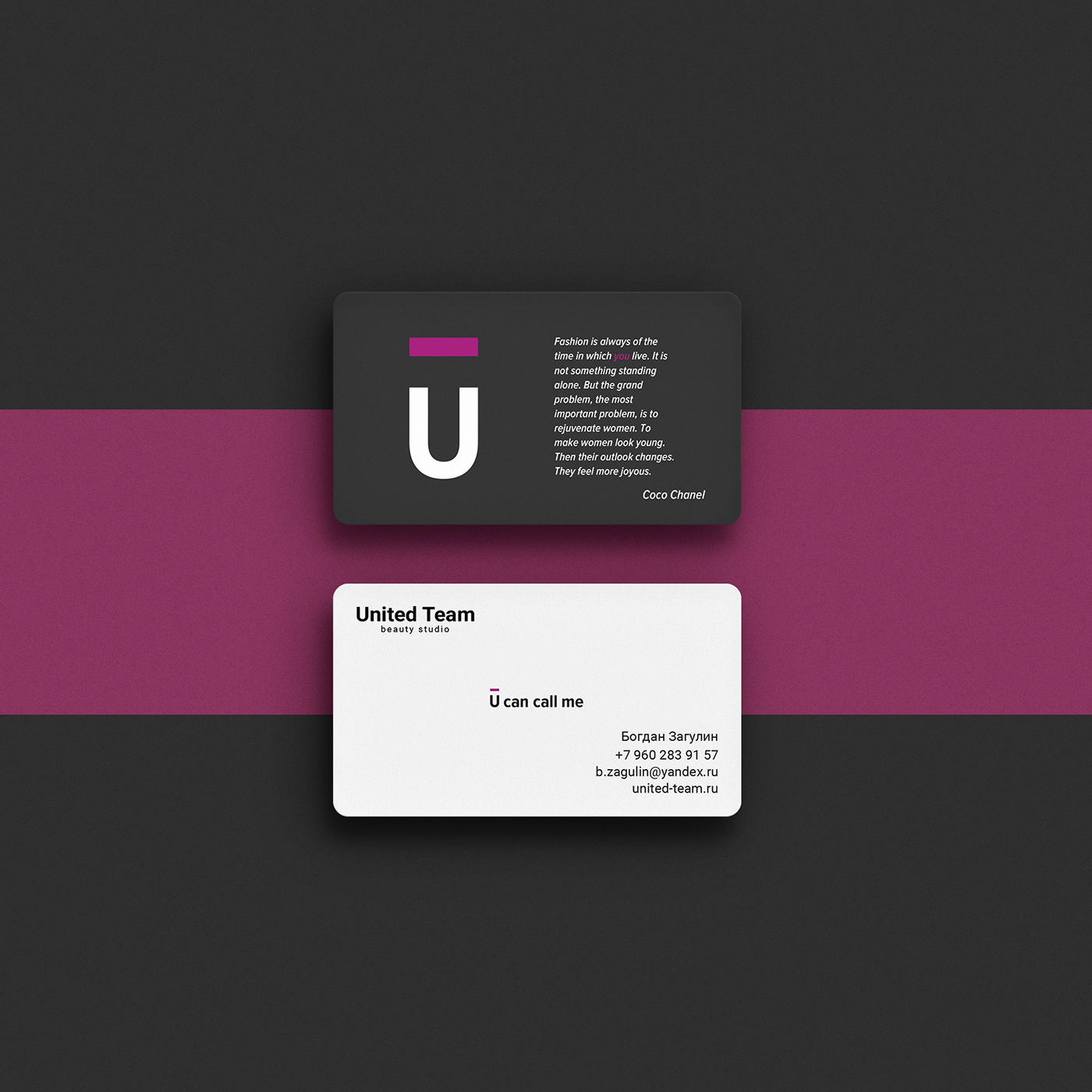
In this logo I decided to show the combination of capital letters of the name (UT) and display the main idea of the company. The Studio is mainly engaged in permanent makeup, which means correction of one or another part of the face. And I reflected that in a flat line above the letter U. The color of the line (purple) shows the luxury, the status of the company and its customers. Working on this project, I immediately decided for myself that I want to create a wordplay here. And it worked. In the logo, first of all we can see the letter U, that is, the abbreviation for YOU, and only then we see the letter T in the negative space. And in the corporate style I captured it in a wordplay. On the business card “U can call me”, on the front door to the Studio “U can enter”, and on various advertising posters variations can be endless: “U make me beautiful”, “U give me happy”, etc., as far as imagination allows. In these texts, instead of the letter U, the logo itself is inserted and the phrases take on a double meaning. Here's the game. This move attracts the attention of customers and instills their loyalty to the company.
Subscribe to me:


