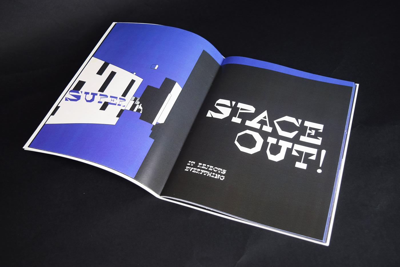
With the knowledge of the typeface and posters/compositions that I have created, I made a type specimen book that is letter-sized. It is 45 pages. I combined editorial design of my article and an article about virtual reality and typography. The use of colour and the design of my book are based on the characteristics of my typeface. It is such a rebellious font that it seems really violent. It is unconventional, aggressive, and angular. Because of the sharpness of its form, it is chaotic. However, the geometric nature of the letters can create a sense of order. It plays around with space. It is named Space Out because ‘out’ implies pushing the space, which fit the feature of its aggressiveness. The most intriguing part of this font is that it creates and interesting relationship between letters and space. The book specimen showcases different compositions of the virtual reality and aimed to let the reader actually go into the space of my typeface.


A walkthrough video in SketchUp using the first model:


