

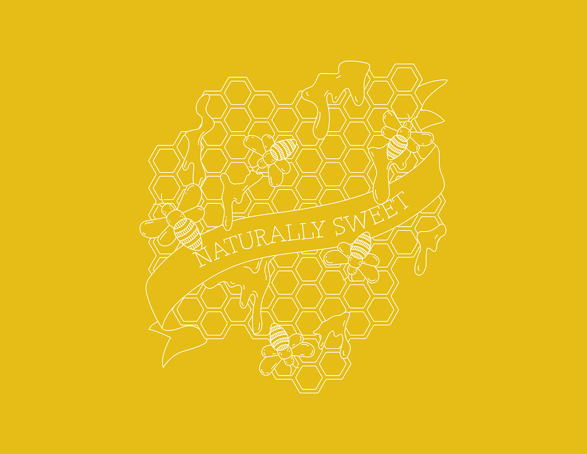
Whenever my family goes out to breakfast together, we all order coffee. My brother and dad take it black, but my mom and I put a lot of sugar in ours. It has since become a joke that we are the "sweetest" in our family, so I wanted to make an award that played off this idea. I decided to focus on the "sweet" aspect rather than the whole coffee idea and I knew that I wanted to do an abnormally shaped award, so I spent time mind-mapping and came up with the idea of honeycombs.


While planning the award, I decided to have all of the lines be a similar stroke weight and chose a font based on the same idea. I chose the font Grandma because I felt like it would compliment the banner since it could be seen a nature-affiliated, classic font. I knew that I wanted to do laser cutting because I knew that I could get a nice shine to the surface to emulate the shine of honey.


When we were expanding the medal by adding texture, I chose to photograph honey and play off the tonal shifts caused by the sheen and pour of it. I lightly put the texture over the file because I didn't want the entire piece to be overwhelmed by the shifting values. I also chose to create a mock up on the side of a building as if it was a mural because this award is meant to make someone happier by complimenting them, and by making it a mural, it would be seen by many people.


