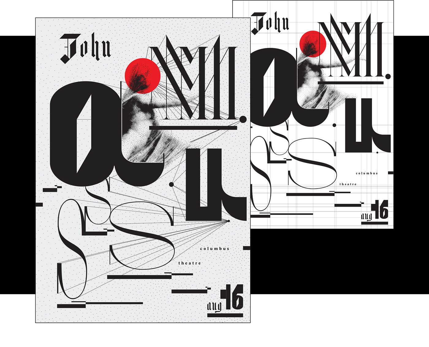
(left) infrastructure demonstrating intentional harmony and contrast, (right) 90 × 128 cm weltformat poster for John Maus’s Providence performance
The work I designed for John Maus’s Providence, concert responds to Maus’s simultaneous expressions of Medieval ecclesiastical-modes (formulas of melodic, rhythmic, early Christian chanting) and what Maus calls ‘today’s vernacular,’ contemporary Pop. Interested in this contrast of sound and history, I formally explored concepts of melody, harmony, sound projection, lightness and darkness.
This Project was a Collaborative Effort
DESIGN, DIRECTION, & TYPE DESIGN: Nick Adam | PERFORMANCE: John Maus, Columbus Theatre
WELTFORMAT POSTER PRINTING: RISD Graphic Design MFA Studio HP Wide-Format Plotters
HARK is a modular, blackletter, lowercase, stencil, typeface designed as the secondary typeface.
DESIGN, DIRECTION, & TYPE DESIGN: Nick Adam | PERFORMANCE: John Maus, Columbus Theatre
WELTFORMAT POSTER PRINTING: RISD Graphic Design MFA Studio HP Wide-Format Plotters
HARK is a modular, blackletter, lowercase, stencil, typeface designed as the secondary typeface.
a custom Processing.JS script was written to create a stippled-like vector edition of Virtue & Co.’s 1863 engraving “The Sleep of Sorrow and the Dream of Joy”
Classically trained musician, political theory PHD, experimental pop star John Maus was headed to Providence to perform at the Columbus Theatre. Historically most of Maus’s videos and designed ephemeral come from his fans, so I sent an e-mail to his agent and this became my opportunity to design a system embracing the complexity of Maus.
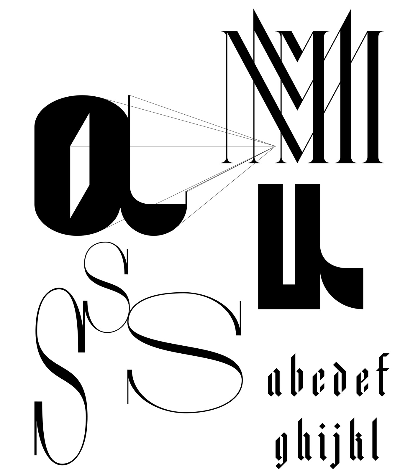
the letter ‘M’ was designed with exaggerated letter drama setting in a manner related to medieval typographic devices this relates harmonic polyphony of Maus’s music
Typographic inspiration came from Medieval heraldic devices, Gutenberg’s blackletter, and high-contrast Didone typefaces often described as capable of portraying beauty. From the large, stylishly different display letters to the typeface made for secondary text, all forms where designed using divisible units. This allowed for a systematic composition that projects harmony.
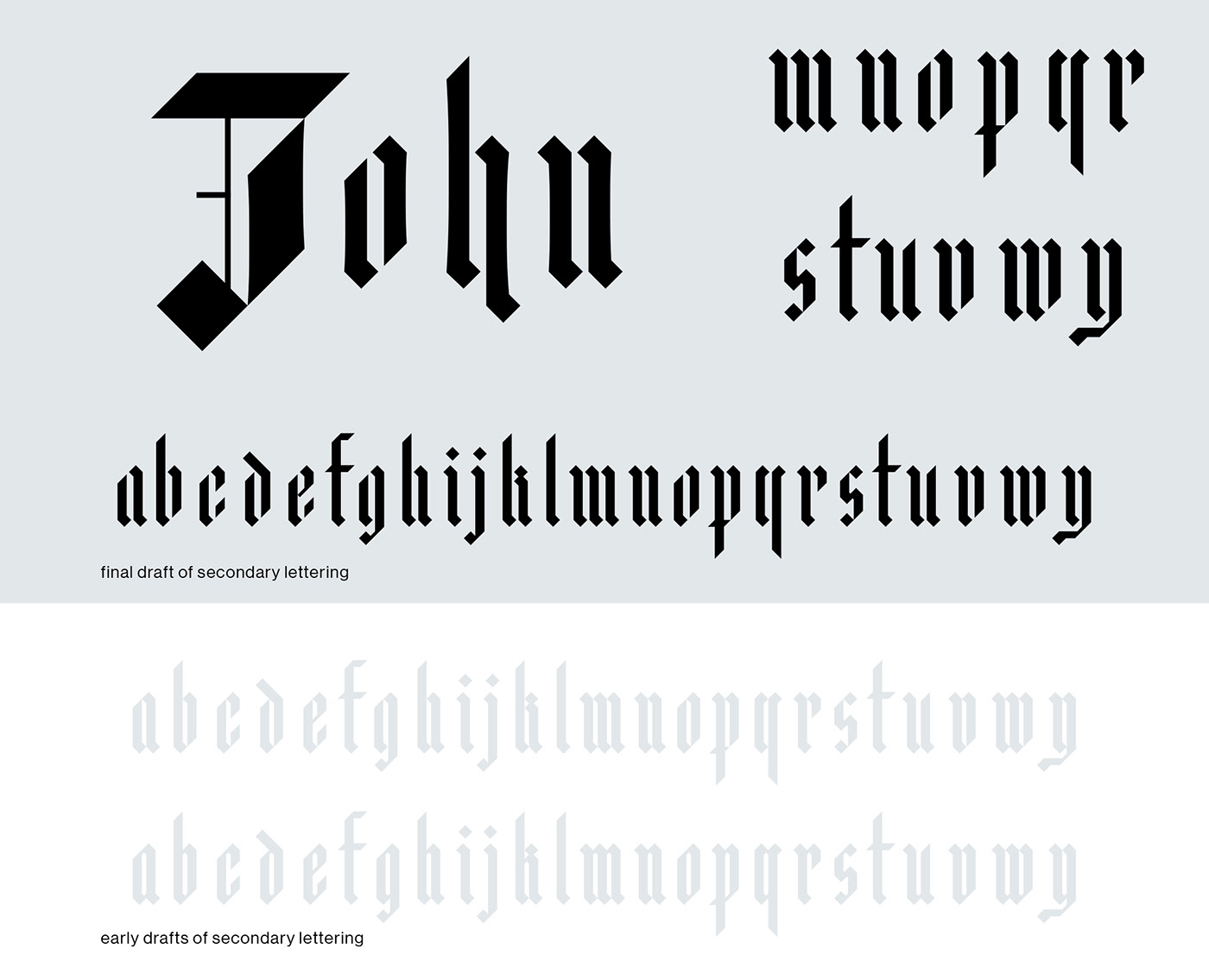
nodding to Maus’s centuries of musical fusion an Albert Durer/Gutenberg-like blackletter alphabet was drawn in a contemporary manner
the final version (shown in black) used a subtle, glyphic-like swelling and stencil structure that allowed greater counter-space, increasing the light and dark contrast.
the final version (shown in black) used a subtle, glyphic-like swelling and stencil structure that allowed greater counter-space, increasing the light and dark contrast.
the weight and placement of each line, letter, and element have integral relationships emphasizing harmonic musicality
Credits
DESIGN, DIRECTION, & TYPE DESIGN: Nick Adam | PERFORMANCE: John Maus, Columbus Theatre
WELTFORMAT POSTER PRINTING: RISD Graphic Design MFA Studio HP Wide-Format Plotters
HARK is a modular, blackletter, lowercase, stencil, typeface designed as the secondary typeface.
WELTFORMAT POSTER PRINTING: RISD Graphic Design MFA Studio HP Wide-Format Plotters
HARK is a modular, blackletter, lowercase, stencil, typeface designed as the secondary typeface.
Featured
GALLERY: Sol Koffler | EXHIBITION: Selections, Work by Graduating RISD MFA Students
GALLERY: Rhode Island Convention Center | EXHIBITION: 2018 RISD Graduate Exhibition