Pride of place is given to Stanley Donwood’s distinctive linocuts on a new packaging range for Up Front Brewing's core beers.
Highly-regarded independent brewer Jake Griffin is currently establishing his core range of beers under the Up Front label. Jake’s twin passions - for exceptional beer and design - have found expression through a collaboration with illustrator Stanley Donwood.


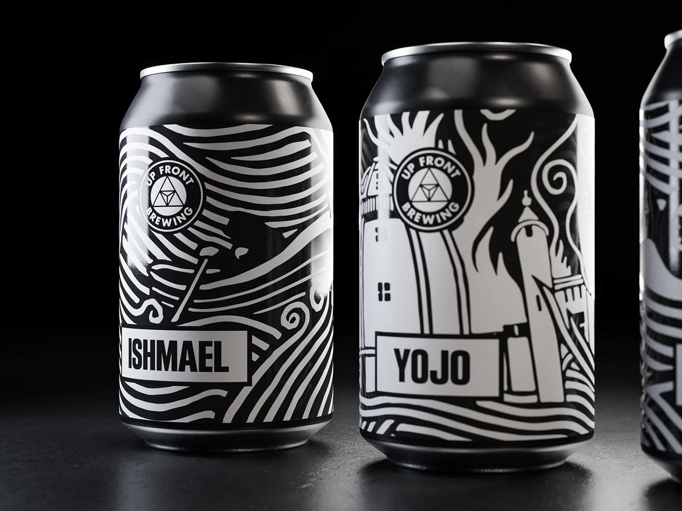

We created maximum real-estate for Donwood’s striking linocut prints, reserving a small clean area for mandatory information and using the rest of the can as the canvas. The high-contrast monochrome prints are perfectly suited for shelf standout. Injecting energy and reflecting the experimental nature of the product, they tie together the whole range through their distinctiveness.


The existing brand identity was refined to align with the signature illustrations (and vice versa). The beer names - taken from Moby Dick - are presented in Block Gothic Extra Condensed, a simple letterpress-inspired font which ties in visually with the linocuts.
We also wanted the monotone contrasts of the labelling to be complete. We worked with Up Front’s printers to select an appropriate production method, overprinting the labels with matte varnish for a high-contrast, pleasantly tactile finish.


Where to buy
—
Client: Up Front Brewing
Role: Design / Art-direction
Discipline: Packaging / Point-of-sale
Photography: Rob Mathews
Illustration: Stanley Donwood
3D visualisations / Animation: Render Studio
Role: Design / Art-direction
Discipline: Packaging / Point-of-sale
Photography: Rob Mathews
Illustration: Stanley Donwood
3D visualisations / Animation: Render Studio
—
For more information about this project visit our website www.freytaganderson.com
To discuss a new project or idea please contact our Project Director Sophie Brown.


