

Ala Longa Visual Identity
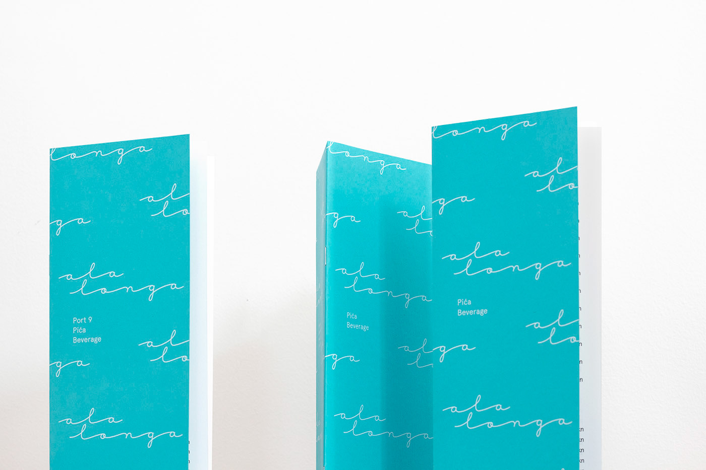
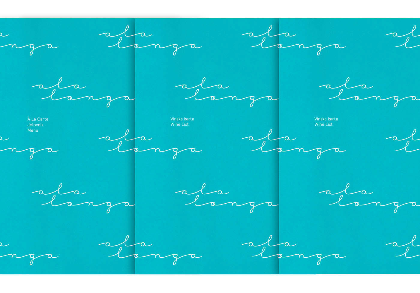
Ala Longa is the new à la carte restaurant located at the Port 9 resort, in Croatia's gorgeous Korčula island. We were invited to design their new visual identity and a bilingual menu system.
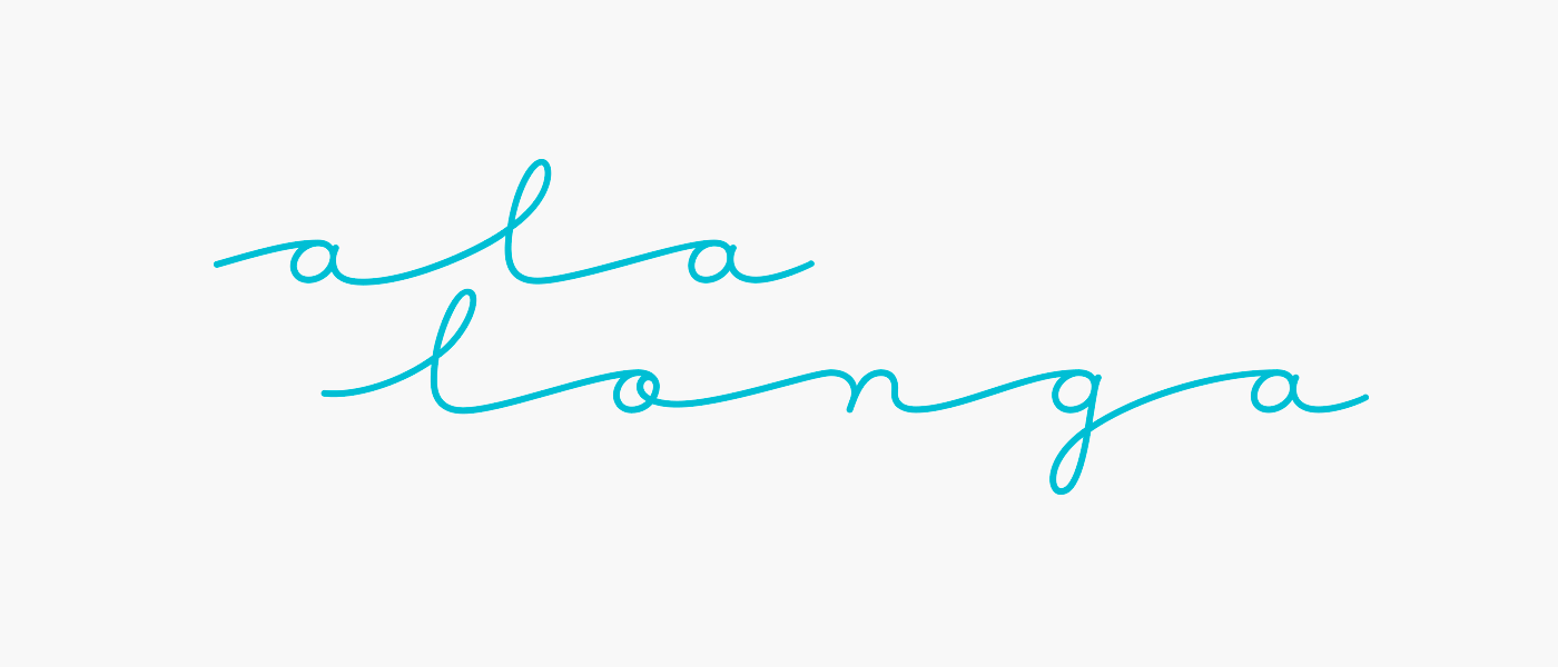
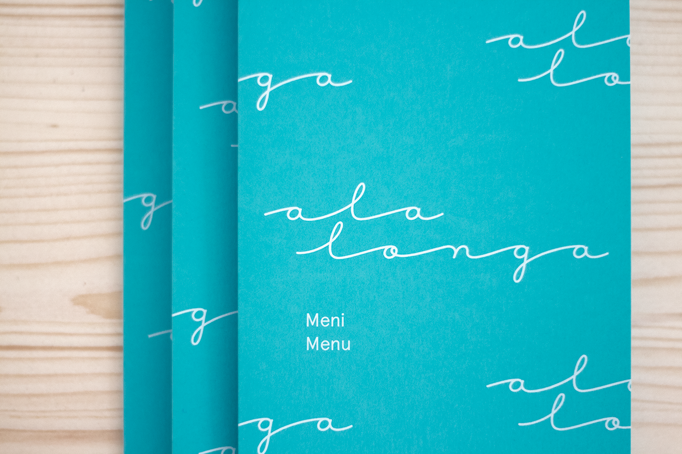
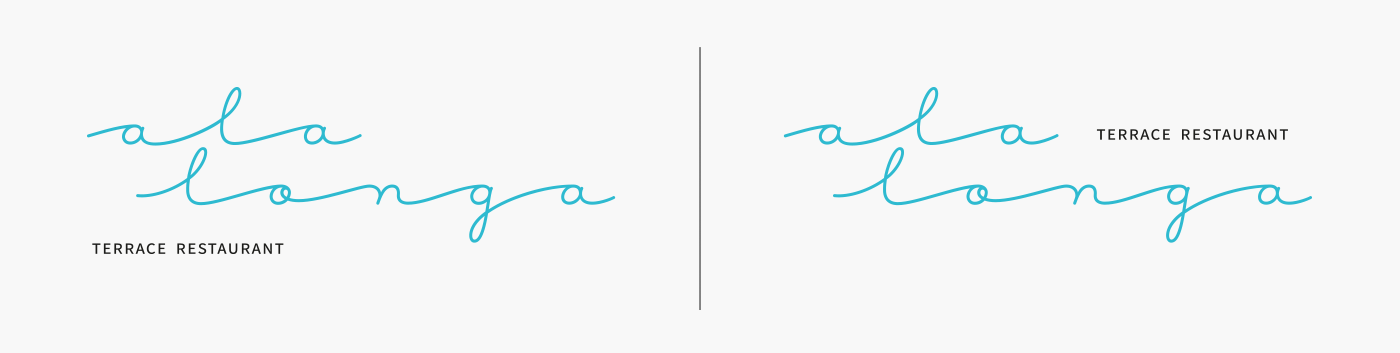
The idea for the logo draws inspiration from the restaurant's name - Ala Longa - meaning long and slow. Letters in the logotype are rhythmically elongated to look like sea waves, evoking feelings of relaxation and enjoyment. No need to rush anywhere, you're on a holiday.
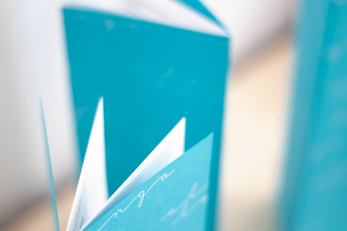
Memorable visual identity is easily established with a simple logotype pattern which brings out the feeling of sea waves with its repetetivneness. Menu covers are printed on a turquoise paper for an optimistic, summer, fresh look.
Client: HTP Korčula d.d.
Agency: Manasteriotti DS
Art Direction and Design: Igor Manasteriotti
Naming: Fabular
Interior Design and Architecture: Kaliterna Arhitektura
Printing: Cerovski Print Boutique
Lettering assistance: BAM studio
Interior photos courtesy of Port 9 Resort
Agency: Manasteriotti DS
Art Direction and Design: Igor Manasteriotti
Naming: Fabular
Interior Design and Architecture: Kaliterna Arhitektura
Printing: Cerovski Print Boutique
Lettering assistance: BAM studio
Interior photos courtesy of Port 9 Resort


THANK YOU
www.facebook.com/Manasteriotti
www.manasteriotti.com
www.facebook.com/Manasteriotti
www.manasteriotti.com


