


Rebranding Brazil's best dining experience.
ChefsClub is a matchmaker for great restaurants and foodies who enjoy experiencing new tastes for less money.
They needed a new visual identity to match their high standards as a restaurant guide and incredible customer service.
It took us a long time to find their brand promise: selecting valuable dining experiences at the tip of the knife.
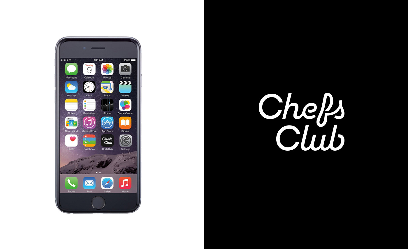
With that important piece in place, we created a personality and identity guideline consisting of high-quality, well contrasted typography, good use of the photography they had at hand, a limited color palette, a brand voice that is authentically theirs and a lettered logo with a secret sauce.
Like a good wine, we saw it grow from the time it left our hands and was made theirs by their incredible team of designers.
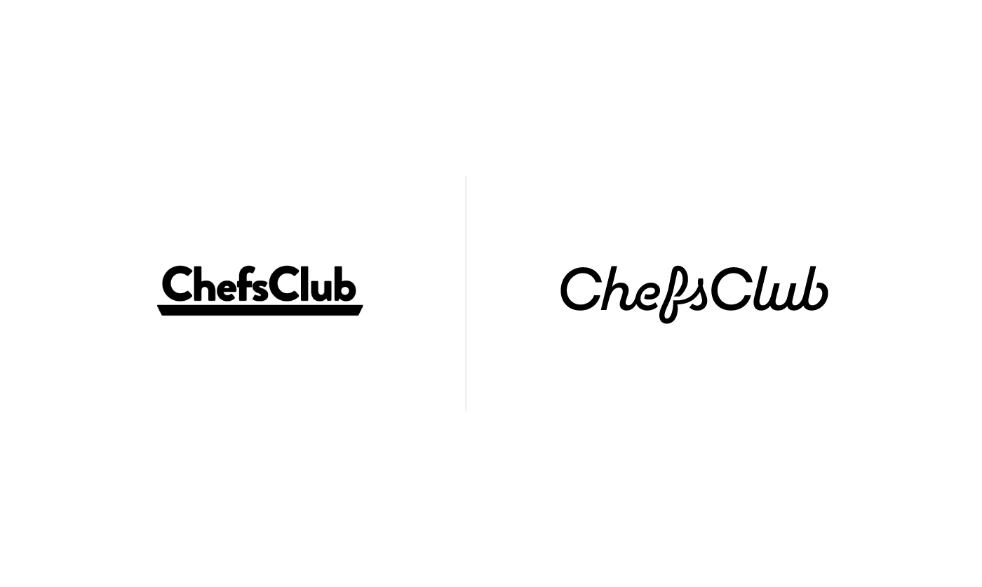
Top: Before and after.
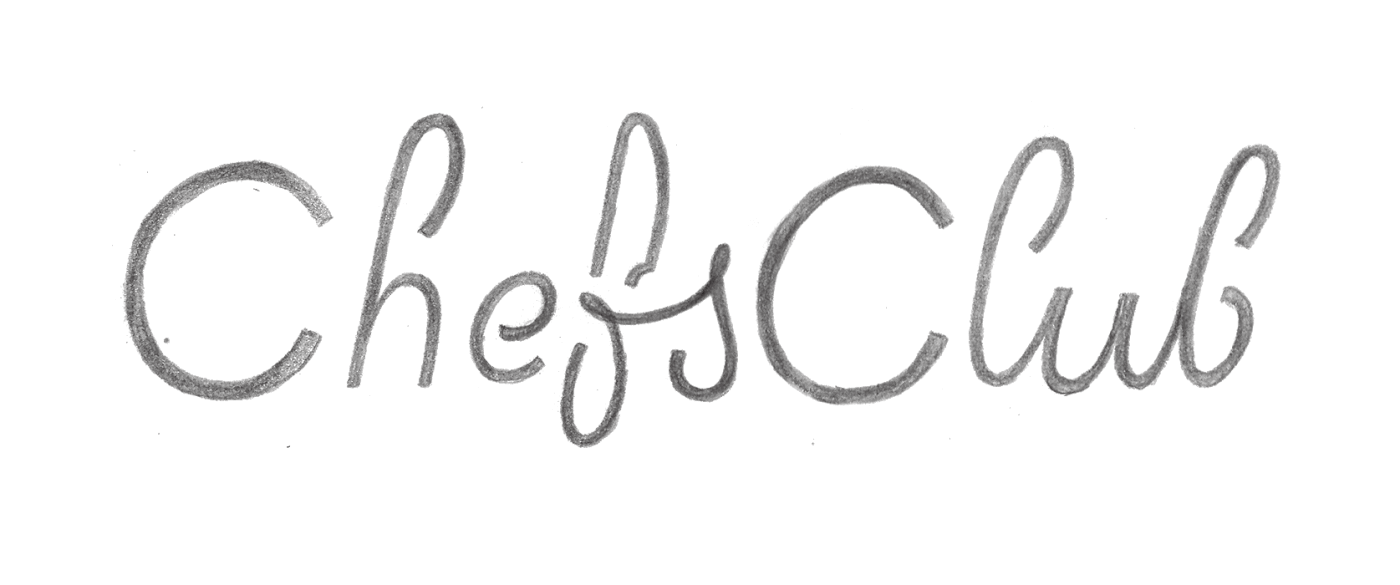
From sketch to finish. In the early rounds we were trying to make the two Cs look like plates and h, f and b like three pieces of cutlery, fork, knife and spoon.
Cheesy, we know. Also, it simply didn't work.

The editorial beauty and boldness of the seriffed typeface Berlingske contrasted with the geometric neutrality of Scandia.
Scandia also helps transition the brand to a more mature and high-end state, as it can look like the rich cousin of the brand's previous typeface, Brandon Grotesque.


Don't ever let type touch your food in real life. But in ads, yummy.


Credits
ChefsClub team: Bruno Serman, Guilherme Mynsenn, Gustavo Peláez, Rafael Vieira
Creative Director: Rodrigo Saiani
Designers: Ana Laura Ferraz, Carlos Mignot, Felipe Casaprima, Flora de Carvalho, Lucas Campoi, Rodrigo Saiani
Strategy: Ana Laura Ferraz, Carlos Mignot, Flora de Carvalho, Rodrigo Saiani


