This project was meant to be about following constraints and it also allowed me to experiment with branding and incorporate my interests in event planning and food.
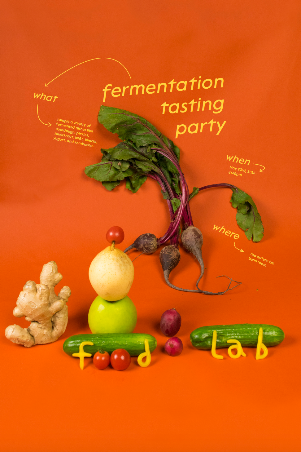
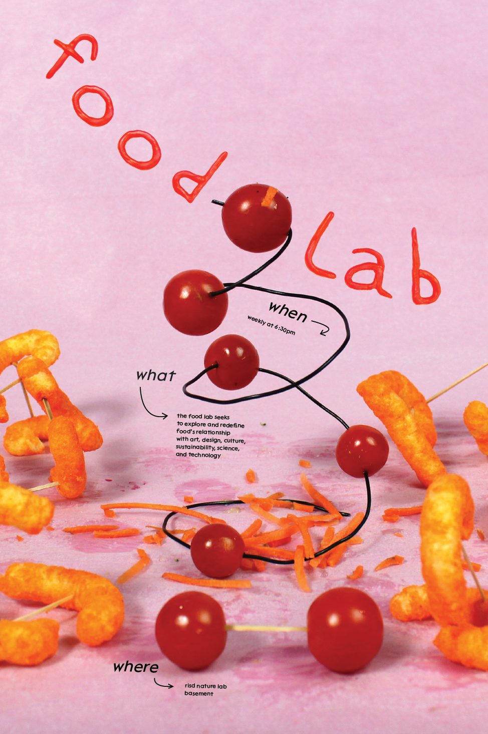
Since this club will ideally grow and continue without me, it was important to create a branding system that was engaging, accessible, and most of all sustainable. The constraints that I construced respect the future graphic designer’s wit and allow for fun in making. The identity itself allows for playfulness and variety, merely asking for a few simple continuities like photography, a colored backdrop, wax lettering, and the typeface Lack by Adrien Midzic for the Velvetyne Type Foundry.
Part of this project also relates to work I am doing outside of the classroom, managing a budget, communicating with club members, and planning the event. These factors sometimes made it difficult to focus on the graphic elements, which was an important and interesting learning lesson. In the future, I can see myself taking managerial/organization roles, but I also know that I will still want to maintain a footing in the creative side. Properly allowing for this balance can be difficult, but it is very rewarding.


