


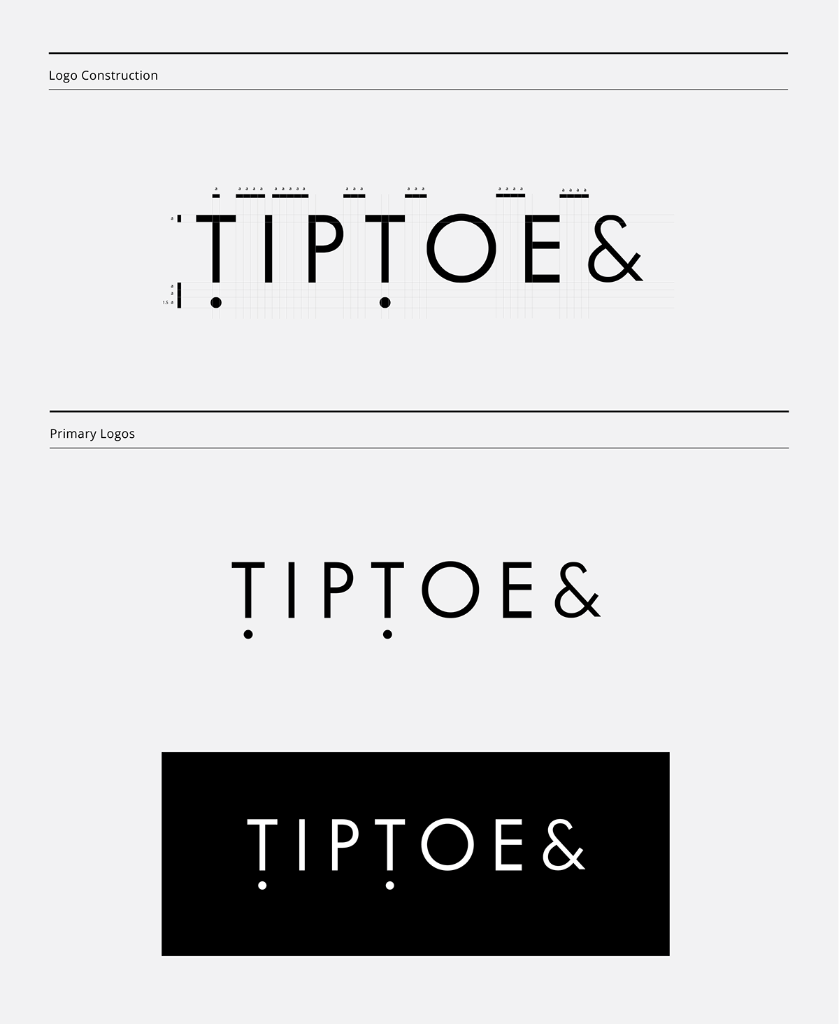
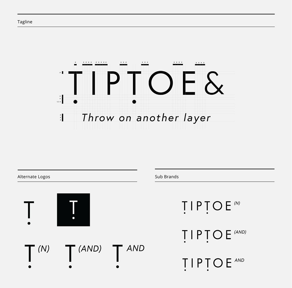
로고개요
까치발을 들어 삶에 무관해 보이던 사회문제를 다른 시각으로 바라보자라는 팁토의 메세지를 반영해 팁토의 알파벳 T를 느낌표로 표현해보았습니다. 느낌표는 일반적으로 감탄이나 명령등 큰 소리로 발음되는 문장의 마지막 온점 대신 놓이기도 하지만 문장의 도중에 강조를 나타내고싶을때도 많이 사용됩니다. 이와같이 우리들이 모르는 또는 회피하고있는 뭍혀져있는 일들을 주목하고 강조하기 위해 팁토의 T 와 ! 를 합쳐 지금 보여진 로고가 만들어졌습니다.
Logo Summary
Alphabet T is represented as an exclamation mark in order to highlight Tiptoe&’s idea where it doesn’t take much effort to tiptoe and peer over a wall to gain a whole new perspective. Exclamation mark is a distinctive indication of major significance, interest, or contrast that is used at the end of the sentence or in the middle to show the strong feeling. Like this, alphabet T and ! is combined to give attention to circumstances that has been avoided and buried.


Visit tiptoe& website here.