Branding ___ 2018
Citicon ©
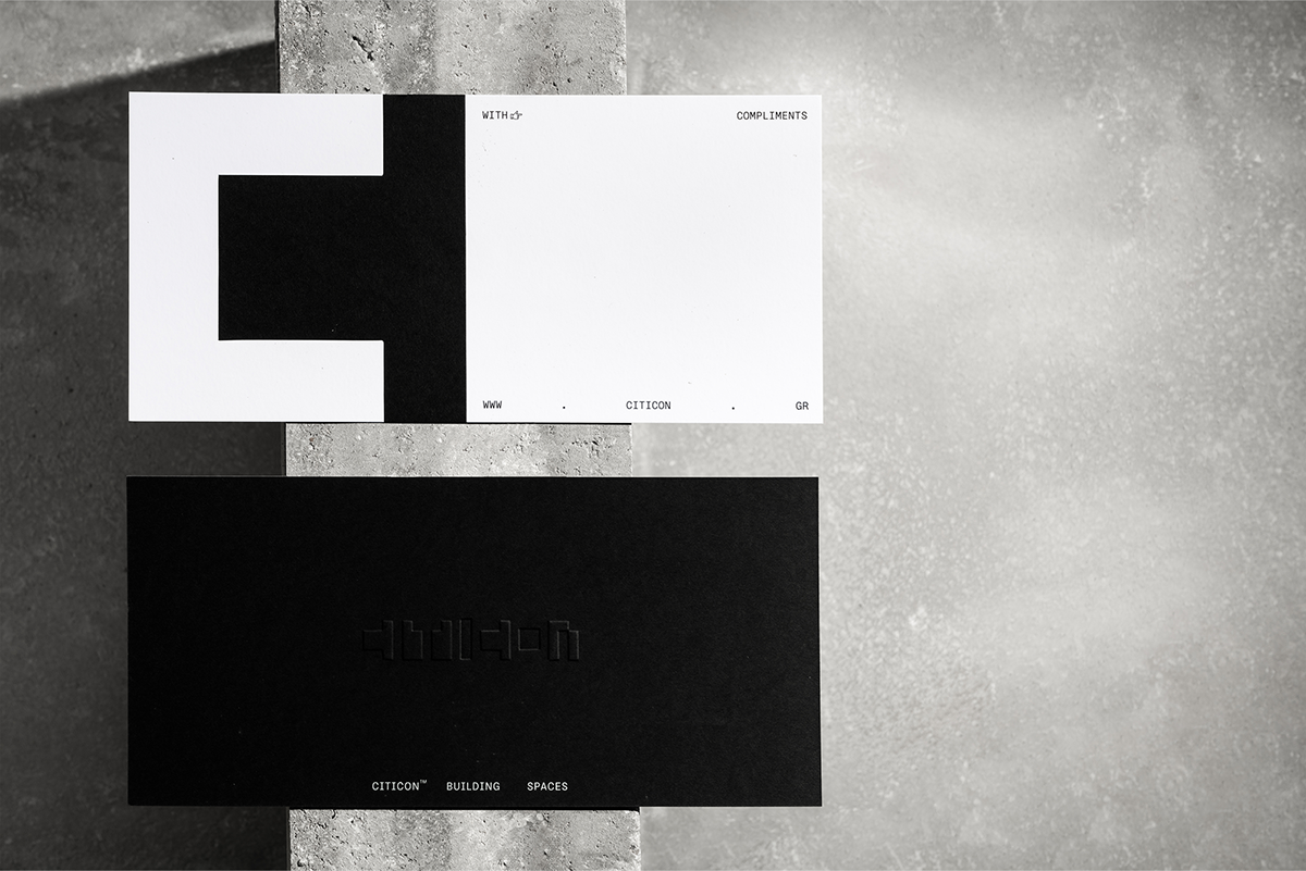
The substraction of space
Logo design and corporate identity for ‘Citicon’, the company activates in the field of architectural design and construction. Given the retention of the name, our logo was designed so that it can deliver the wider sense of space forming through it’s interaction with the structural element.
The corporate identity, extends with the use of black and white though out. The reproduction of the logo in it’s printed application uses the combination of embossing techniques in order to enhance the visual result. Typography optimally exploits the space which is applied in while it configures a wide arrangement of its’ data system.
The corporate identity, extends with the use of black and white though out. The reproduction of the logo in it’s printed application uses the combination of embossing techniques in order to enhance the visual result. Typography optimally exploits the space which is applied in while it configures a wide arrangement of its’ data system.
Athens _______ Greece