
This poster illustrates the idea, development, scope and reception of the design identity created by Lance Wyman for the 1968 Olympics held in Mexico City, a landmark in the history of graphic design.
HOW LANCE WYMAN DESIGN MEXICO FOR THE MODERNIST WORLD
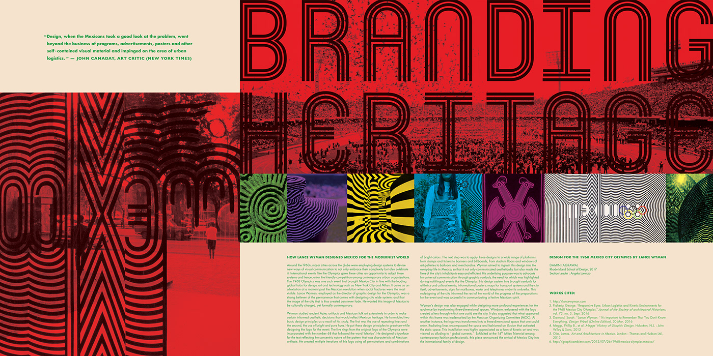
Around the 1960s, major cities across the globe were employing design systems to devise new ways of visual communication to not only embrace their complexity but also celebrate it. International events like the Olympics gave these cities an opportunity to adopt these systems and hence, enter the friendly competition among contemporary urban organizations. The 1968 Olympics was one such event that brought Mexico City in line with the leading global hubs for design, art and technology such as New York City and Milan. It came as an alleviation at a moment post the Mexican revolution when social fractures were the most visible. Lance Wyman, employed as the director of graphic design for the Olympics, was a strong believer of the permanence that comes with designing city wide systems and that the image of the city that is thus created can never fade. He wanted this image of Mexico to
be culturally charged, yet formally contemporary.
Wyman studied ancient Aztec artifacts and Mexican folk art extensively in order to make certain informed aesthetic decisions that would reflect Mexican heritage. He formulated two basic design principles as a result of his study. The first was the use of repeating lines and the second, the use of bright and pure hues. He put these design principles to great use while designing the logo for the event. The five rings from the original logo of the Olympics were incorporated with the number 68 that followed the word ‘Mexico’. He designed a typeface for the text reflecting the concentric nature of the pattern that was characteristic of Mexican artifacts. He created multiple iterations of this logo using all permutations and combinations of bright colors. The next step was to apply these designs to a wide range of platforms from stamps and tickets to banners and billboards, from stadium floors and windows of art galleries to balloons and merchandise. Wyman aimed to ingrain this design into the everyday life in Mexico, so that it not only communicated aesthetically, but also made the lives of the city’s inhabitants easy and efficient. His underlying purpose was to advocate for universal communication through graphic symbols, the need for which was highlighted during multilingual events like the Olympics. His design system thus brought symbols for athletics and cultural events; informational posters; maps for transport systems and the city itself; advertisements, signs for mailboxes, water and telephones under its umbrella. This redesigning of the city informed the rest of the world of the progress of the preparations for the event and was successful in communicating a festive Mexican spirit.
Wyman’s design was also engaged while designing more profound experiences for the audience by transforming three-dimensional spaces. Windows embossed with the logo created a lens through which one could see the city. It also suggested that what appeared within this frame was trademarked by the Mexican Organizing Committee (MOC). At another instance, the logo was transformed into a three-dimensional space that one could enter. Radiating lines encompassed the space and fashioned an illusion that activated the static space. This installation was highly appreciated as a form of kinetic art and was viewed as alluding to “global currents.” Exhibited at the 14th Milan Triennial among contemporary fashion professionals, this piece announced the arrival of Mexico City into
the international family of design.

