Skills: Branding
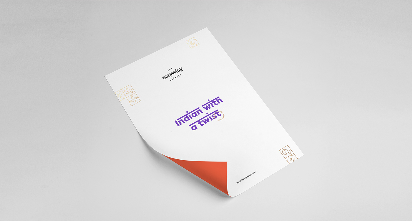
The project was to build a brand for a Portugal-based Indian fast-food restaurant with gourmet touches based on high-quality ingredients and decoration. As if it wasn't hard enough to mix fast food, India, and a premium look, we added one more brand element to the equation: Portugal.
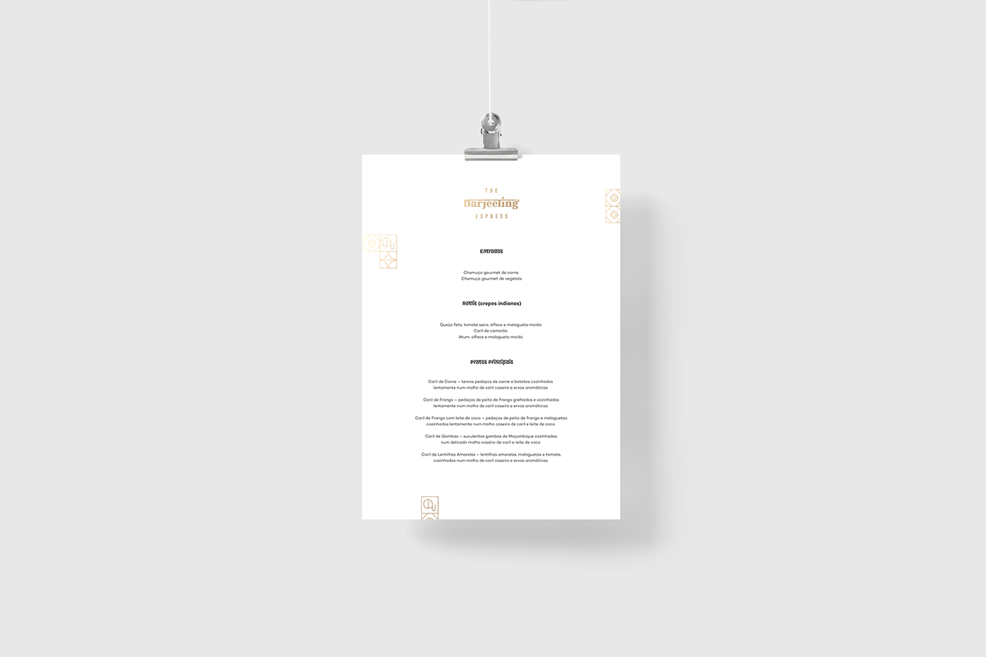
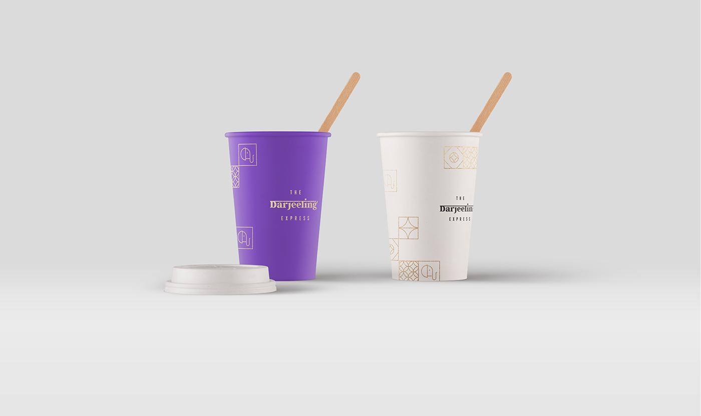
We worked with a principal Serif typography in combination with a Condensed Sans in order to achieve a good message & concept hierarchy. We created a visual world full of details: typography resources that reminds to Hindi calligraphy, Portuguese typical tiles with Indian elements, a reduced color palette that remains elegant but reckons of India.
We managed to put together many visual elements to help us build The Darjeeling Express essence as a whole. We hope you like it :)