

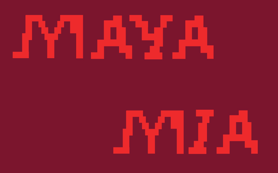
/\/\ /\ Y /\ (MAYA) is M.I.A's third album, released on July 7, 2010. The album's tracks center on the theme of information politics and are intended to evoke what M.I.A. called a "digital ruckus". Her music is abrasive and subtle simultaneously with her sampling of industrial sounds and her playful use of homophones to give her words multiple readings.
This project attempts to recontextualize the album and the shows performed by M.I.A during the /\/\ /\ Y /\ tour in a purely typographic way. Typography is used as form, information, and expression through a promotional poster and video for the two shows played at the Royale in Boston as well as a design for the album with a poster of select songs.
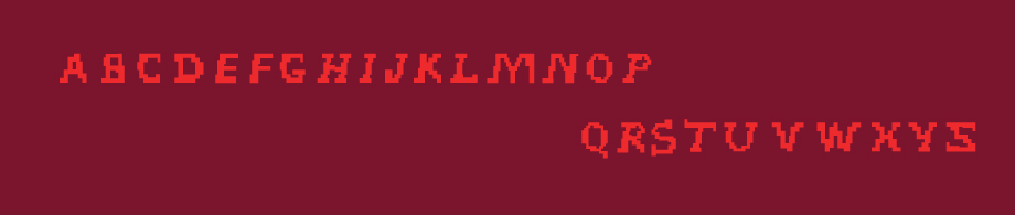
MAYA Typeface
The Typeface was designed with the idea of display type and the limited amount of pixels used in designing for a screen. The gridded type references a digital world as much of this album's music deals with ideas "digital ruckus" and love through the internet. The type is both simplified and distorted with the use of it being constructed like a bitmap which references the digital content in the lyrics and the music that is sonically distorted.
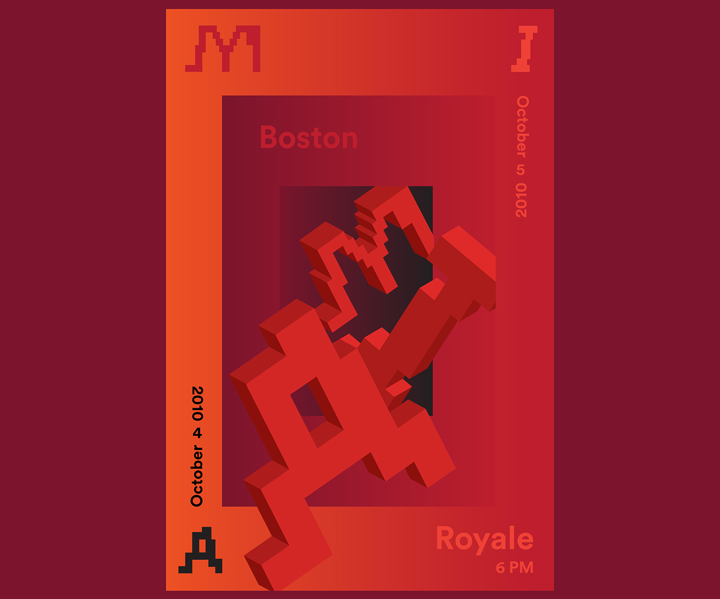
Promotional Poster

MAYA album cover, case, and CD

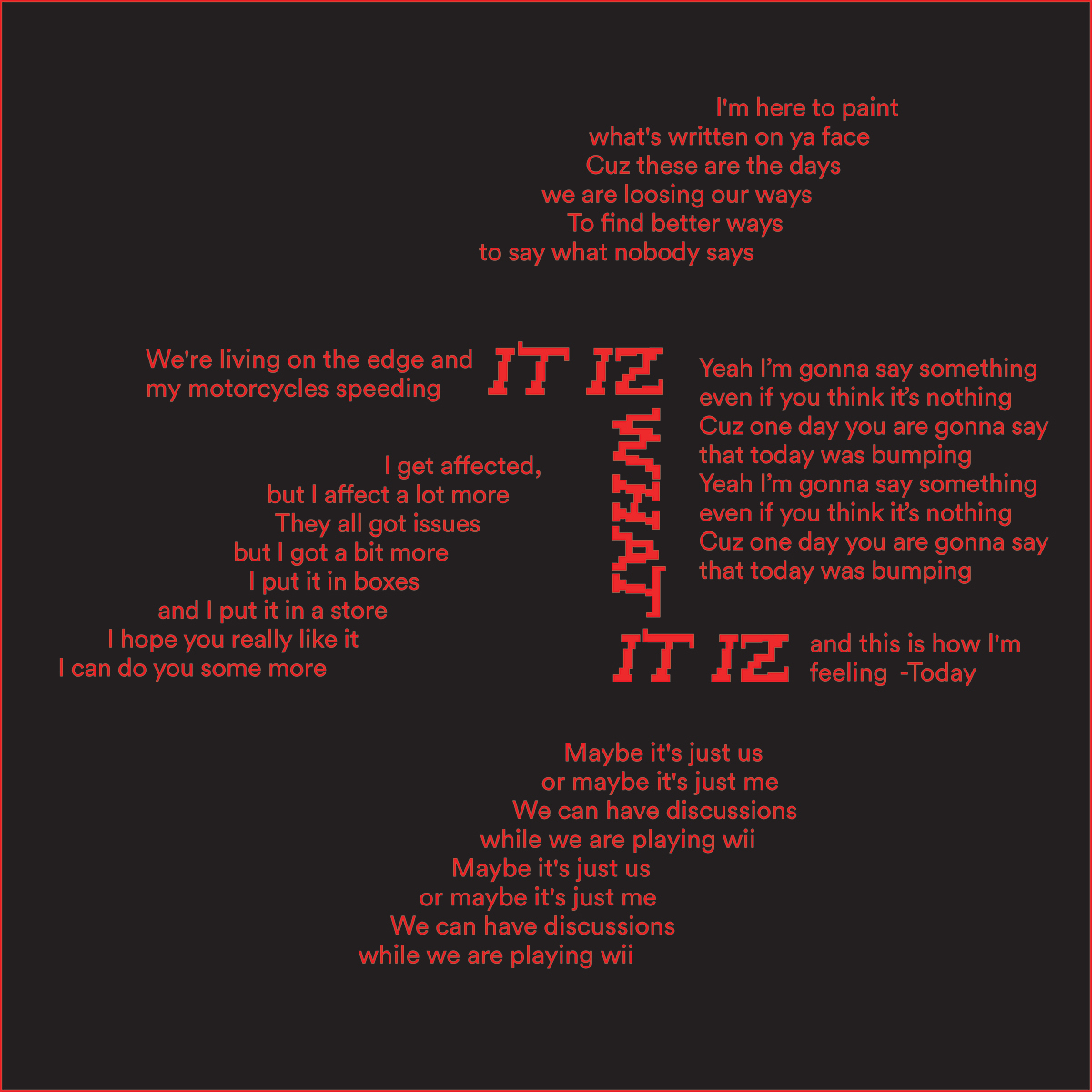
Foldable Lyric Poster
Promotional Video

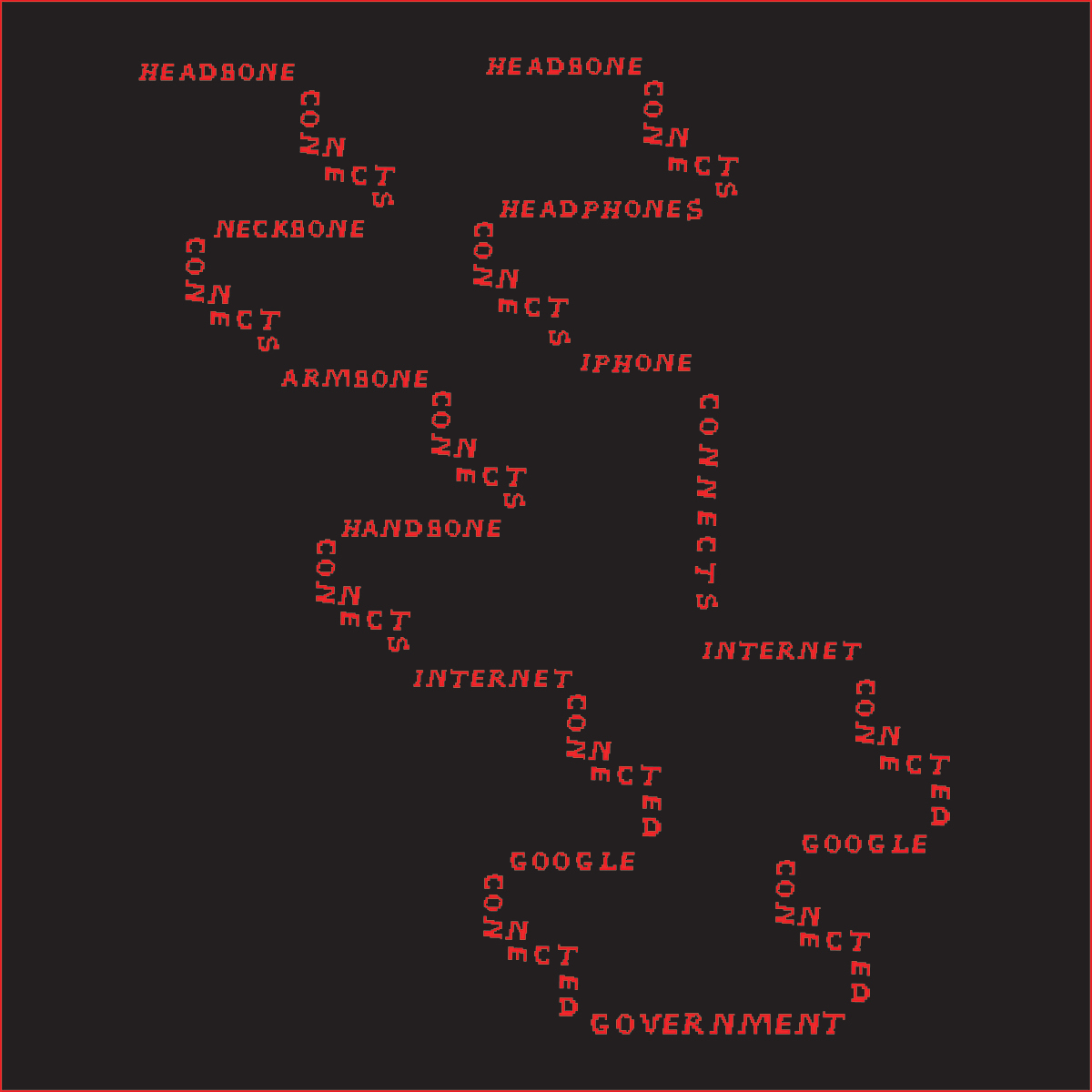
The Message

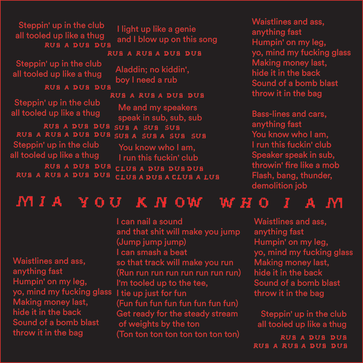
Steppin' Up

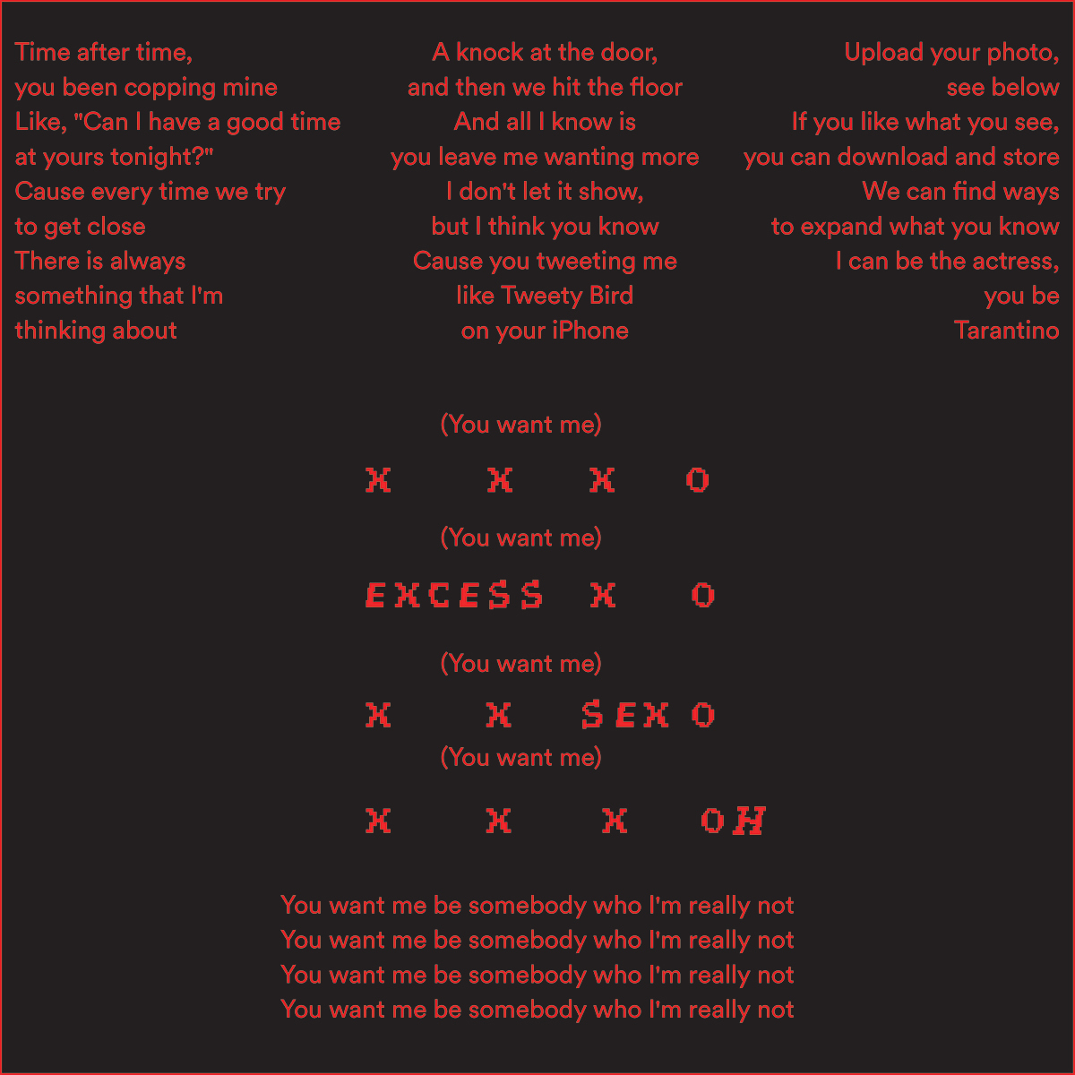
XXXO

Tekilla

It Takes a Muscle

Lovalot

It Iz What It Iz

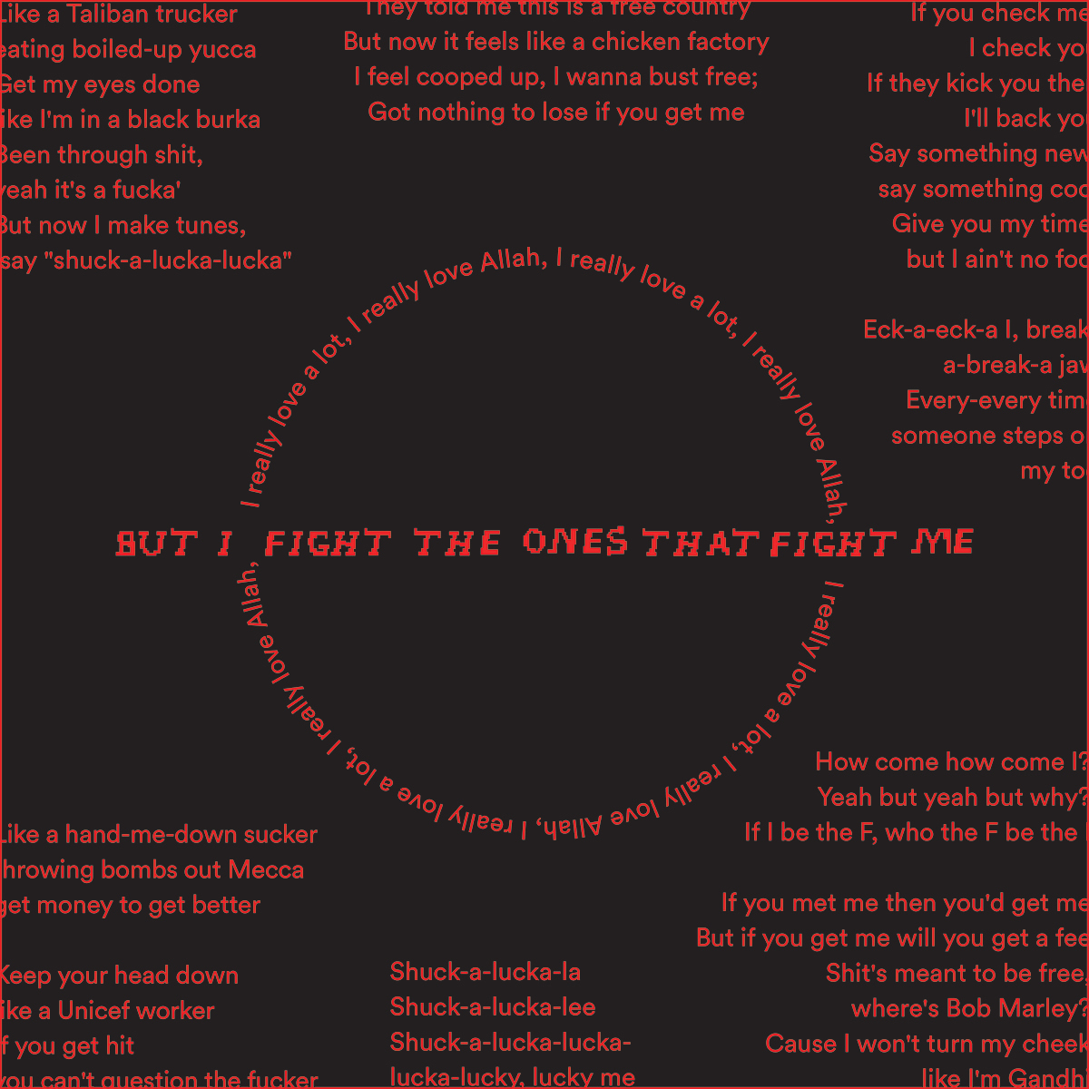
Born Free


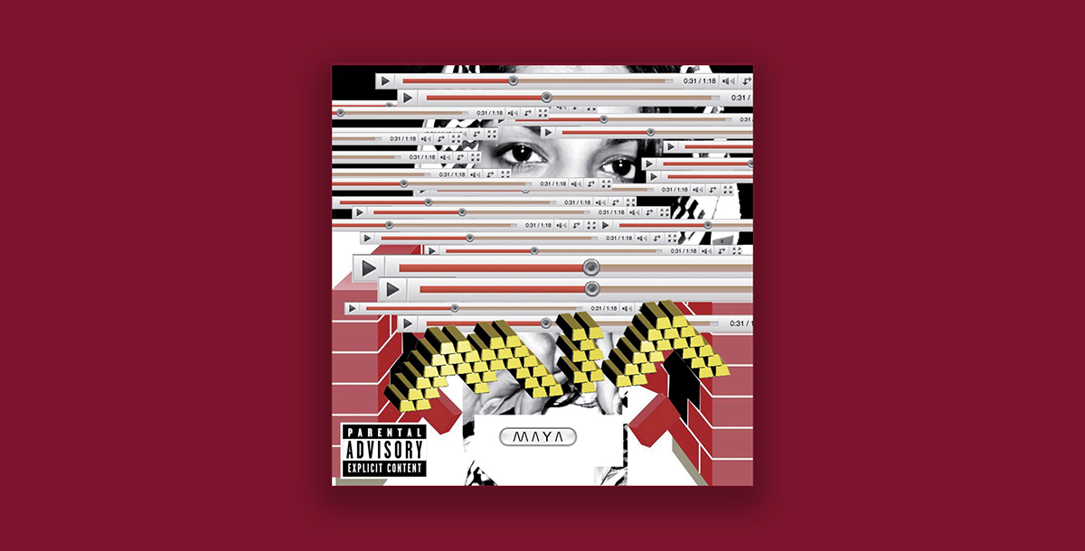
M.I.A's original album design