

Fall 2017
Type 1
Emily Rye
'Sotong' 소통
The word ‘Sotong’ in Korean directly means communication. My typeface tackles with the social stigma that is sometimes carried with non-english speakers, who may have distinctive pronunciations shaped by their mother tongue/first language. Language is a method of communication to impart information and convey feelings, in order to stay connected to one another. It should not make one feel inferior or less sophisticated if he or she does not have a certain manner of speaking that a native speaker may have. As long ast here is a basic understanding of the context said, nobody should be troubled or concerned by accents.
This typeface is an illustration of the situation. The ambiguity of this typeface ay set back the speed of recognition but does not completely hinder the ability to detect what the letters are.
Each latin alphabet is made up of actual Korean 'Hangul' characters, therefore each letter is comprised of at least 2 Hangul characters and is not an arbitrarily designed form.

To showcase my typeface, I printed my pages on a thick textured paper to mimic the look of traditional Korean textbooks back in the day. To amplify the traditional quality of the book, I adopted Japanese binding technique to hold the book together with a red string.


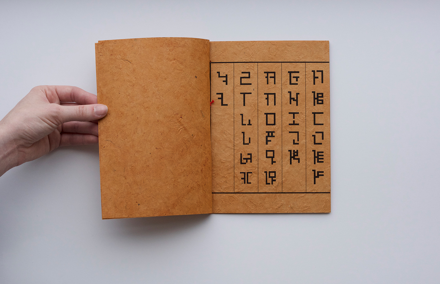
Alphabets from A - Z (reads from right to left)

"Korean Hangul"
The Korean 'Hangul' characters that make up my latin alphabets
The Korean 'Hangul' characters that make up my latin alphabets


