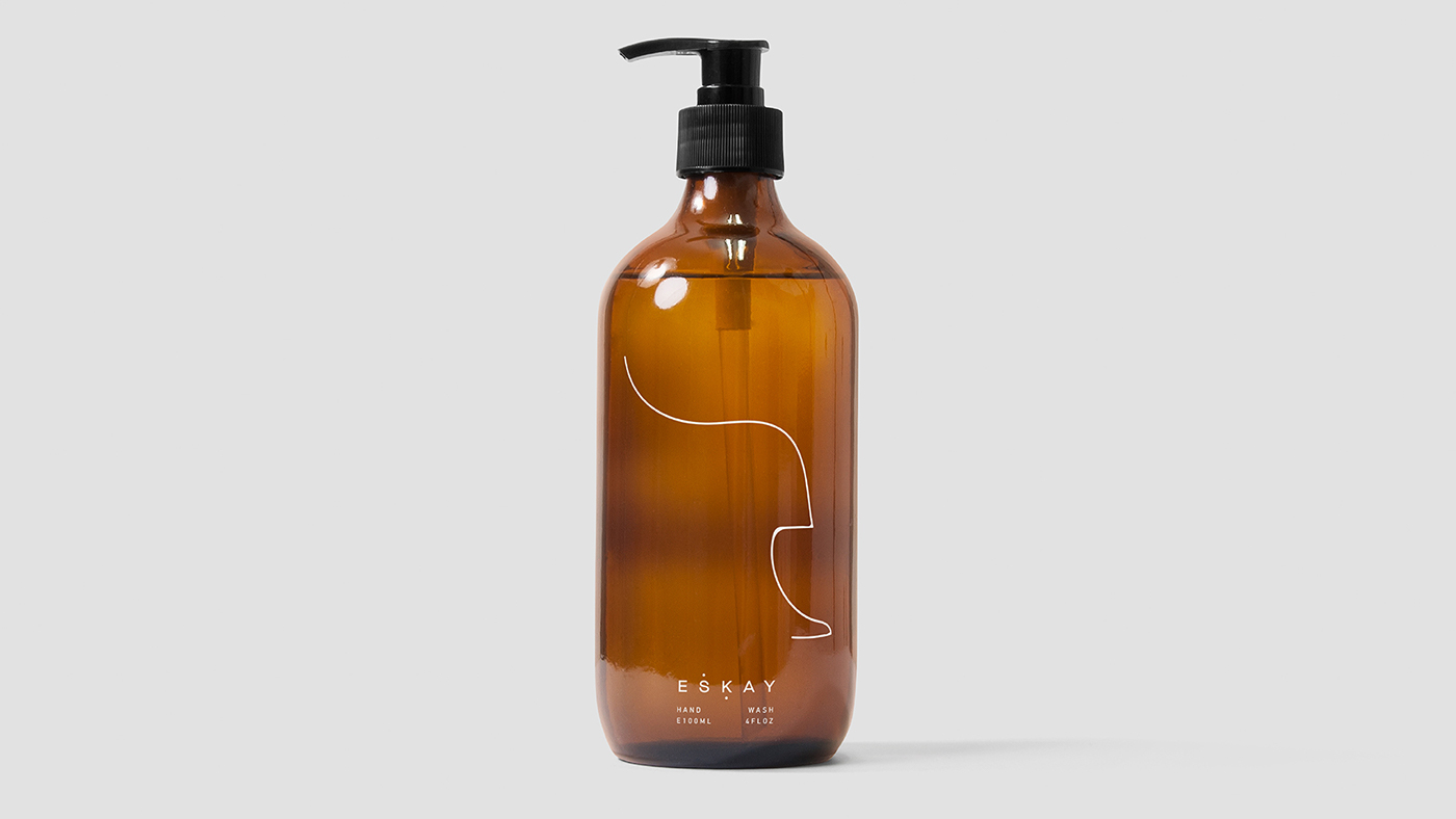
Eskay is an all natural, organic and homemade skincare range based in Stockholm, originating from a vegan home, the most important thing for the company was that clients, can understand and read all the ingredients used within the products, priding itself on the quality of the ingredients.
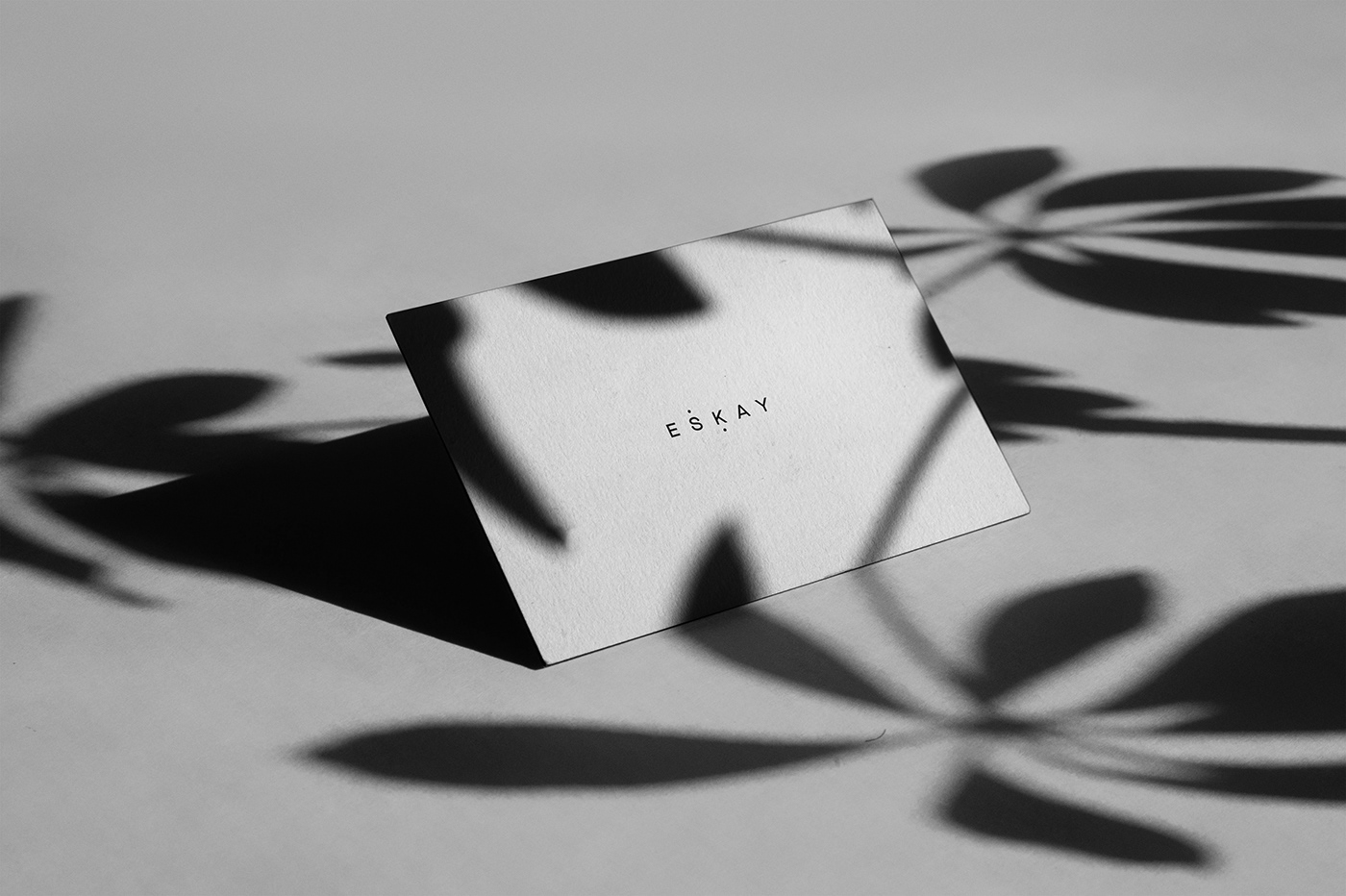
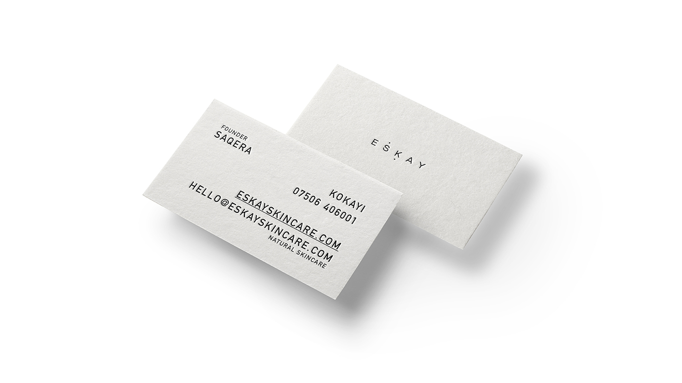
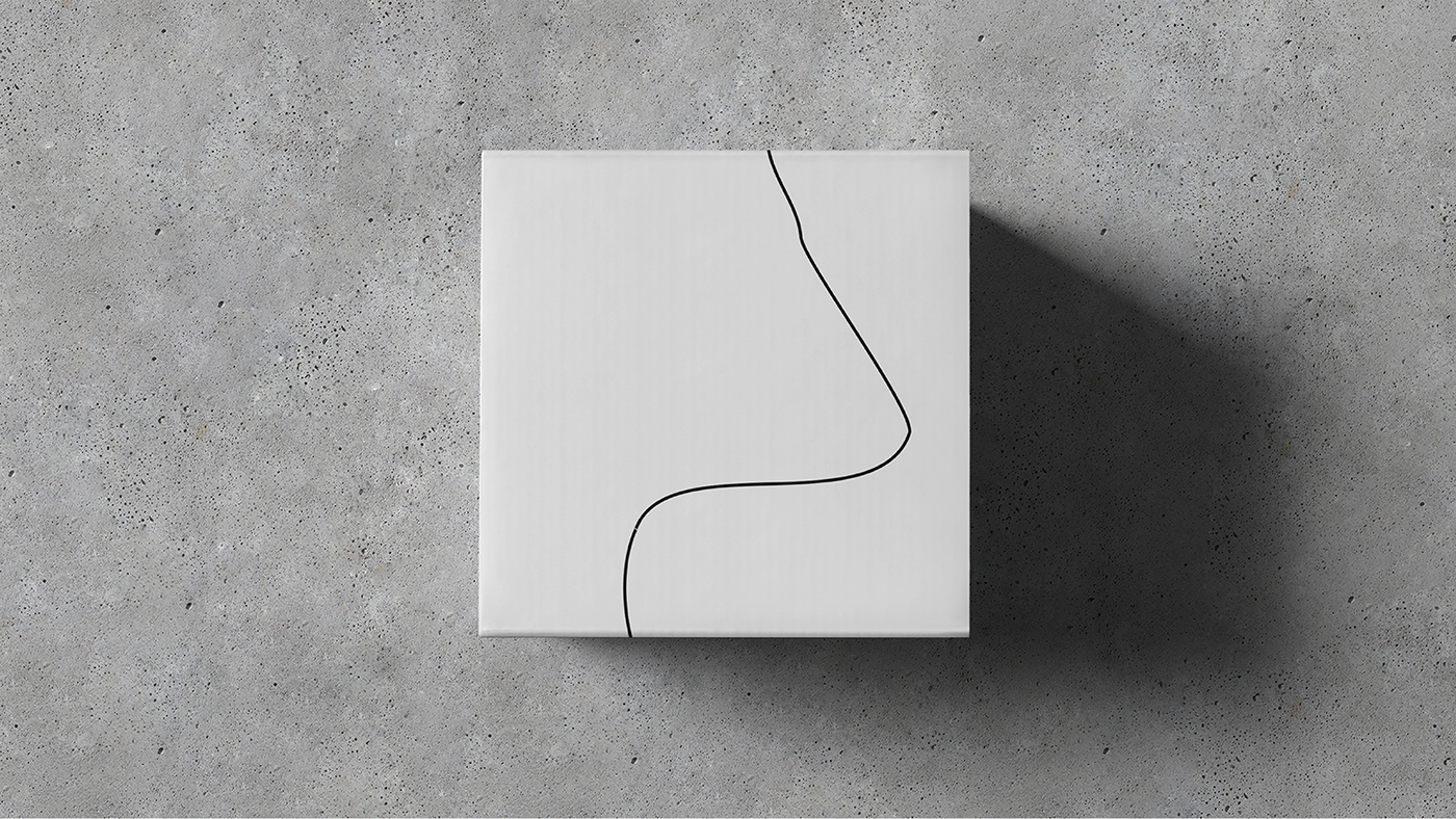
The logotype has been created to have a delicate and considered layout with the inclusion of subtle design motifs. Wide-set characters create a more minimal and modern composition, creating a logotype that is ambiguous. Creating a brand new typeface for the logotype was essential to continue the fresh and handmade theme. The letters have been drawn to have a slightly thicker width than height, creating a more modernist typeface.
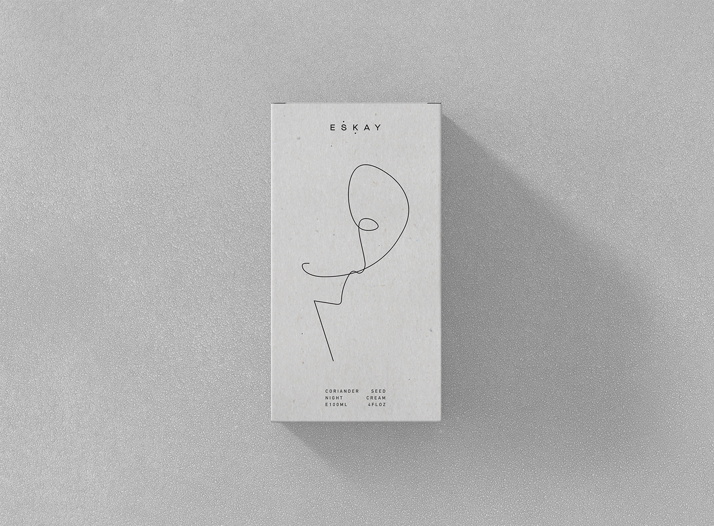
The letters, "S" and "K" have deliberately been marked to reference the meaning of the word "Eskay" which is the phonetic sound of Saqera Kokayi's initials. Saqera is the founder of Eskay. It was essential to create a link between Saqera and the products, as the company began by the products being cooked up in her kitchen. Ensuring every ingredient was hand-picked, locally sourced and organic. This concept also ensure that all the products, will definitely, have a personal touch!