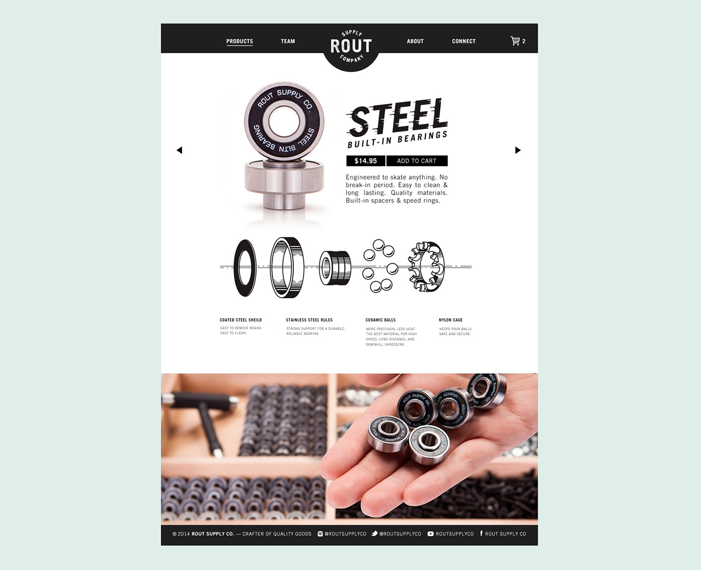
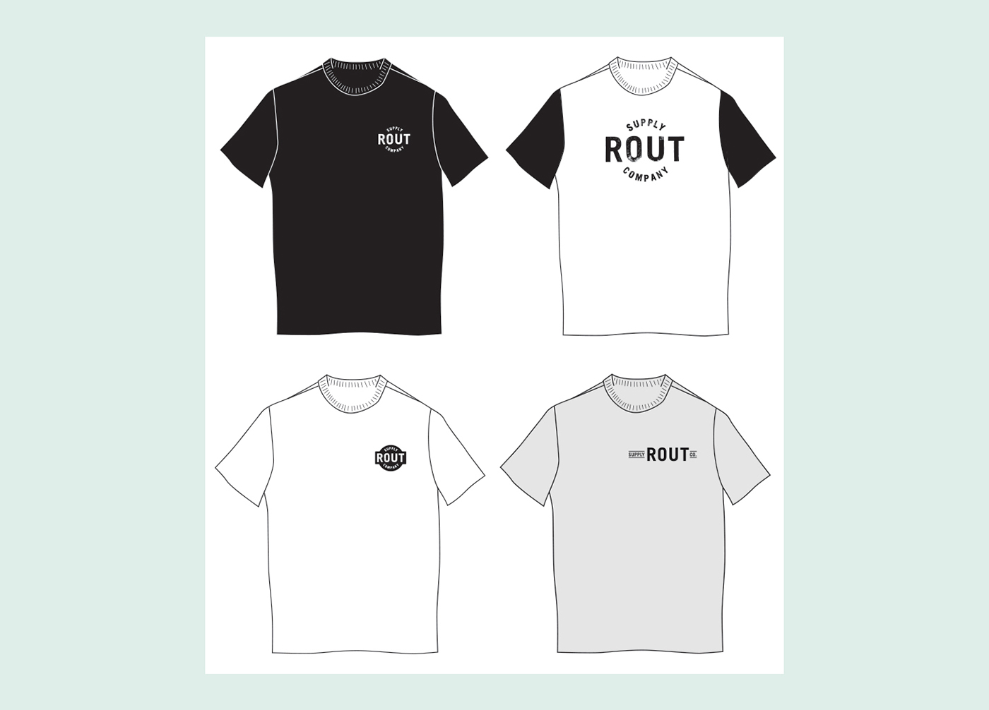
Branding, packaging, collateral, and UI design for a skateboard bearings company. Photography by Erik Ursin.
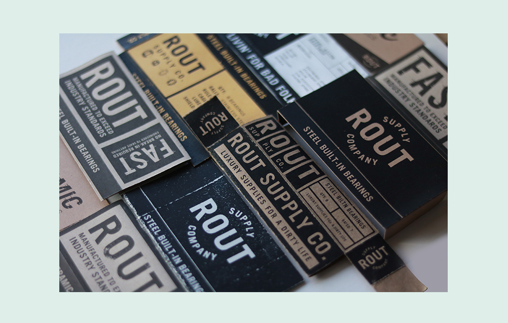
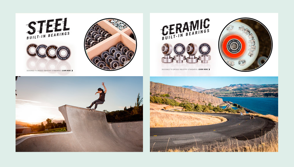
Inspired by vintage product packaging, Rout's brand aesthetic is bold, confident, and accessible. In a sea of visual noise and racing stripes, Rout stands out.
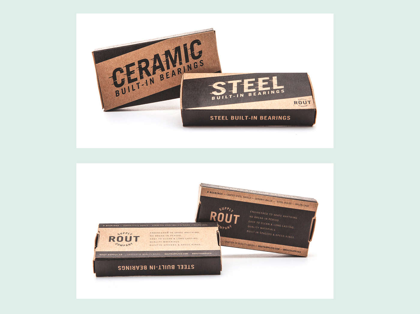
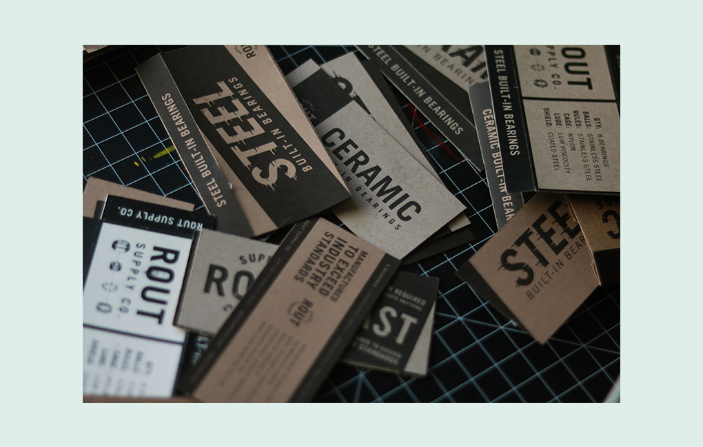
Most bearings companies tend toward loud racing motifs and bright colors. In comparison, Rout packaging has a hand-made and printerly quality. During the design process, our tiny creative team worked from an office that was attached to a skate shop, allowing us the opportunity to test how well our prototypes stood out in the in the bearing case throughout the process.
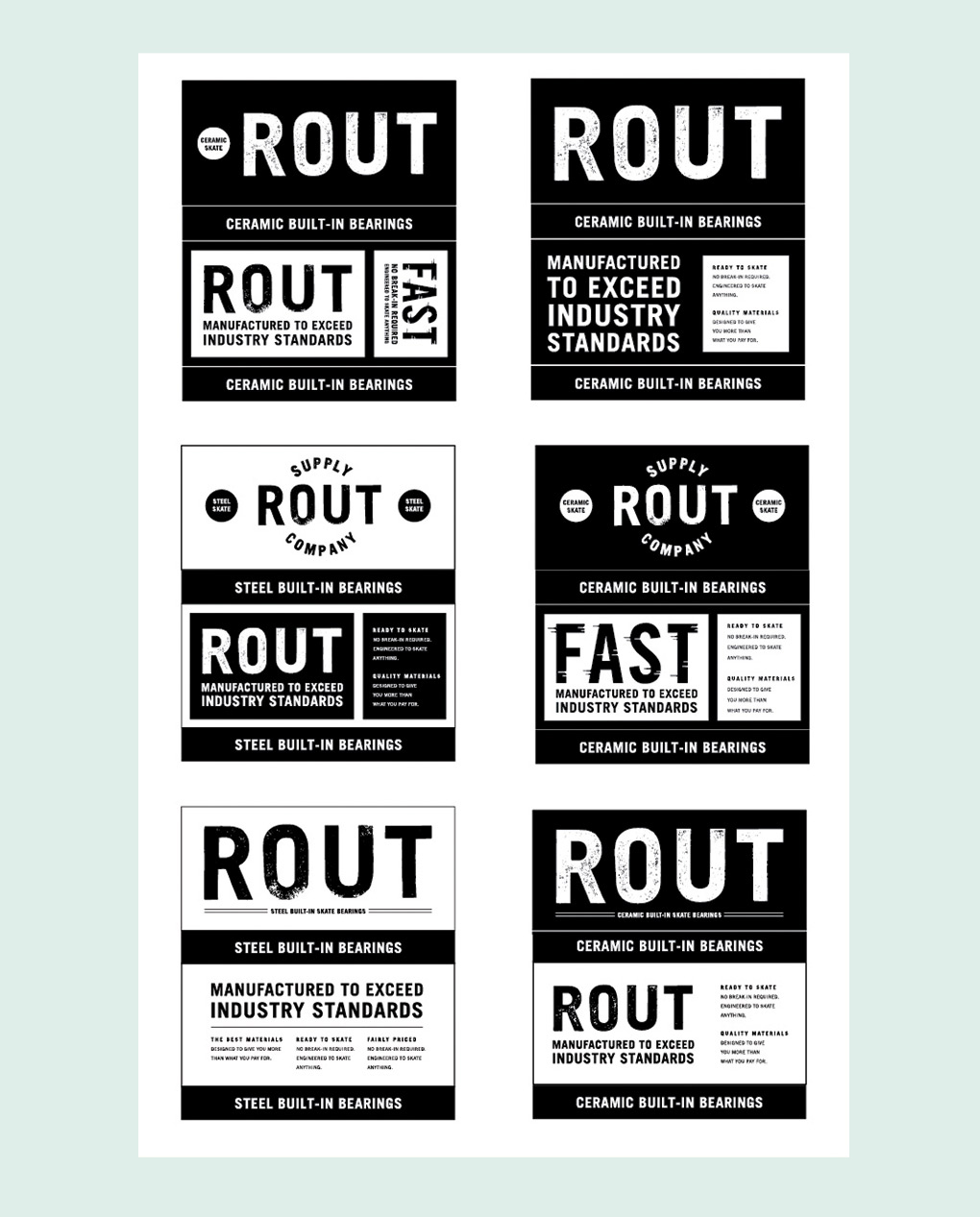
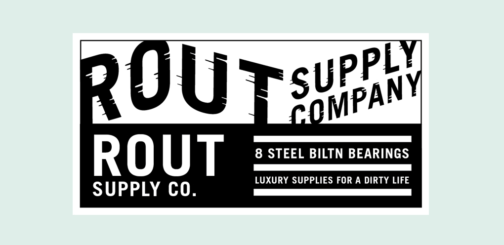
Expressive and playful secondary type elements look fast. Custom typography incorporates speed lines to convey product characteristics— no accompanying text necessary!

There were many sketches and iterations that lead us to our final designs. We experimented with type, verbiage and material.