CANDY BAR
SKETCHES


CONCEPT 1

My first concept involves using shiny buble writting for the title ‘Jelly bar’ and a cursive smaller font for the sub heading ‘with white chocolate’ i decided to add the word delisious to make it more appealing. I decided to make my ingredient Jelly become a cartoon as i want this bar to be targeted at young children. The cartoons will be shown swimming in the white chocolate, possibly wearing scuba diving gear spashing around.
colour scheme will involve white for the chocolate and bright colours such as red, green and yellow for the title and jelly characters.


CONCEPT 2

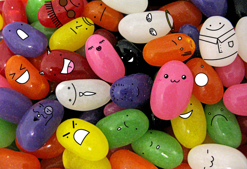
My second concept follows a similar idea with the cartoons but with a different font , more of swirly font and i plan to play around with jelly beans as a background of some sort.
The colour scheme will be of the general colours jelly beans have like shown in image below.


references
https://www.google.com.au/search?biw=1159&bih=661&tbm=isch&sa=1&q=jelly+beans&oq=jelly+beans&gs_l=psy-ab.3..0j0i67k1j0l2.1772083.1773
17.0.1773954.11.10.0.0.0.0.394.1534.0j2j2j2.6.0....0...1.1.64.
psy-ab..5.6.1531.8K6hAoa5zAA#imgrc=xxr1XCu6n7WHSM:
https://www.google.com.au/search?biw=1159&bih=661&tbm=isch&sa=1&q=jelly+bean+cartoon&oq=jelly+bean+cartoon&gs_l=psy-ab.3...3726.6146.0.6587.8.8.0.0.0.0.237.237.2-1.1.0....0...1.1.64.psy
ab..7.1.236...0j0i67k1.gmW_mqhPbn8#imgrc=hM--d8K9J_3e-M:
https://www.google.com.au/search?biw=1159&bih=661&tbm=isch&sa=1&q=jelly+bean+cartoon+green&oq=jelly+bean+cartoon+green&gs_l=psy-ab.3...40622.41822.0.42152.6.6.0.0.0.0.206.976.0j3j2.5.0....0...1.1.64
psy-ab..1.1.206...0j0i30k1j0i8i30k1.SeYXYA8UXhk#imgrc=zhfVyB-zZZ5g8M:
brief change
The changes to the brief included : Make the bar for Adults and make it sugar free / low sugar


final product

Reflection
Introduction
A client needed new concept art for a candy bar for a meeting . The name of my candy bar was "Jelly bar with white chocolate". In the beginning I visualised a child's candy bar with cartoon jelly beans . I had considered what children like and what visually appeals to them and had a plan. I had to take into account the fact that this would eventually be displayed in supermarkets so had to be bold. Later there was a modification in the requirements for the candy bar and the Target audience was chosen to be adults and the bar had to be sugar free/low sugar. Then I had to consider the following questions, what makes a candy bar an adult candy bar? Do real adults even eat candy bars? Have I seen any 'mature' or 'adult' candy bars? I did some research, I didn't know where to begin and simply googled 'candy bars directed at adults' and found they used mainly dark colours, I decided instead of going with the norm I would compromise that element and try to make a bar that would be bright and eye catching, but once u pick it up u notice it's not just a children's bar.

My first insight comes from having to turn a milk/dark chocolate bar into white chocolate. This issue arises from not being able to find a good photo online of a white chocolate bar, therefor I had to find a milk chocolate one ( insert photo and reference link after) and use photoshop to turn it into white chocolate. This process seemed like it would be difficult , I began by grabbing a photo of white chocolate and using its colours as a reference. That proved to be a more difficult way when I was shown how to use different layers with different levels, layer adjustments and settings to change the colour to match as much as possible. It was easy to find a white colour but difficult to make it look creamy. This process made me realise that not all Resources are going to be available to you to make your work easy for you, sometimes tasks seem daunting but can become easier once you get the hang of it, nothing is impossible , trial and error is essential. The process involved using masking and playing around with the settings especially shift edge as the photo of the chocolate bar was quite rough to work with


My Second insight came from attempting to make my chocolate bar look realistic, specifically the jelly beans embedded within and jelly dripping out of the bar. I was taught how to use the gradient map but couldn't get around it well enough for it to help me, this experience taught me how to come up with other ways to create the same or similar outcome. Instead I used the dodge and burn tools as well as the blur tool in order to create shadows and light where I thought it was needed for the dripping jelly. For my jelly beans I used a reference Leigh made but even then found other ways to create the same effect. Adjustment layers played a big part in this.


Throughout this project I learnt that making something look realistic takes time and patience, and advice from others as what u see and think of your work isn't always accurate and someone else's point of view can be very helpful. I've learnt also that all tasks can be completed even if they seem impossible, motivation is key in finding new ways to get to your intended outcomes.
Invoice

