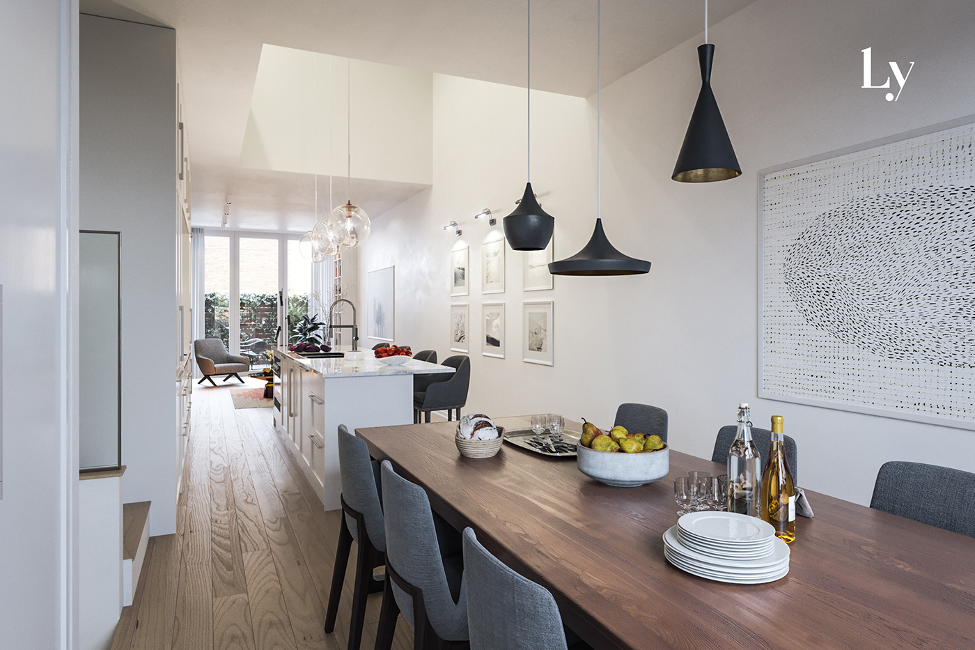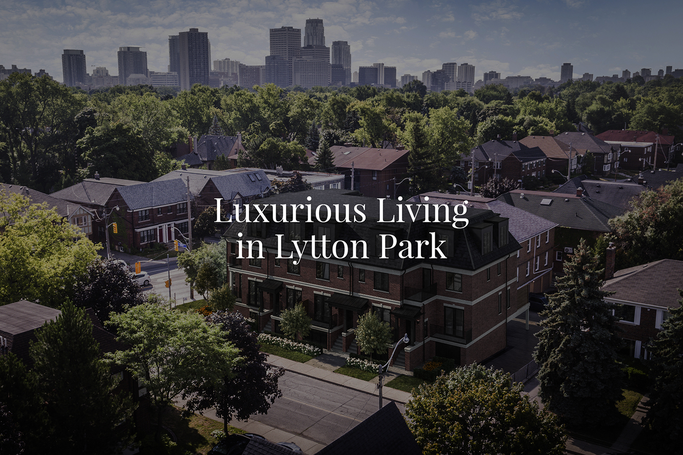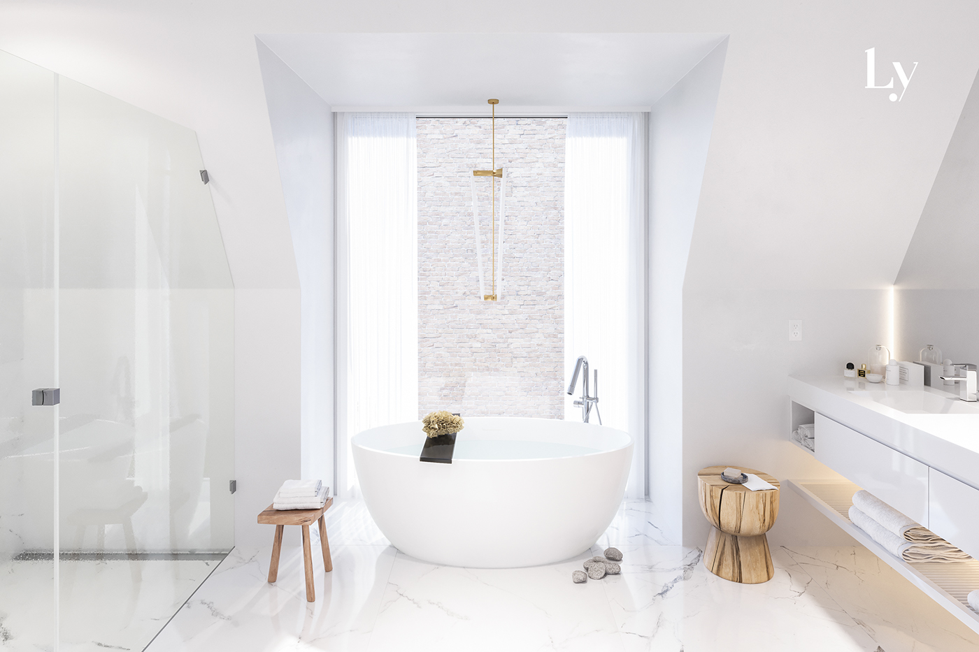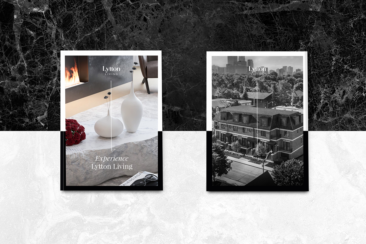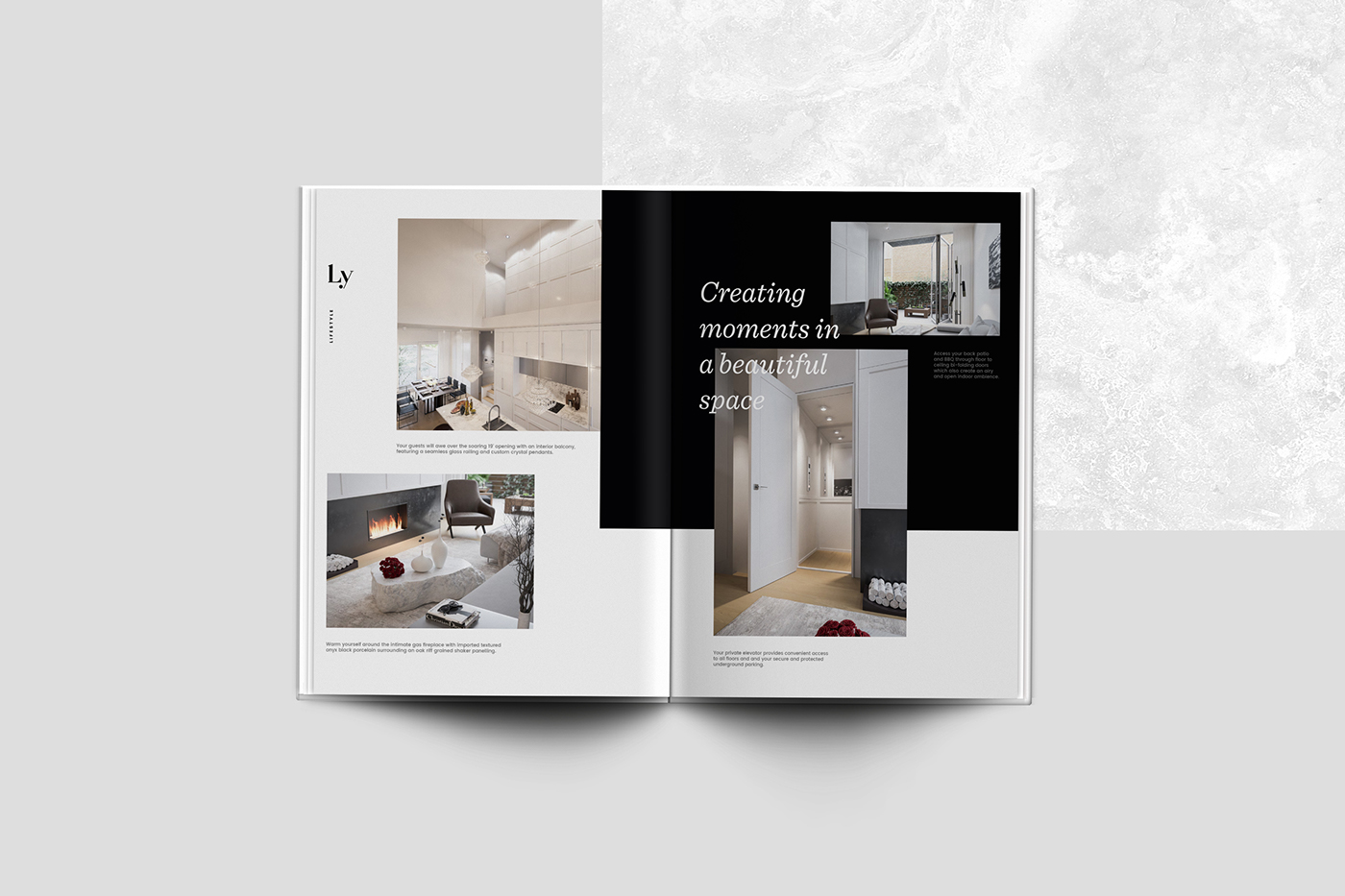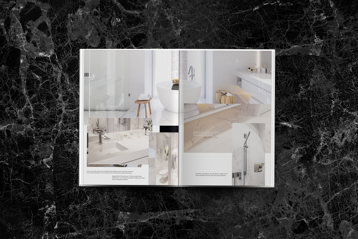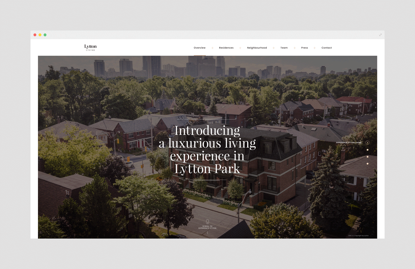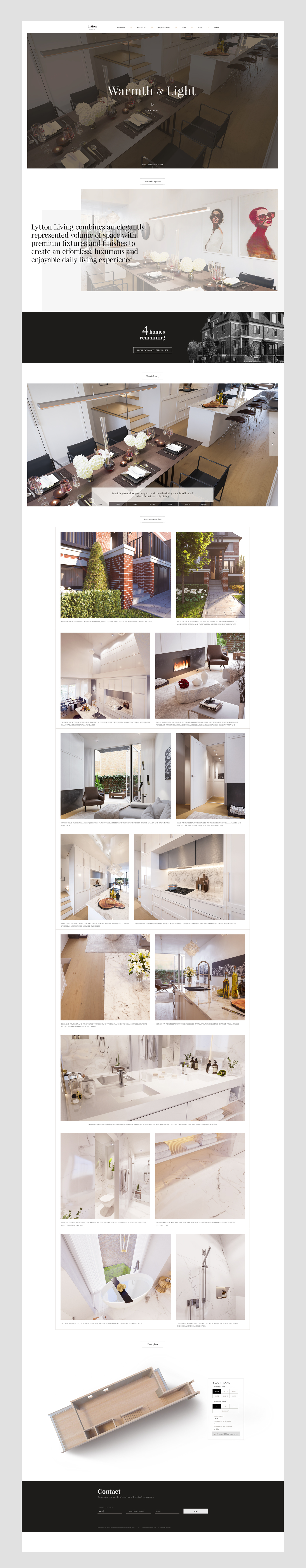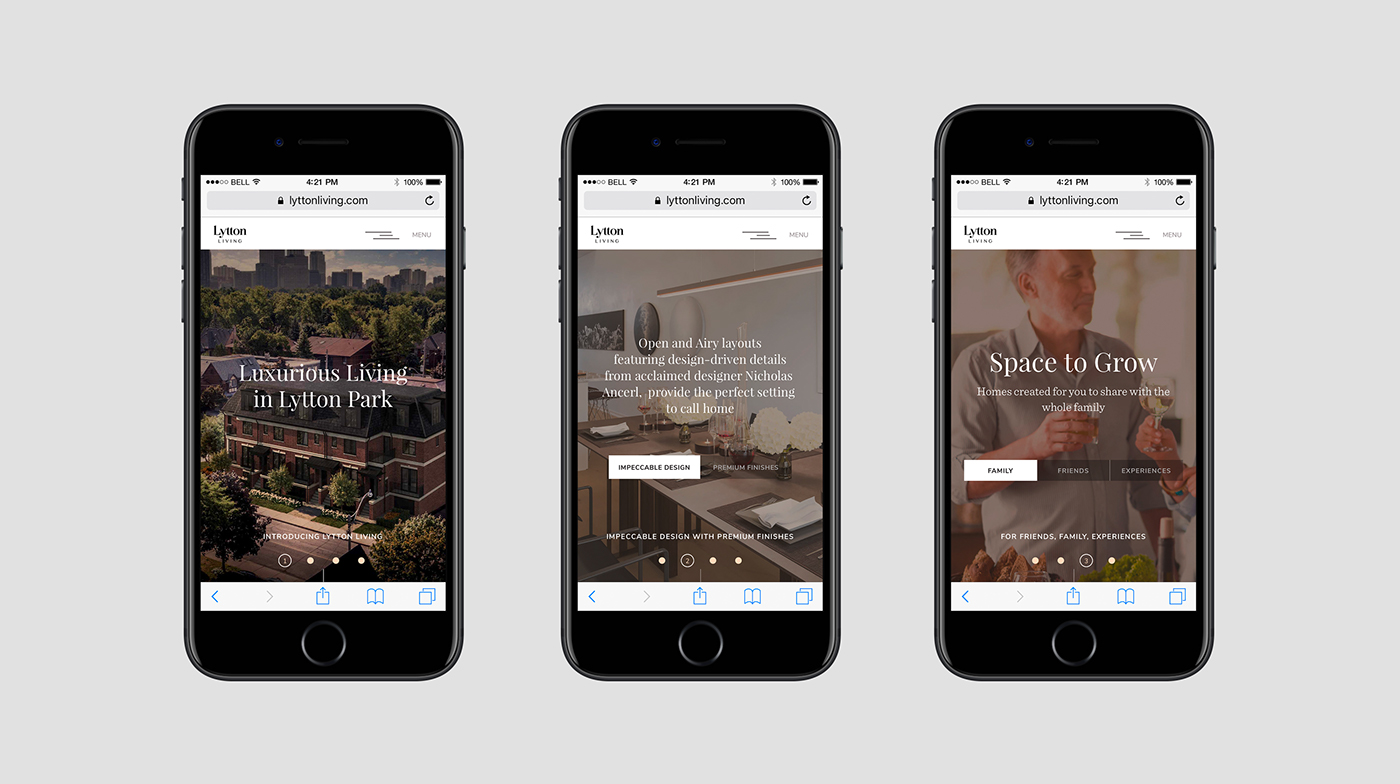

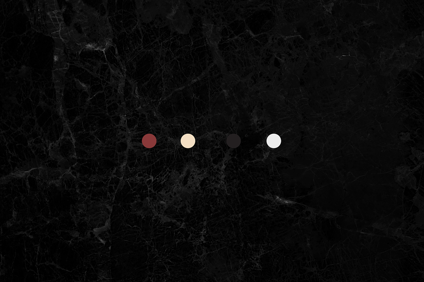
Premium brand requires an appropriate approach. Subdued colours of interiors, the highest quality finishing materials and luxurious spaces received a graphic design which harmoniously emphasizes the prestige of Lytton Living. Using bold fonts, muted colour palette and minimalist graphic elements we obtained fresh and legible visual identity accentuating the elegance and distinction of the Luxurious Living in Lytton Park.
Release Date: 2016 Deliverables: Branding, website, UI/UX Client: Lytton Living Art Director: Jorg Creative Communications
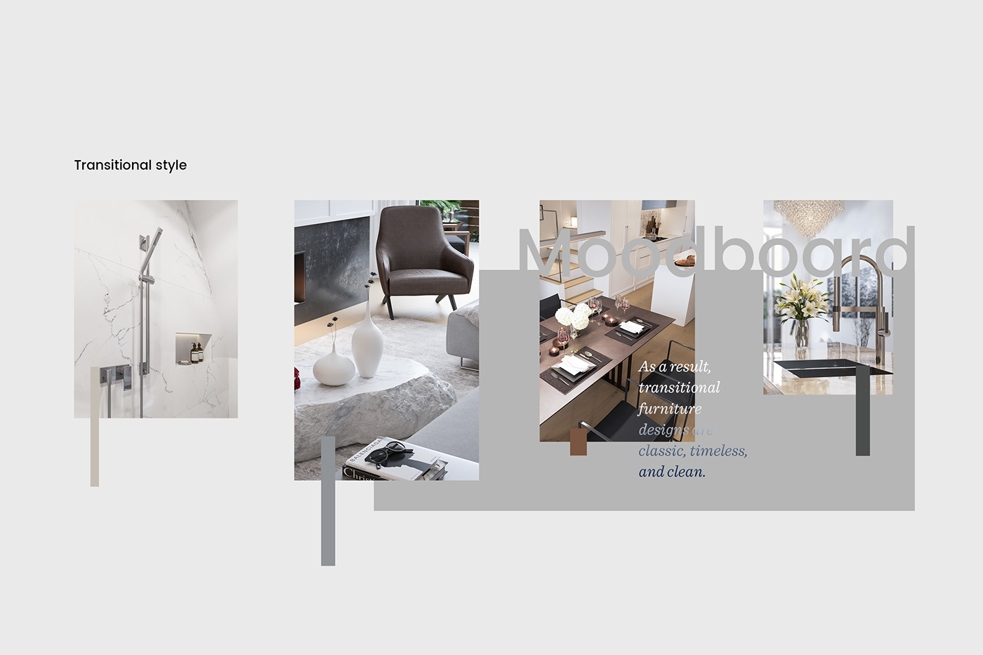
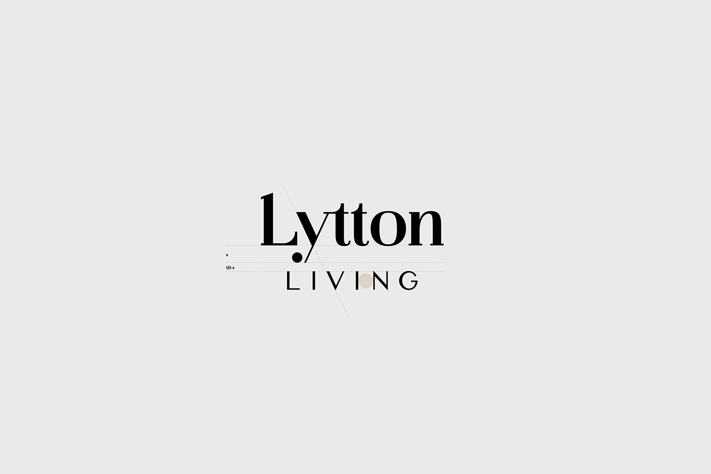
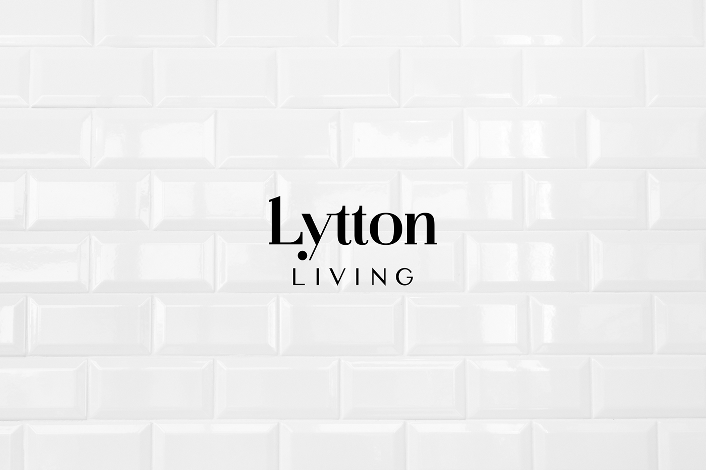
In this particular example we have tried to combine strong, but very distinct and classic serif with a light modern deconstruction (ie. „y” letter”). It strongly refers to styles mixing in transitional trend. All typographical solutions are entirely designed by Creogram (custom design).