Monogram Logo Case Study
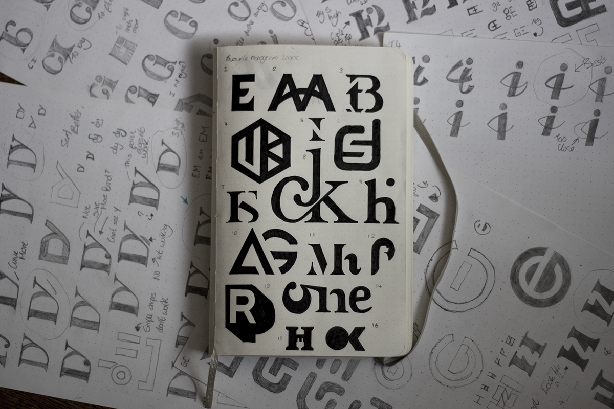
I recently saw a lot of monogram style logos and thought they were really cool. After spending some time looking through a lot of them I thought I would learn how they were done. I decided I was going to design a monogram logo for every letter of the alphabet; I picked a random letter or number for every letter. Before I started designing I thought I would look more into how monogram logos are made. I picked out several of my favourite logos I had seen around the internet and decided to draw them by hand; this way I would get a feel of how the idea was really generated, this also really helped me understand the process of creating these logos, (see below my sketchbook of logos). After feeling confident I had learned something I decided to have a go for myself and set out designing a logo for every letter of the alphabet. I thought I would share the logos that I had created for everyone to look at, maybe inspire a few people and to receive feedback on my work. So, have a look through them all and let me know what you think, what's your favourite and what could be improved or done differently?