Proenergy Visual Identity
Proenergy Croatia is a Swiss owned company that delivers electric and gas power. Active in Croatia since 2010, they offer more affordable, safe and reliable supply of energy.
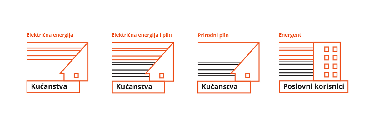
In 2015 they supplied 1.3 billion kWh of electric energy and 450 million kWh of natural gas to Croatian businesses and households.
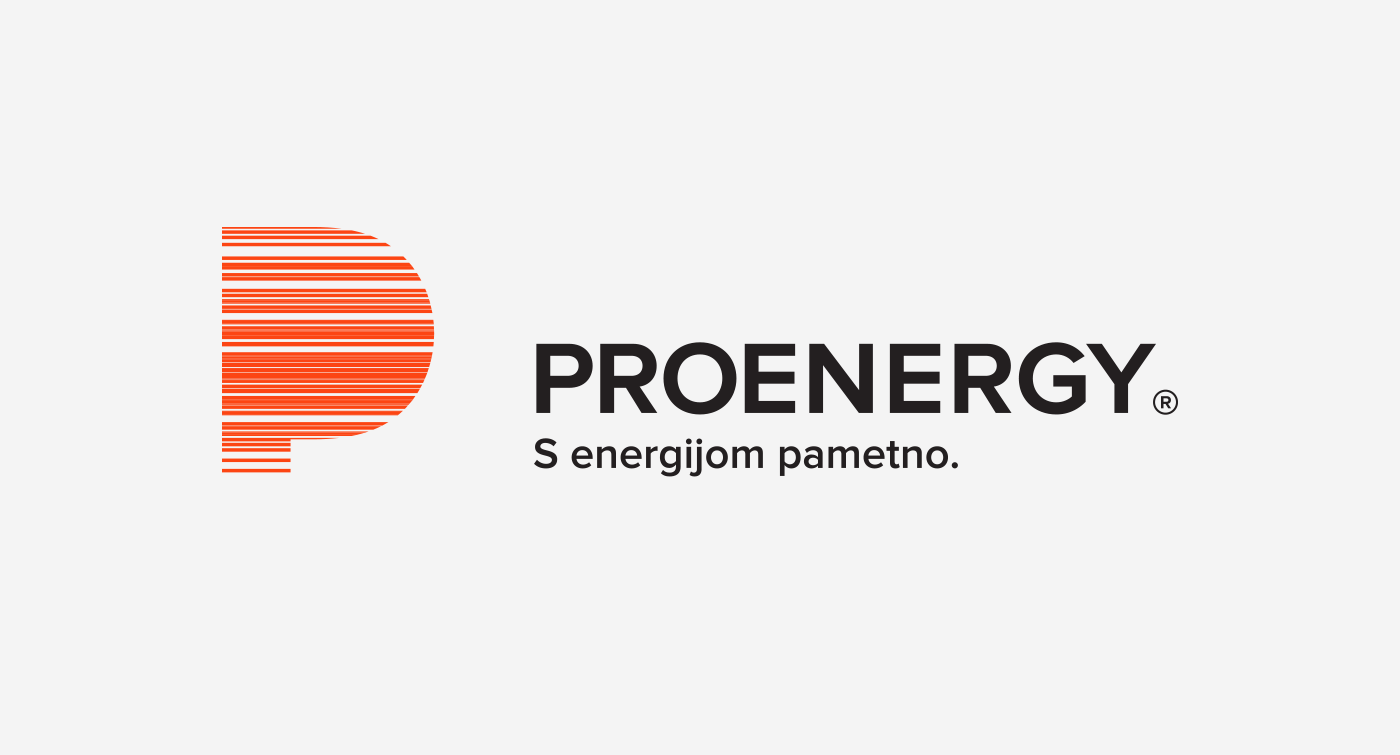
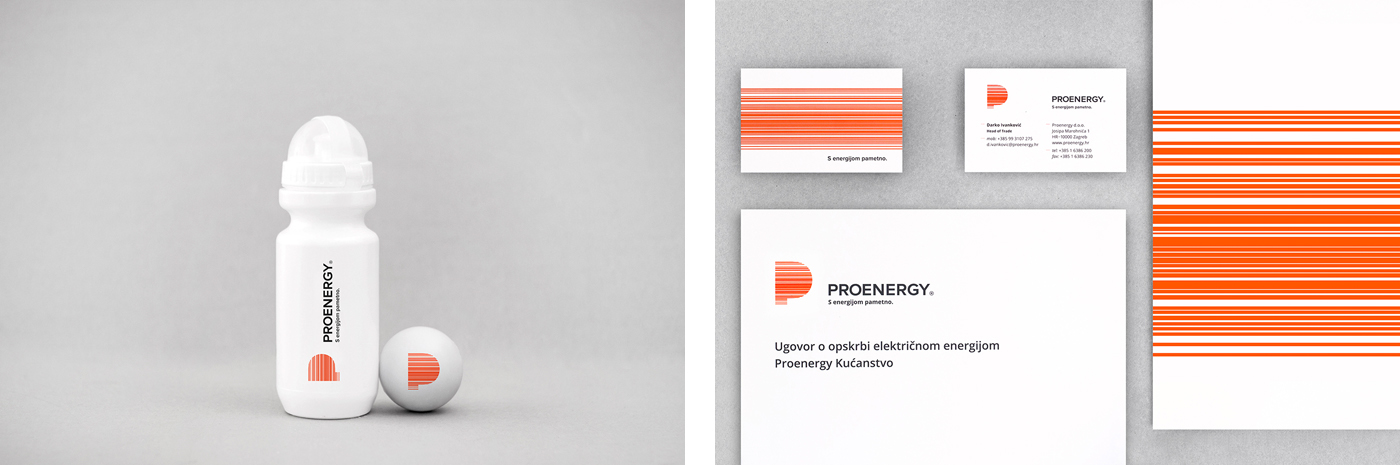
In 2016 Proenergy approached us to redesign their ageing identity. Concept for their new visual identity is a controlled flow of energy. Energy is depicted by horizontal orange lines, strong and uninterrupted, safely contained within the letter P. Different line thicknesses emphasize the movement and speed, with orange color used to convey life, warmth and activity.
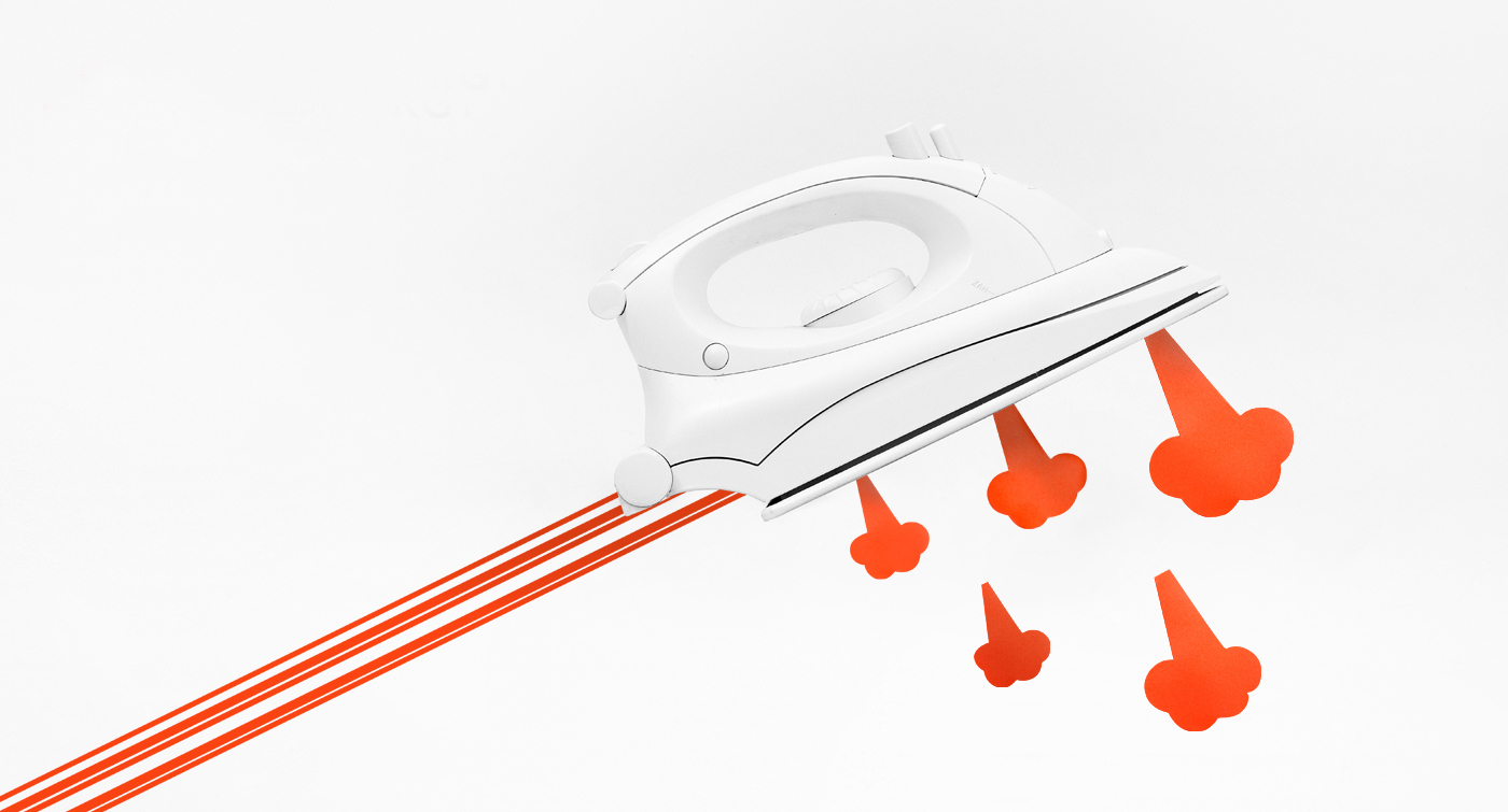
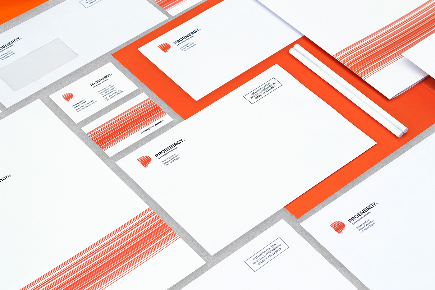
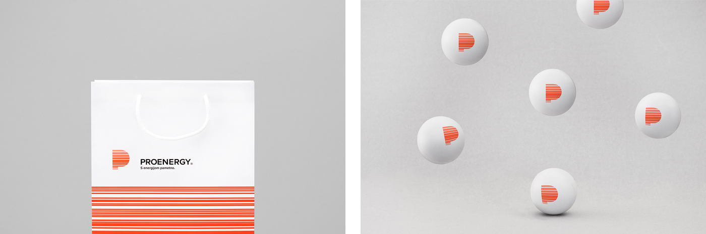
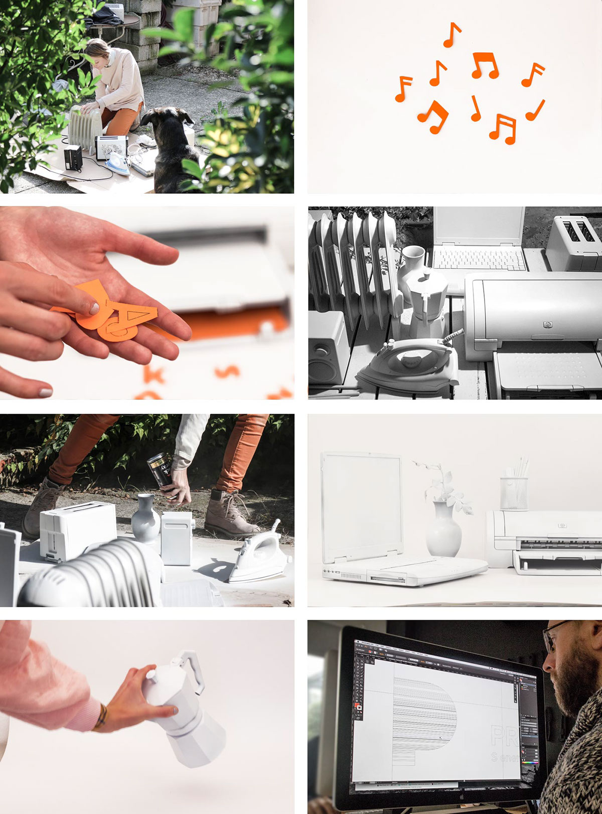
To further strengthen the concept and give the company a more human face we proposed a series of brand image visuals showing people's everyday home and business appliances come to life thanks to the energy delivered by Proenergy. We also designed the complete stationery system, contracts, pricelists, bags, etc.
Art Direction and design: Igor Manasteriotti
Design and photography: Ana Valjak
Agency: Manasteriotti DS
Slogan by Utorak


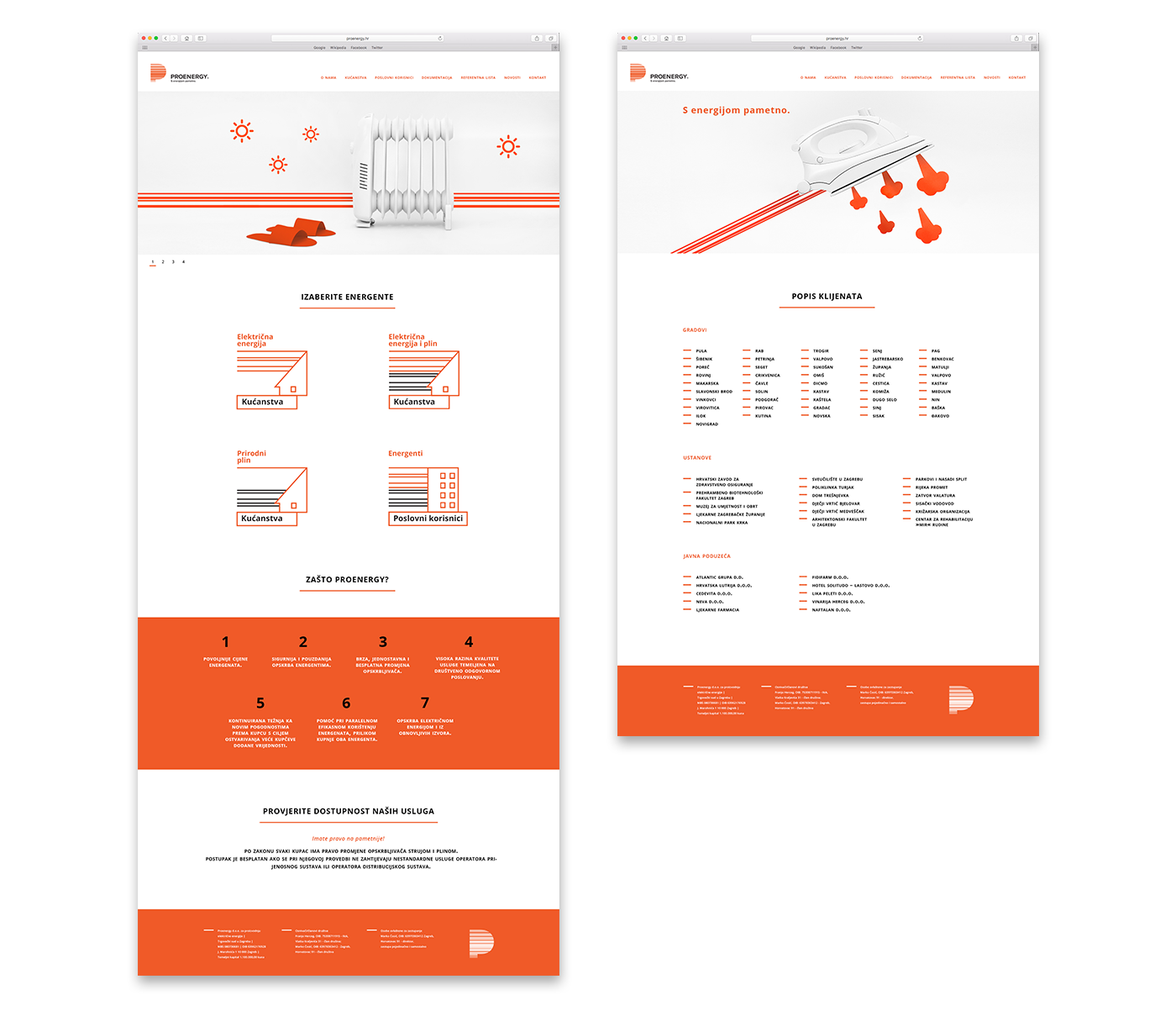
A series of visuals depicting how people's everyday home and business appliances come to life thanks to the energy delivered by Proenergy. They are used in posters, flyers and website (under construction).


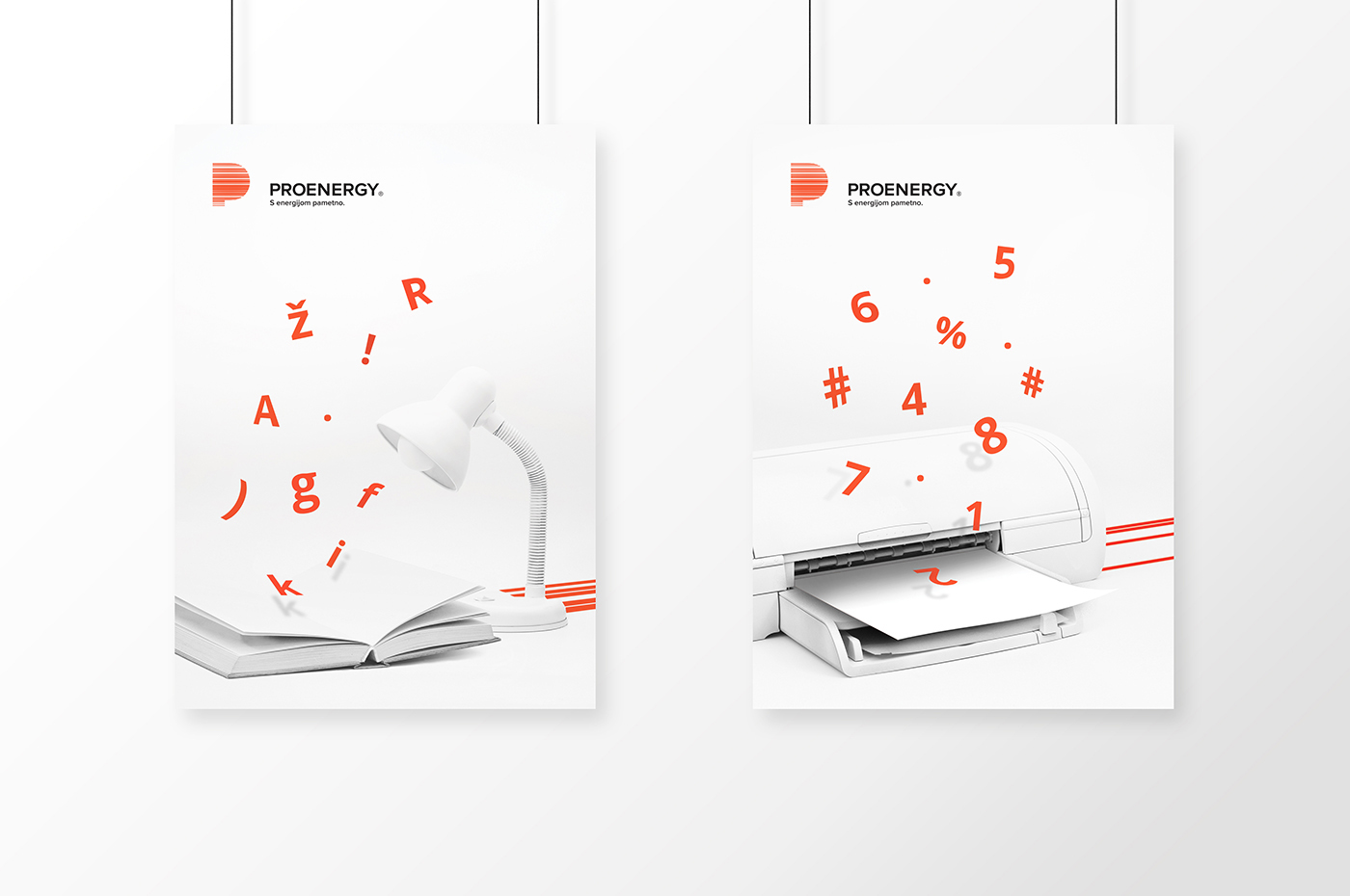

To make the brand visuals we bought the necessary appliances in a local flea market. Lots of haggling was involved. Next, we cleaned and spray-painted them to unify their design and make them appear more sculptural before photographing them.
THANK YOU
www.facebook.com/Manasteriotti
www.manasteriotti.com
www.facebook.com/Manasteriotti
www.manasteriotti.com


