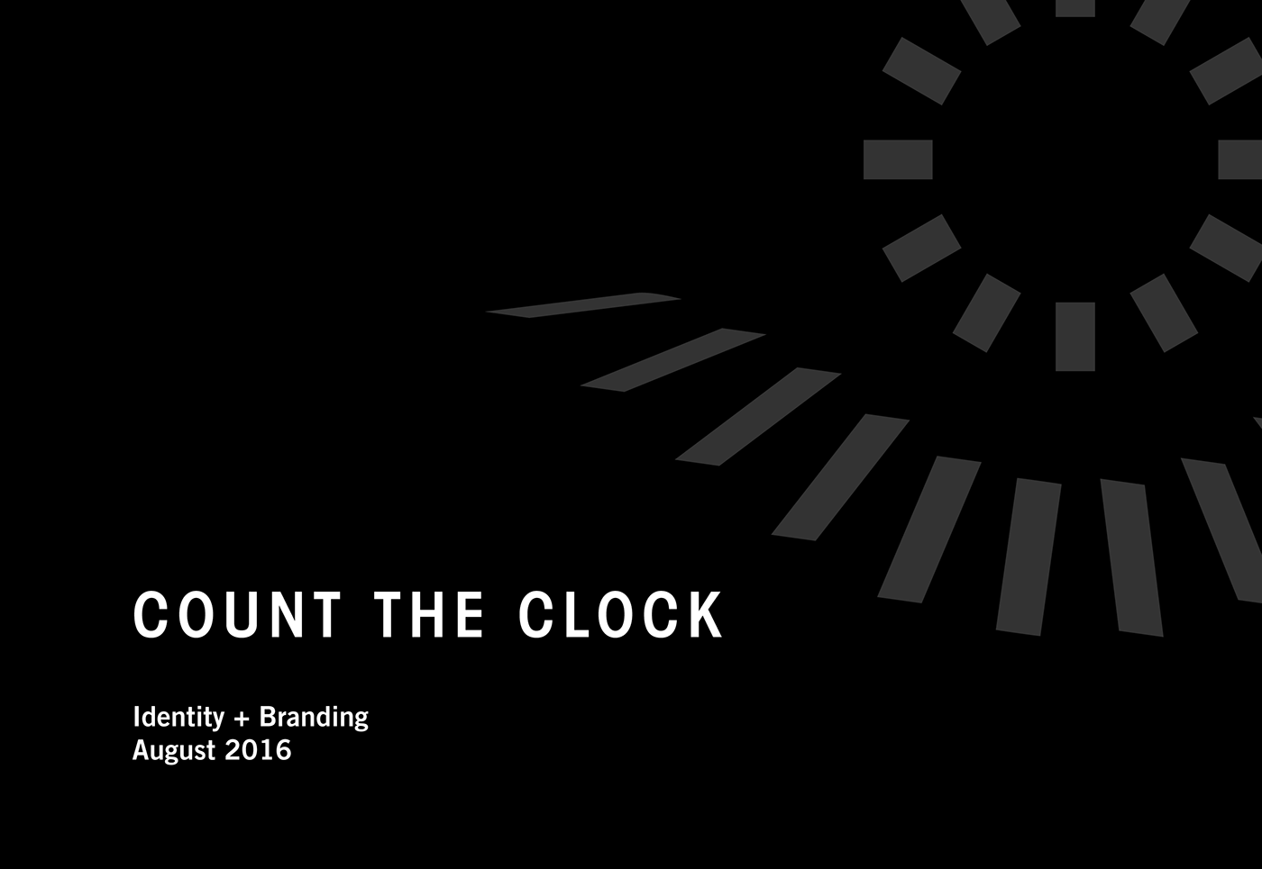
Count the Clock Productions is a production company created by a team of Northwestern University filmmakers. Their name, “Count the Clock,” comes from a phrase coined by Shakespeare in Sonnet 12 in a time long before clocks were invented.
To celebrate their two year anniversary, Count the Clock reached out to me for a visual brand that represented them as a forward thinking, path blazing studio defining the next generation of filmmaking.
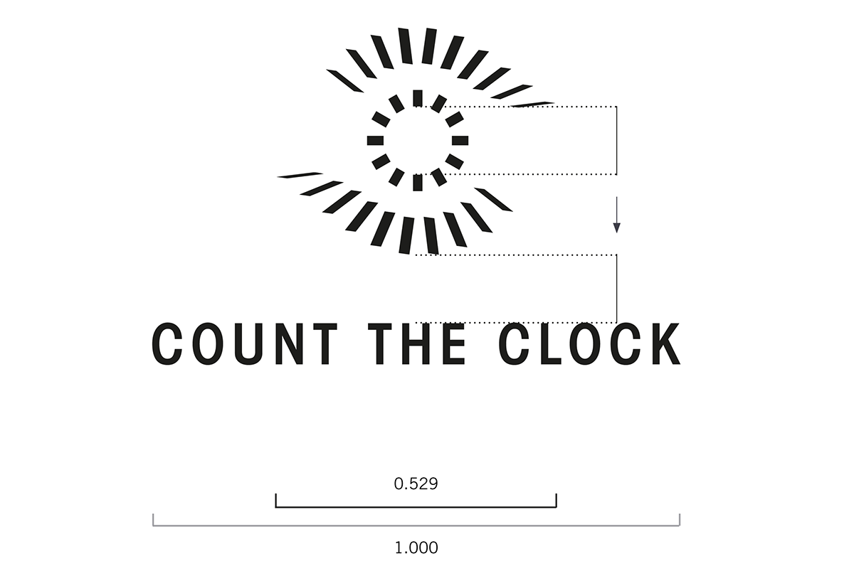
The Logo
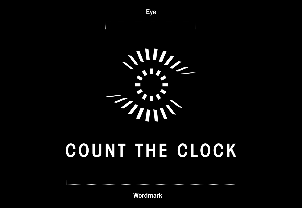
The logo is made up of two elements: The Eye and The Wordmark.
The Eye is a single color symbol comprised of 32 strokes of varying lengths and angles, arranged in two layers that form an orbital formation. The central ring symbolizes the 12 dials on a traditional timepiece. Surrounding it is a 24 dial symbol disintegrating at the sides. Together, they evoke an image of an eye while creating a sense of dimension, as if transporting the viewer through time.
The wordmark uses the typeface Avant Garde Condensed Book Bold, with optical kerning and 120 tracking.
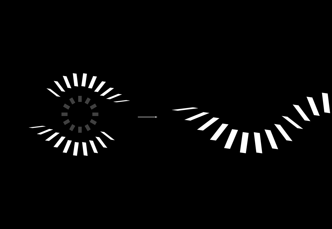
The Frames
The Frames represent not only the passing of time and dimension, but also the frames in a moving picture. They are constructed from The Eye, taking the top and bottom row of “lashes” and merging them into a wave-like shape.
Through the use of frames, it is possible to create graphical texture and draw emphasis to key elements in an image.