Project Introduction
This project shows the development process of a detailed prototype of a new mobile application in a very short time, as well as a desktop mockup of the visualization of the data gathered in the mobile app. The original product was given by another team which I was not involved, but the challenge is to implement a working prototype and basic UI design based on a specification developed by a team.
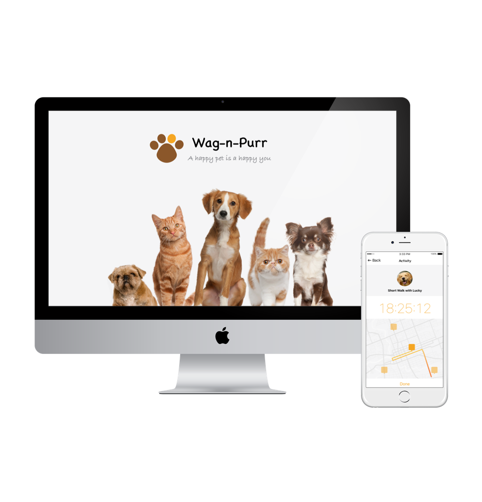
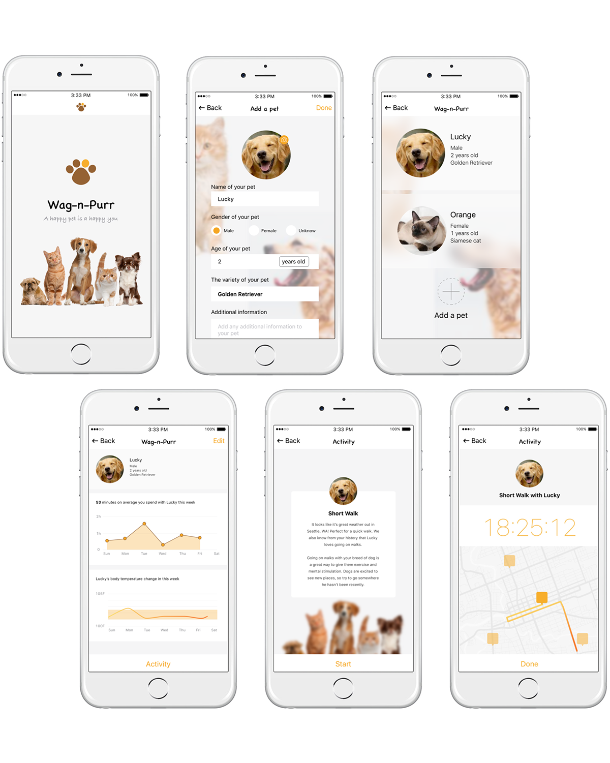
The given product, named Wag-n-Purr, is an iOS 7 application that helps motivate and empower new and seasoned pet owners to engage in novel and fulfilling activities with their pets. The application utilizes contextual aware information and a learning algorithm to recommend activities tailored to fit the owner’s busy lifestyle and the particular needs of their pet. The overall goal of this application is to help pet owners become more engaged and informed in the care of their pets to help their pets to live long and happy lives.
Navigation and Flow
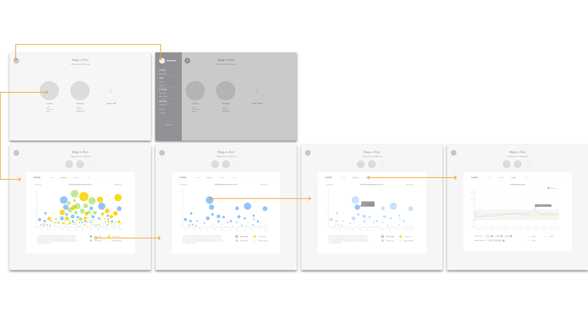
There are currently three main flows in the application: 1) Adding a pet; 2) Choosing and doing an activity (manually and via notification); 3)Viewing situation-based help articles. Additionally, a special first launch setup flow is launched when the user does not yet have a pet added.
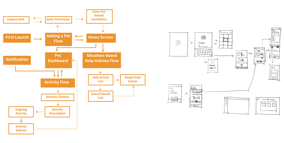
In order to use the recommendation engine aspect of the application, users need to add at least one pet to the system. The Adding a Pet flow is initiated from the Home Screen. In the case where the user does not have any pets added (i.e. when they first launch the app or if they remove all of their pets), the Adding a Pet flow is initiated from a Getting Started screen.
The Activity flow begins with a recommendation of several activities. Once the user selects an activity, they see details about how to perform the activity, the benefits that it will provide, and other information about why the activity was recommended. The user can choose to begin the activity, which launches an activity timer. Upon completion of the activity, the user goes to a debrief screen which provides more information about the activity they just completed. The relative data will be collected from the biometric device on your pet automatically(optional). Finally, the user is taken back to the Pet Dashboard.
Wireframe
The wireframe shows the two loops in the application which are the “adding a pet” and the “choosing and doing an activity”. The link screens for these two loops are the home page and the dashboard page. Since the overall structure of the application is not complicated, and the add a pet function will be used not quite often, the bottom navigation bar as a result is unnecessary here. Just a side bar for the account information could be saved for the home page.
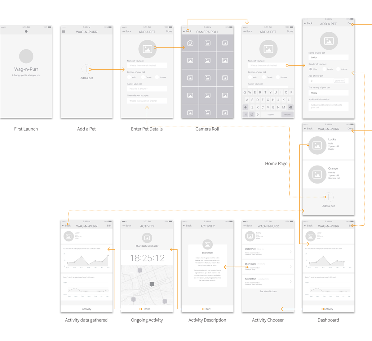
Using side bar to hide and show the information about the account (user). The reason why I choose hamburger bar is that I think it’s an effective way to separate user’s information and pets’ information structurally and visually, especially for the website with the relative simple structure.
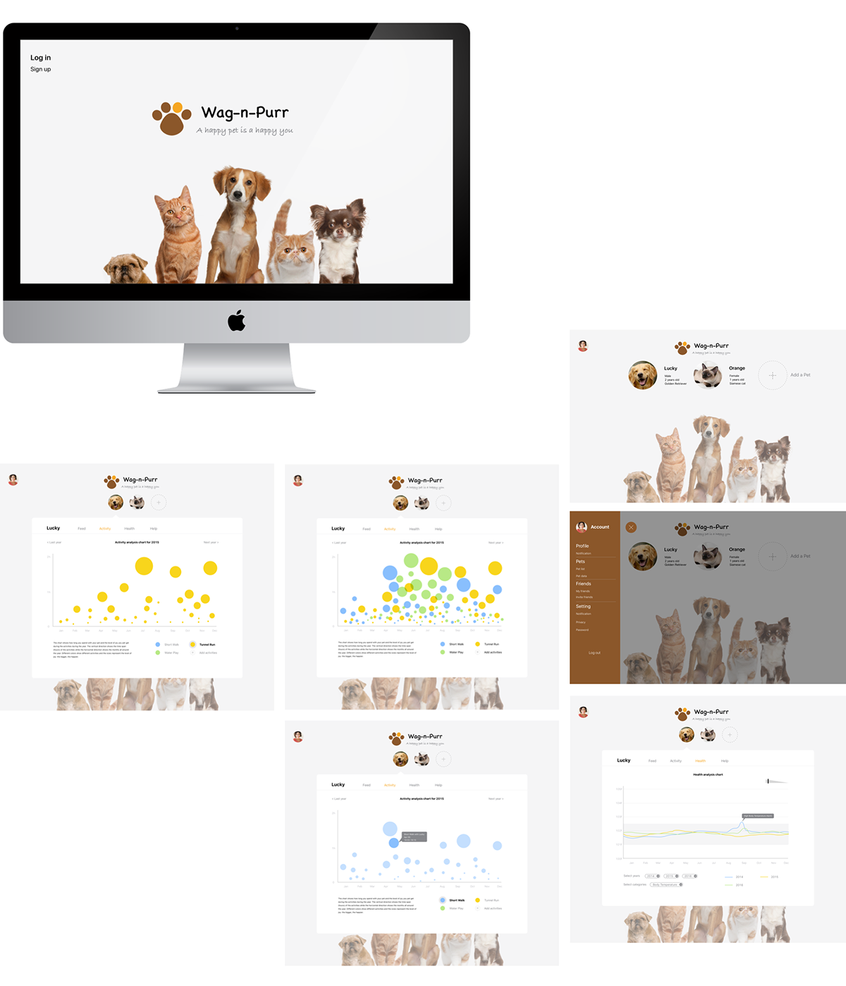
The health data, activity and other visualized information of pet shows when the user select the pet. Based on different animals, the data is not comparable for the most situations. So, it’s better to show the data based on one or certain “owner”. And it’s also easier for veterinarian to track one pet’s health history via this way.
User also can manage the pets through the web. So, the web is an extension of the mobile and the wearable (perhaps).
Visual Design
The visual design is a very important part of this quick design challenge. I chose orange and brown tone as the color scheme by referring the color of fur. The logo and the typeface tried to create a relaxed and happy narrative to users. Since there would be more than two colors in the data visualization part, many white space were using to keep the overall layout clean and neat.

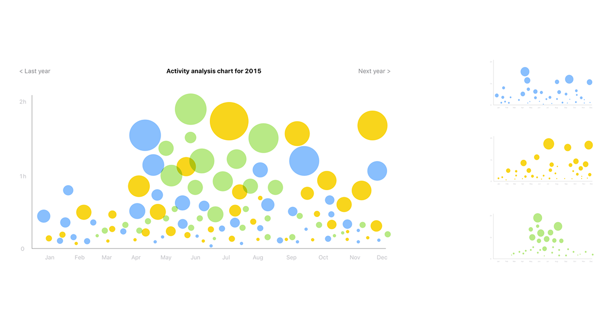
Data Visualization
The chart shows how long you spend with your pet and the level of joy you pet gets during the activities during the year. The vertical direction shows the time span (hours) of the activities while the horizontal direction shows the months all around the year. Different colors show different activities and the sizes represent the level of joy: the bigger, the happier.