This Project was a Collaborative Effort:
STUDIO: Firebelly | CLIENT: Public Media Institute
DESIGN TEAM: Nick Adam
DEVELOPMENT TEAM: Matt Soria + Bryant Smith
DESIGN TEAM: Nick Adam
DEVELOPMENT TEAM: Matt Soria + Bryant Smith
TYPE: Grilli Type, GT Haptik
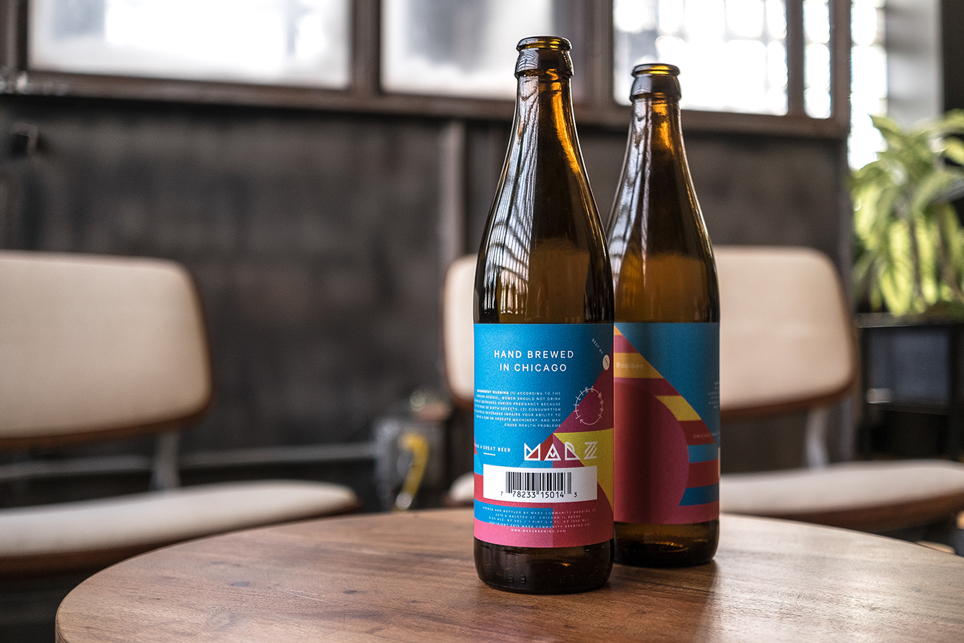
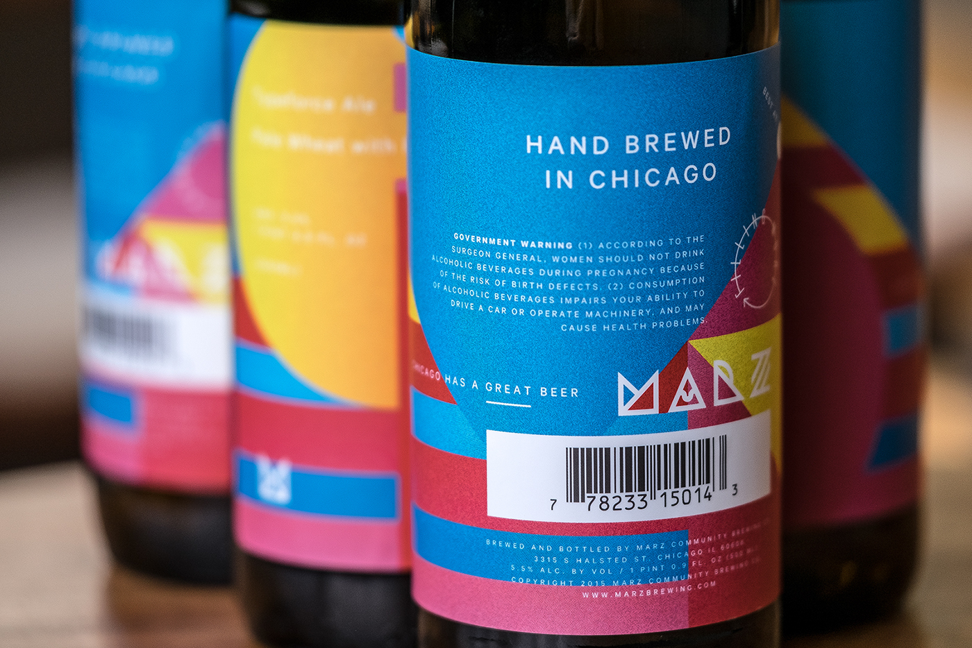
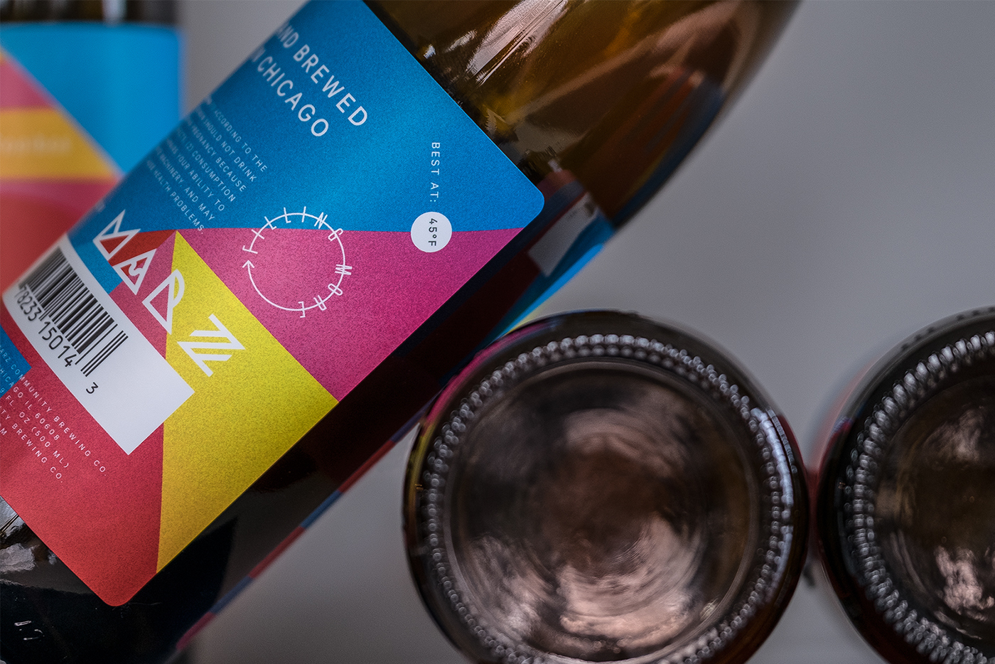
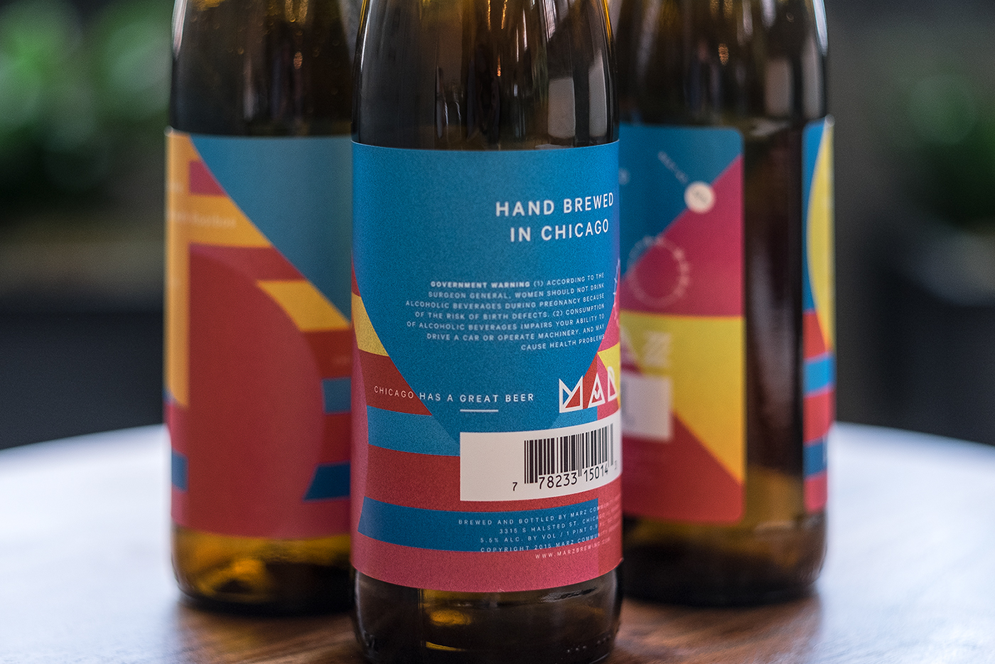
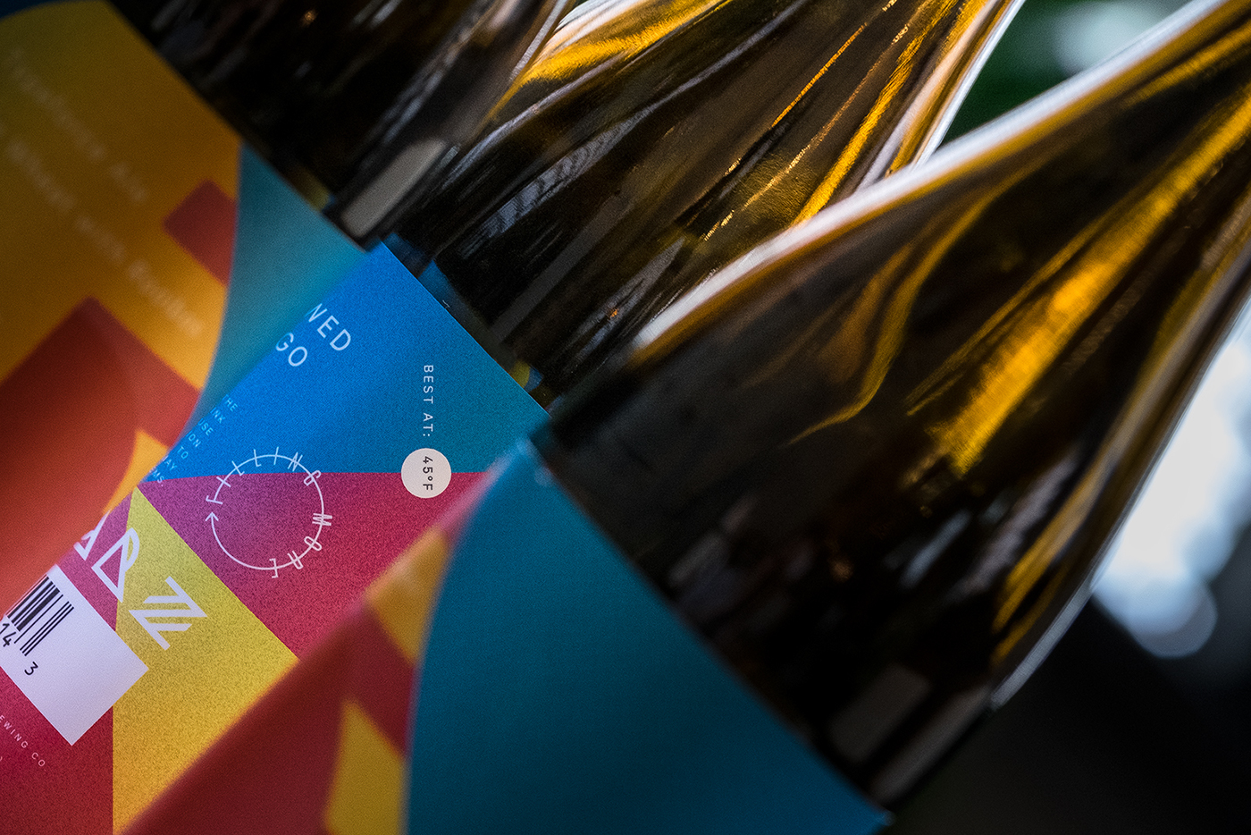
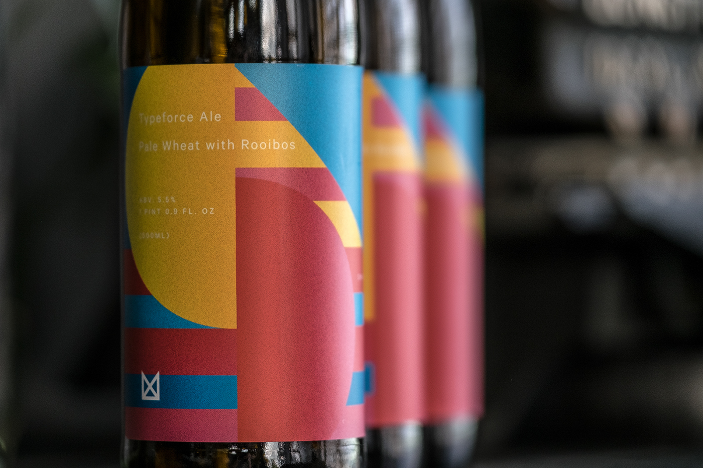
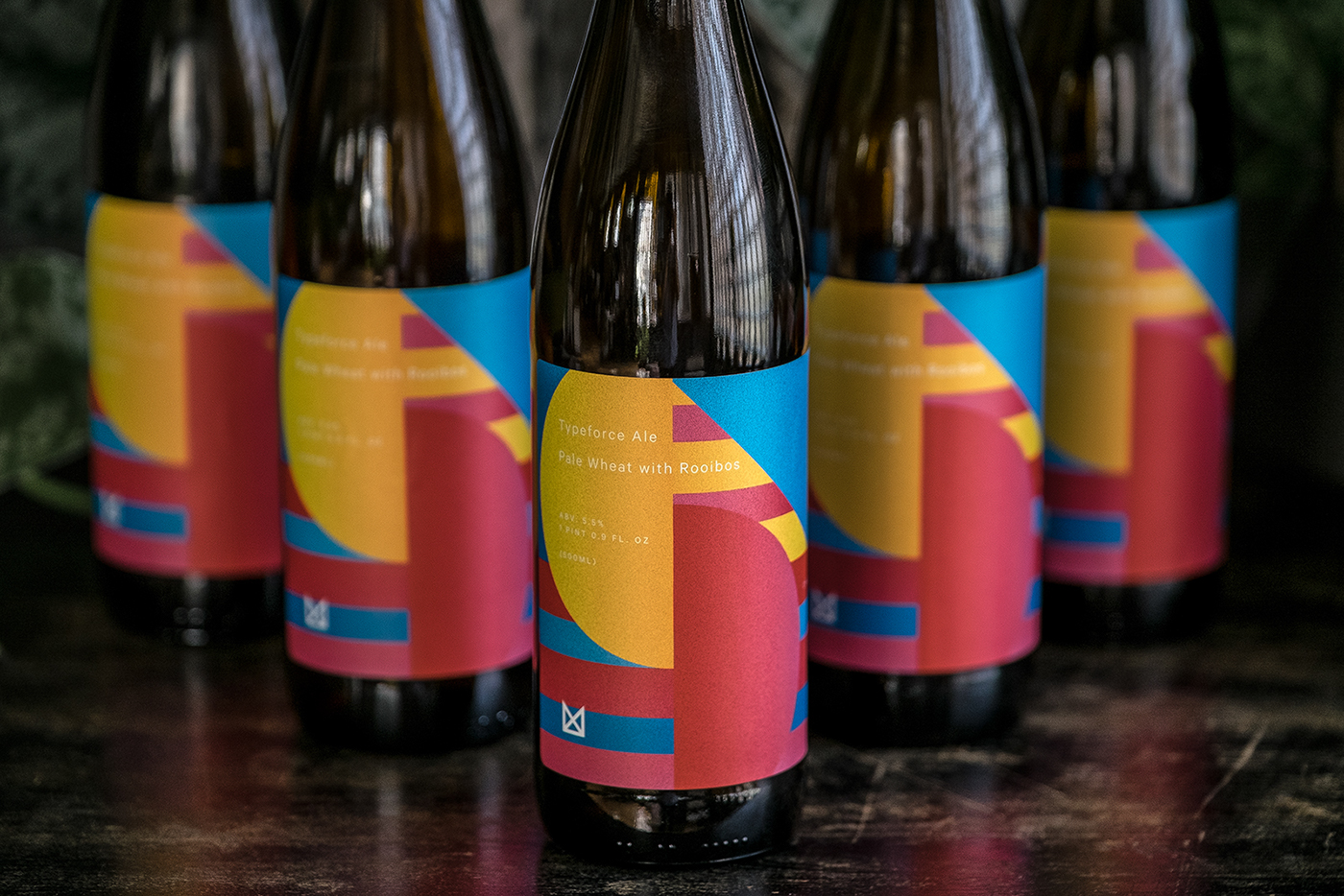
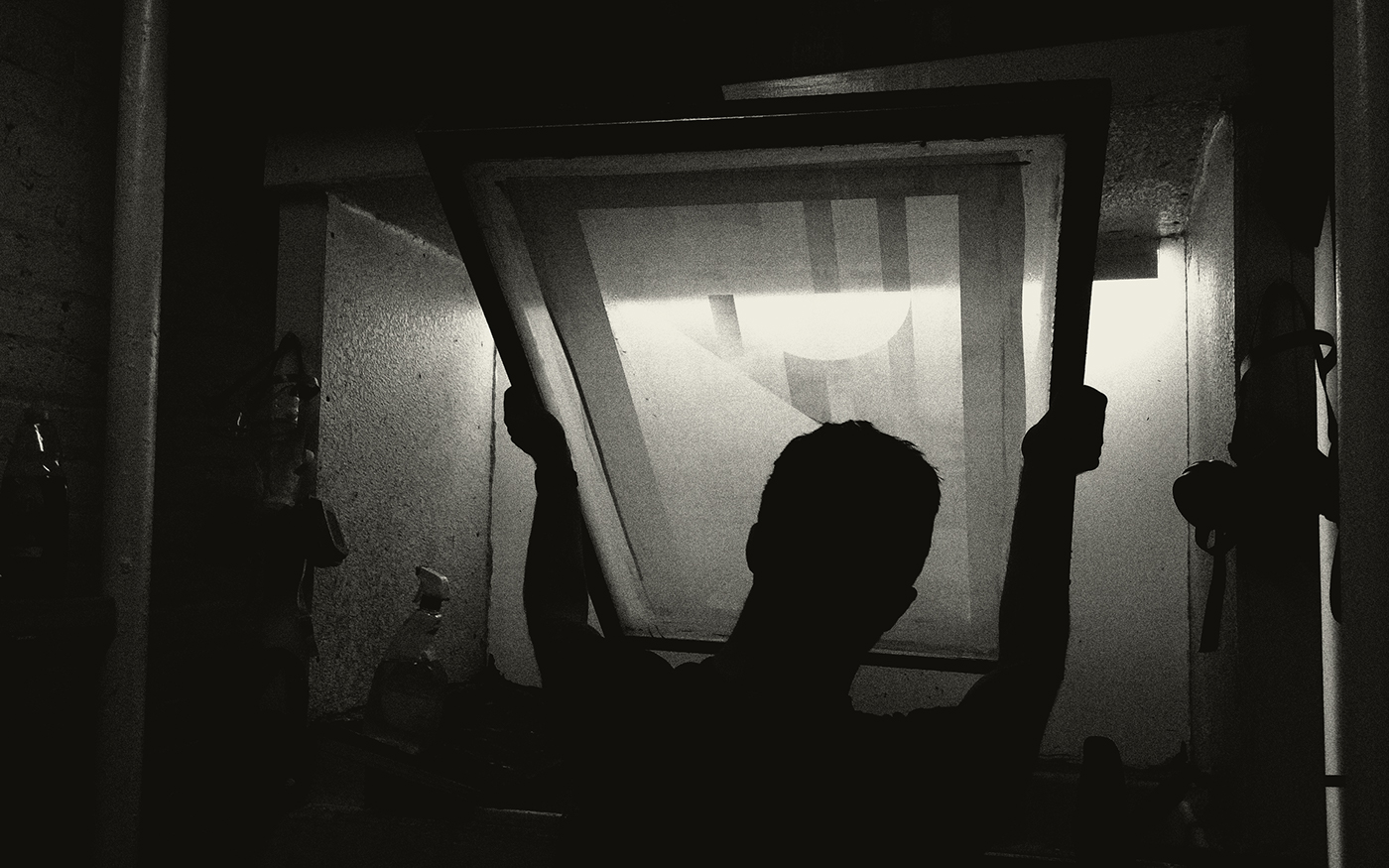
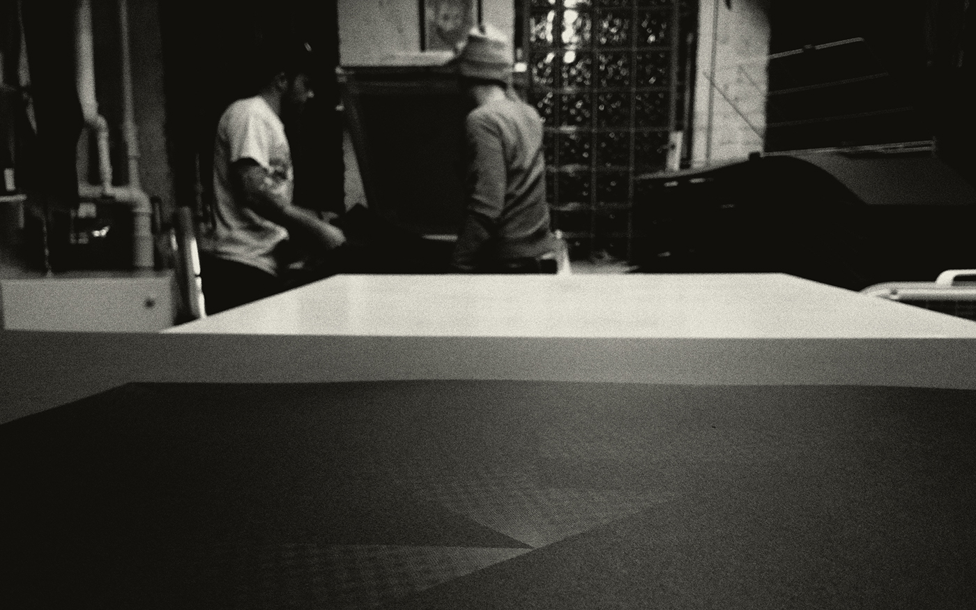
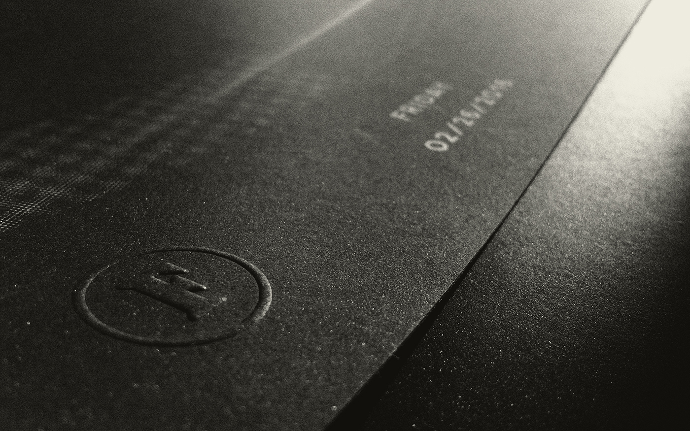
During my time at Firebelly I had the honor of directing and designing the identity system, website, and promotional materials for Typeforce 7. We were able to partner with Marz Community Brewing for a custom designed, limited edition beer to be available at the event. Exhibitors were gifted a silk-screened poster printed by Ghost Press on French Paper.
PROJECT CONCEPT:
In the contemporary culture of graphic design, an identity is commonly understood to mean much more than a logo. An identity is in fact a system, often built in response to a form, generally a logo. Though a logo can be a powerful tool that can immediately convey meaning, it’s only one piece of the kit that makes up an identity. Identities can be established lacking this piece.
Graphic designers and those working directly with visual identities accept this, but many outside of the discipline often think of the logo as the whole identity. This difference in understanding served as an opportunity to explore a systems approach to branding through an identity system without a final form.
The 7th annual Typeforce exhibition took place on February 26, 2016; creating its identity offered an opportunity to explore the idea of identity as a kit of parts. This wasn’t necessarily at the top of my mind when beginning the project, but I arrived to it in a manner that Cranbrook’s Elliott Earls might classify as post-facto rationalization. Wherein the process, specifically the design making, is an act of research and yields unanticipated discoveries.
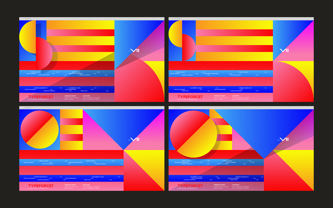
The Typeforce 7 identity didn't have many deliverables to evolve this kit of parts across, but the responsive and interactive nature of the site allowed users to play with the pieces and evolve the look and feel.
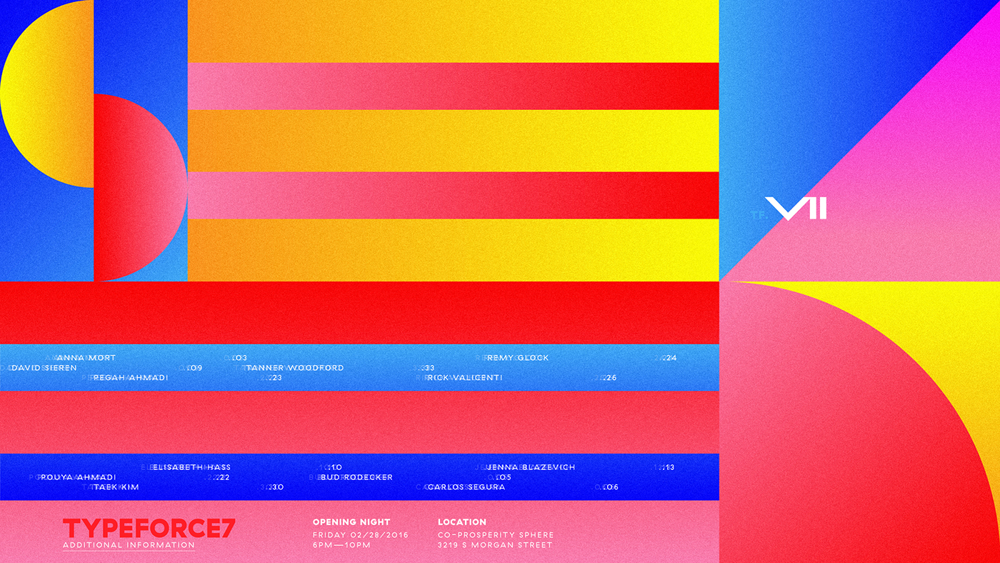
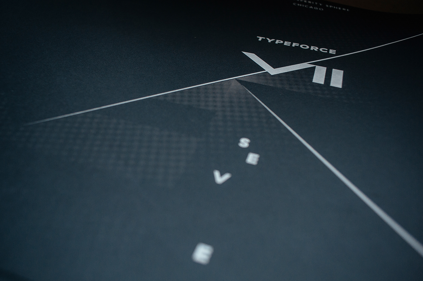
The work for the 2016 Typeforce started in my usual manner: scouring semiotics for significant, dramatic meaning. Where better to look than a number with known recognition: seven? Beyond being the lucky number, it too symbolizes the deadly sins.
Capital vices inspire a wealth of imagery that could make for a system with legs—here — toads represent greed, lions portraying wrath, and the plumage perfect peacock personifies pride. Meaning, visual play, energy that has been around for nearly 1800 years, and who doesn’t want an opportunity to explore ‘wrath’ in their work?
I’m certain I could make a fantastic exhibition identity based on sin, (I’d love to), though this did not feel right for an event that historically has served as a welcoming and safe place for people’s creative expression.
So, it was back to the books and to sketching. Emerging near the same time in history as the sins, the seven virtues. It is said that practicing the virtues protects against temptation from the seven deadly sins. Wow, full circle!? Where else did I go? All over the place. I’ll let you google the significance of the number seven in a tarot deck, because all of this dark, heavy meaning was really starting to be too much for me.

What about making as exploration, as pure fun. Making not out of requirement, but because we have a mind, hands and tools? Making for the love of design and achieving something pure, something that elicits aesthetic pleasure? Scrapping everything, pushing around shapes and colors, fun emerged and I had little idea where it was going. It felt guilty. Like how you feel after leaving school, entering the design profession, starting to make kick-ass work for friends and clients, telling your family—this is what I do.
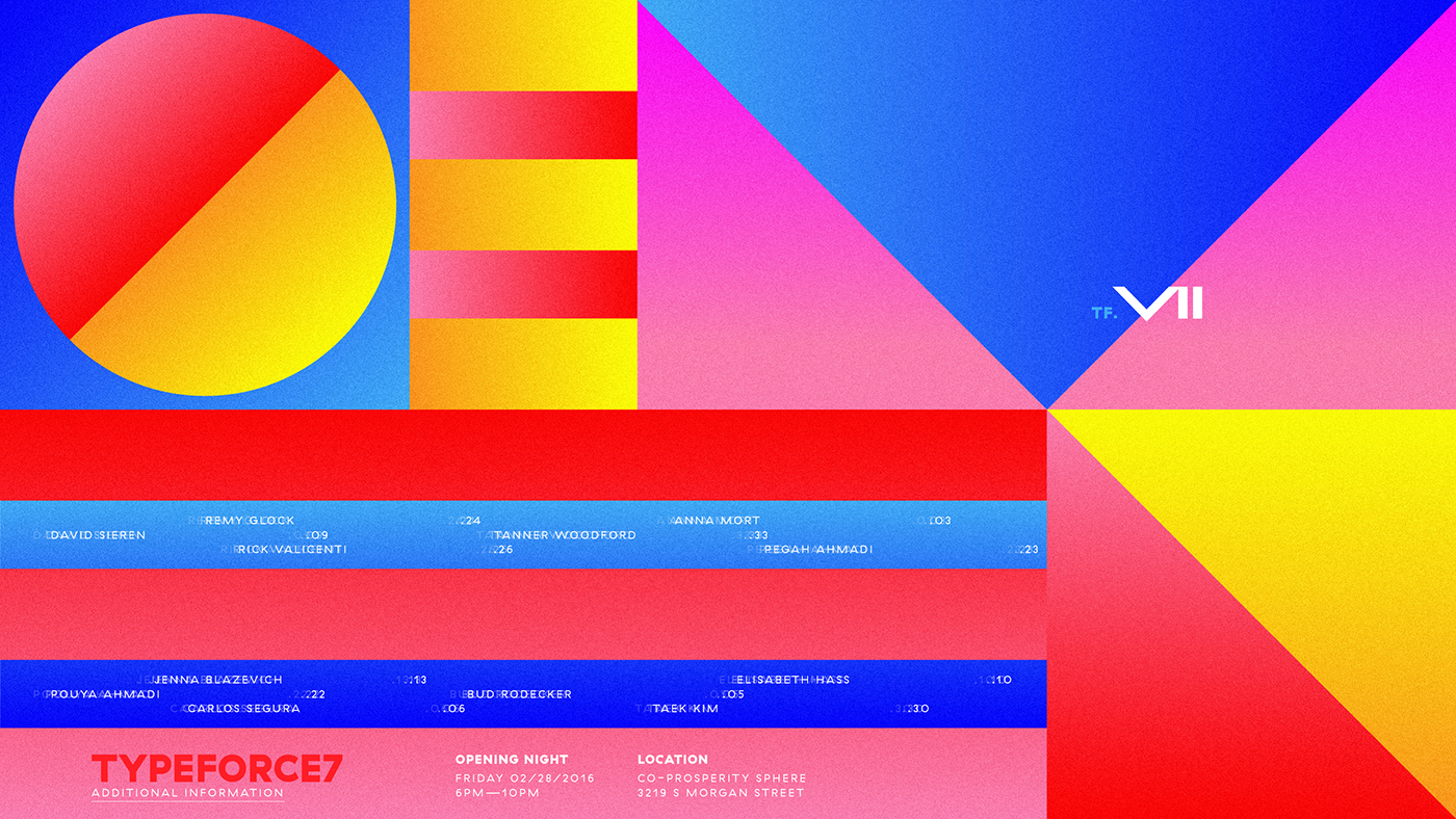
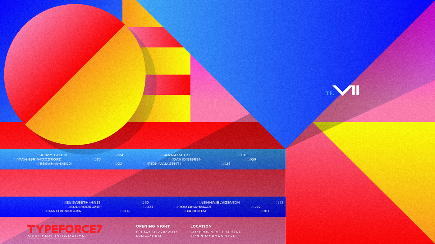
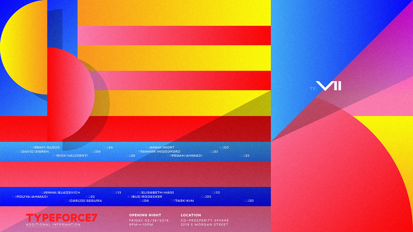
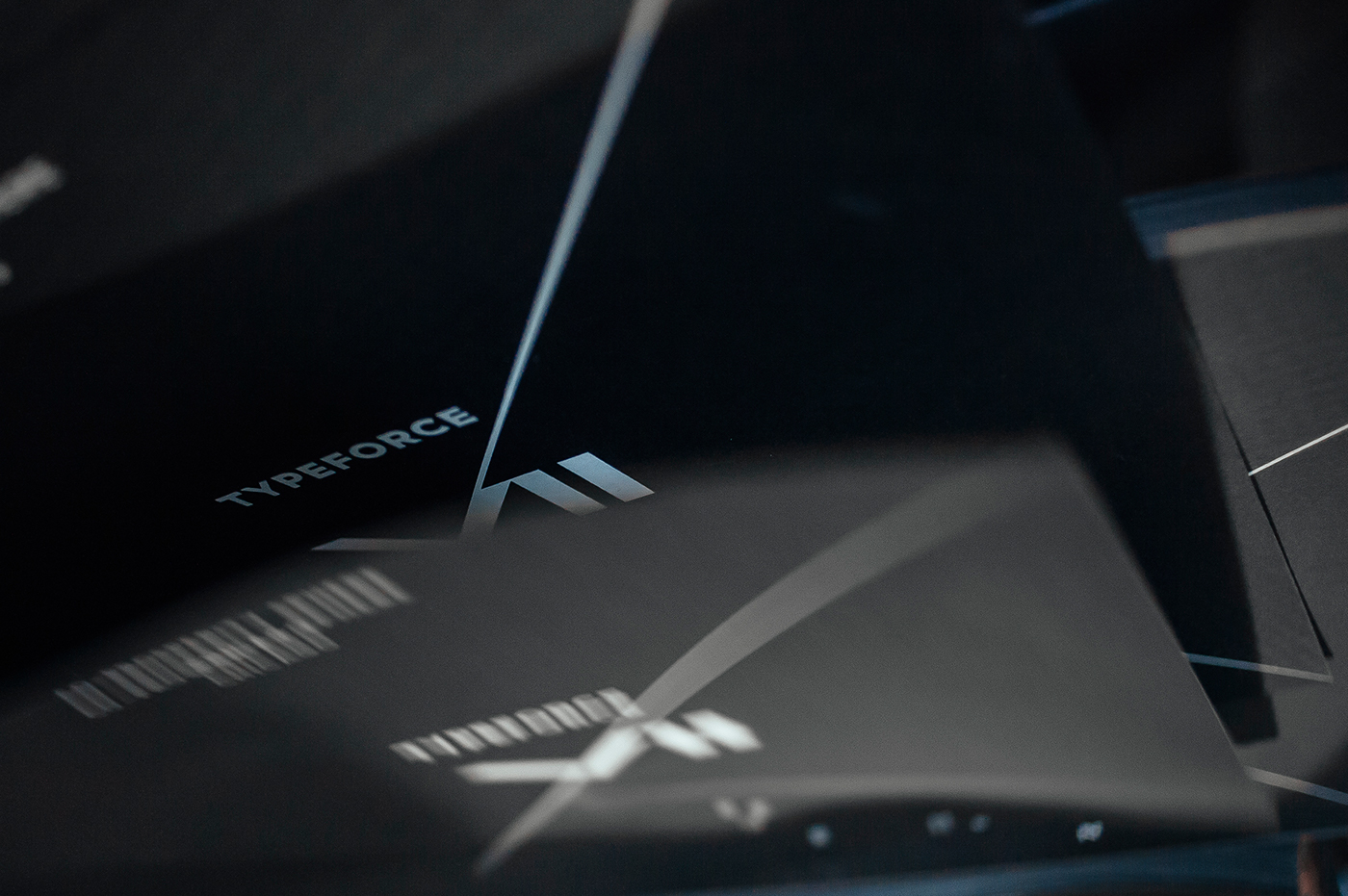
This idea began to put the first lines on the paper. With letters returning to their geometric roots; this geometry could shape the composition and then be defined digitally by viewport height, where the horizontal attributes are determined by a responsive expanding and anchoring of angular elements.

This build can translate across all devices, to mobile and just as easily to print. This idea takes the responsive nature and need for all things and puts it in the forefront, but rendering this graphically means there is no final form. It was this act that brought about this idea of our sans-logo identity as kit of parts. By designing variant styles and sizes for the shapes that represent consonants, the identity became something ever-changing, influenced by user interaction.
In this is a hyper post-internet framework for an identity, we built this with straight CSS, no assets (no SVG, JPG, PGN) other than two font files for a black and regular cuts of GT Haptic from Grilli Type, chosen for its mono-linear geometric build. Keeping it internet-ie, I went with light-based bright, bold colors taken directly from Adobe's default RGB palette. Seven colors allow us to show depth via gradient blends and serve an historical nod to Isaac Newton's defined rainbow spectrum.

Internal projects like this one must move quickly. With neither road map nor specific destination in mind, I’m particularly proud that we landed on an identity that has no logo, no final form and a minimal/manageable amount of parts.
The kit of parts as they exist today includes: set shapes and variants that spell S E V E N, color palette that can mix and blend as desired, noise texture to add slight tactile qualities, GT Haptik for its geometric harmony.
Recognition and Awards:
Society of Typographic Arts, STA 100
Project Deliverables:
Branding, Concepting, Identity Design, Strategy, Creative Direction, Website Design, Beer Packaging, Poster design, Digital Collateral
This Project was a Collaborative Effort:
STUDIO: Firebelly | CLIENT: Public Media Institute
DESIGN TEAM: Nick Adam
DEVELOPMENT TEAM: Matt Soria + Bryant Smith
DESIGN TEAM: Nick Adam
DEVELOPMENT TEAM: Matt Soria + Bryant Smith
TYPE: Grilli Type, GT Haptik


