Overview
Nextnap is a company that specializes in promoting sleep health. They offer a service in which customers rent themed room spaces with Nextnap-brand napping pods and use them for three different set times (20, 60, and 90+ minutes).
Their philosophies are: If you make time in your day to exercise, socialize, watch TV, etc., why don't you make time to sleep? and Sleep is personal.
Inspired by gym memberships, Nextnap offers different monthly/yearly paid memberships (as well as single-use) to encourage their customers to keep using their services and track their sleeping patterns. Their premium members also have access to consultations from sleep-professionals. In addition, Nextnap is partnered with some companies that host their Nextnap-brand napping pods to encourage healthy sleeping habits and increased productivity in the workplace.
Customers are generally aged 25-60, and range from business professionals to the 10% of people in the United States from any background that suffer from sleep disorders.
Mood Board
Before we designed our corporate identity, we came up with images that represent the look and feel of our buildings and offices, as well as the pods and themed rooms. Our office look was inspired by minimalist, Eastern-style interiors and patios, particularly the design work of Kenya Hara. The room themes are inspired by different relaxing sceneries, such as Japanese gardens, aquariums, the night sky, and many others.

Logos
Our mark is a power button with a "refresh" symbol. It only takes a minimum of 20 minutes to get enough rest to power through the rest of your day, so we wanted our logo to represent how quick and simple it is to achieve this; it's as easy as clicking a button.
The teal-blue of the power button represents sleeping, given its calm, cool tone, and the reddish-pink represents the energy and power obtained through getting a healthy amount of rest.

The mark
Type only


Lockups
Icons
We created a series of icons using the graphic style of our logo. They each have a playful, thick-lined style, and are intended to be used on our applications, particularly for the web.

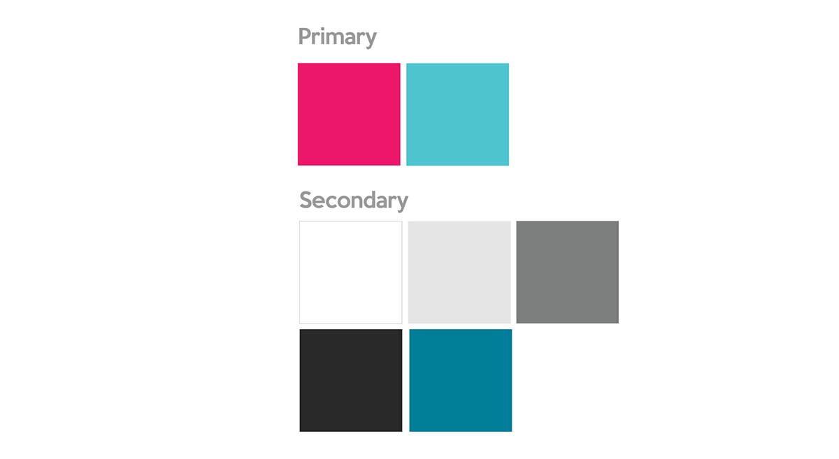
Color Palette
Our primary colors, used in the logo and more of our graphic style, represet energy and relaxation. Our background colors range from white to medium grays to give our company a contemporary, sleek feel, as well as 80% black and dark teal-blue for accents.
Typeface Palette
We decided on the typeface "Keep Calm" for our logo and display type because it combines classic, serif elements with a sleek, modern san-serif typeface. As a secondary typeface for our copy, we chose the "PT Sans" family because its lowercase letters match with the rounded counters of Keep Calm, and it coordinates with the display type nicely on our applications.

Website
Since our company is so new and revolutionary, having a user-friendly and informative website was key to developing its brand identity. Here are some screen grabs of the desktop site:
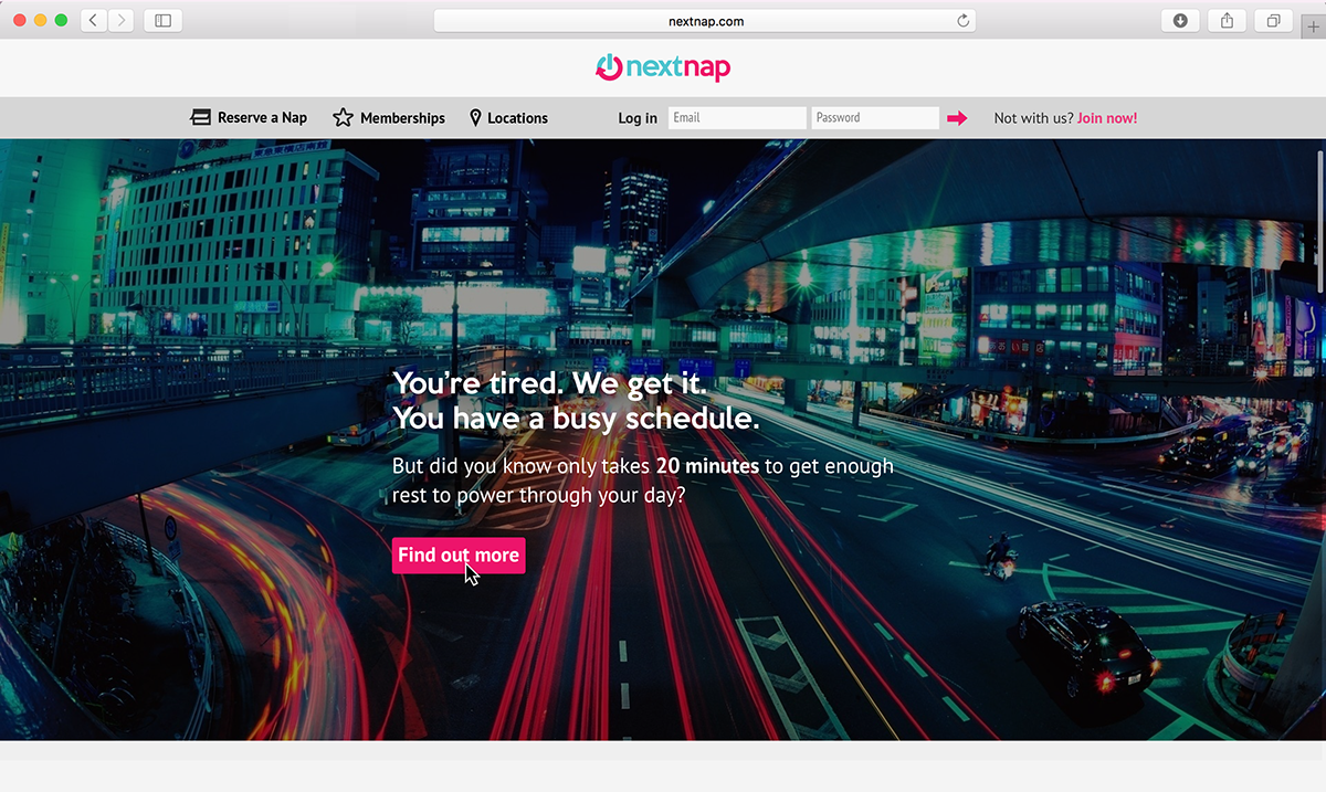
Landing Page
This is what is what a customer that is not logged into an account will see when they open the site.

Our Mission
After the customer scrolls down, or clicks "Find out more," they will learn about what the company does/why they should use it.

Our Services
After the customer scrolls down or clicks "Take a look," they will see this page. It gives them information about Nextnap's pods, themed rooms, and office partnerships.

Welcome Page (For Members)
Instead of the first landing page, this is what a customer would see if they are logged into their account. This is also the page that they are referred to after they log in. Here, they can view their account history and napping progress, as well as recommendations based on their sleeping patterns and previous purchases.

Reserve a Nap
This is one of the pages on the navigation bar. It helps customers reserve a nap in advance so that they can tap in and tap out easily during their work day.


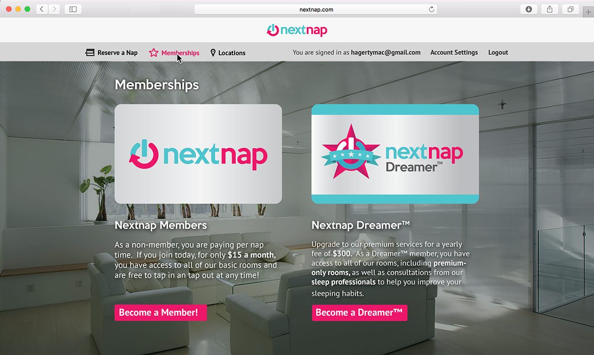
Memberships Page
This gives the customer information about our two different memberships, and lets them sign up or upgrade.

Locations Page
Here, a customer is able to click on the map and view our several locations and look up their addresses/phone numbers.
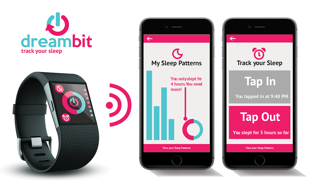
Mobile/Watch App
We also have designed a smartphone application for members to use that allows for them to easily access their account, history, and stats, as well as reserve naps and tap in/out of their appointments more easily.
In addition, we have created Dreambit, a digital watch application that pairs up with the mobile application to allow for even easier access to important features.

Membership Cards
Here are the membership cards for each type that can be used by customers that do not prefer the digital applications to swipe in/swipe out of their appointments.

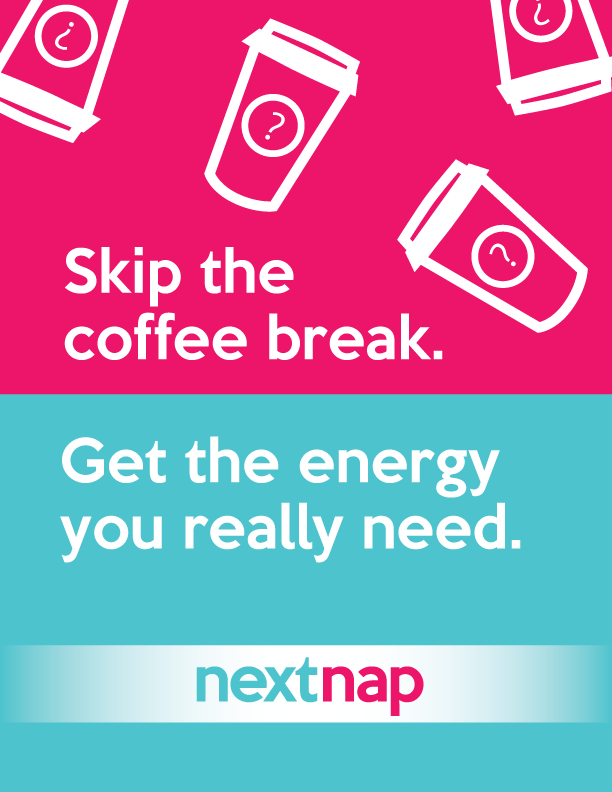
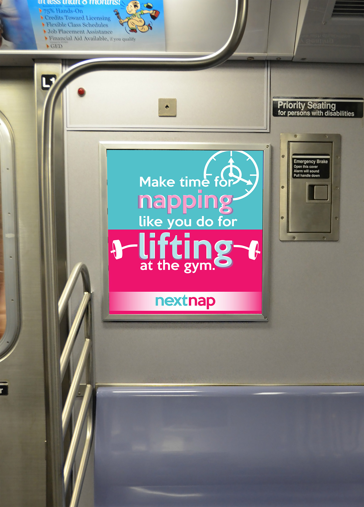
Print Ads
Here is how our graphic style can be applied to print advertisements, and different ways that they can be seen by viewers.


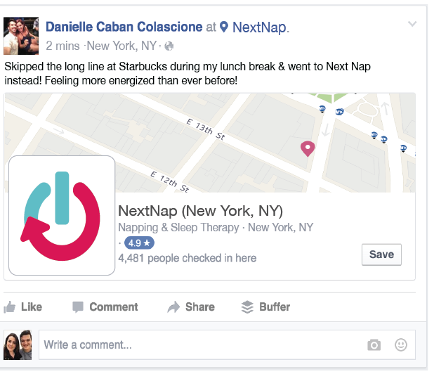
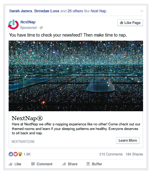
Social Media Ads
To promote Nextnap to a wider audience, we also applied our graphic style and advertisements to social media. Here, you can see how typical Facebook check-ins and suggested page advertisements would look. In addition, we also included an advertisement on LinkedIn, since many of our target audience members use it.


Credits
Jason Huang - Logo design, iconography, card design, and mobile/watch application
Colton Schwartz - Logo design, color palette, typography, advertising design
Jackie Boody - Copywriting and advertising design
Marisa Hagerty - Typography, web design, and product design design
Colton Schwartz - Logo design, color palette, typography, advertising design
Jackie Boody - Copywriting and advertising design
Marisa Hagerty - Typography, web design, and product design design


