Student assignment.
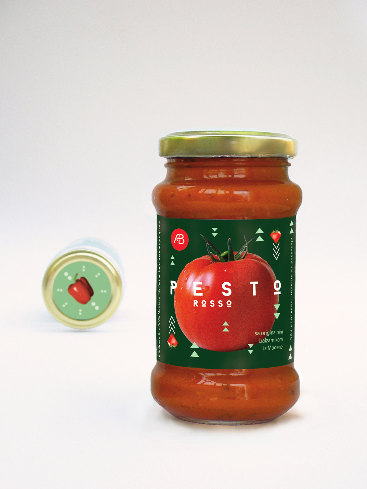
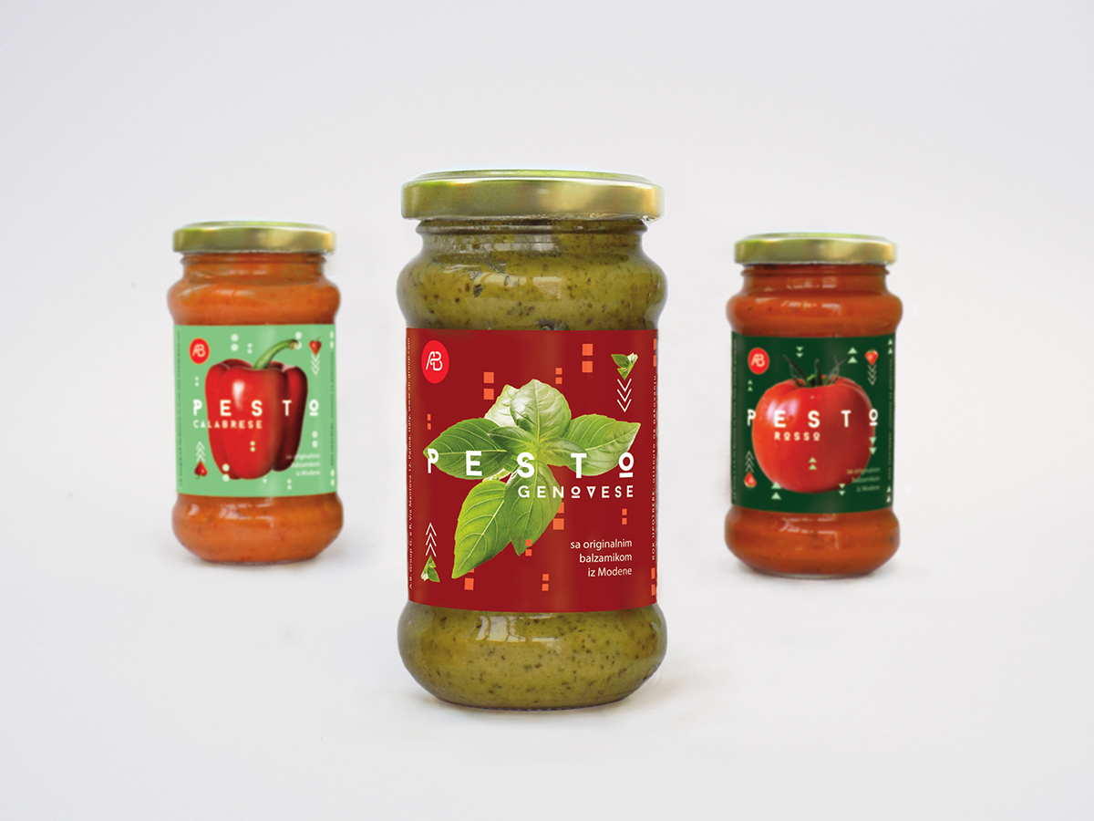
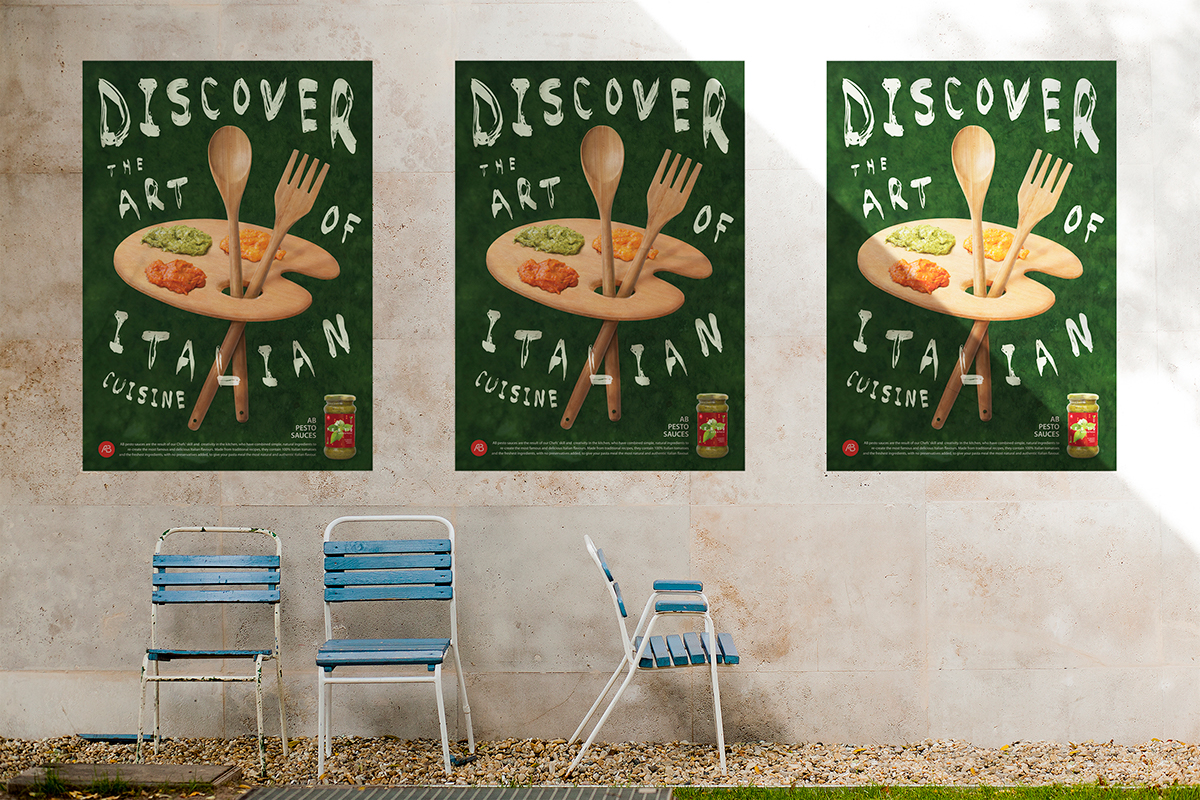
The task was to create not just a series of labels but the whole advertising campaign for the product. Loving Italian food and all things Italian, I decided to create a series of labels for various pesto sauces. :-)
The name of the brand (A.B.) is also fictive but it was chosen because, to some extent, it can refer to the term „ABCs“, that is, the rudiments of something-just like this sauce is the key element of Italian pasta dishes and a must-have for every lover of Italian cuisine. The basic shapes on the labels (the circle, triangle and square ) convey this message, too. By combining the appealing photographs of the main ingredients for each type of the sauce with fresh and vivid greens and reds, I wanted to create labels with both retro and modern looks.
Font used: lovely "Baron" by Fontfabric! :-) https://www.behance.net/gallery/9537663/BARON-(Free-typefamily)


Featured on Packaging of the World
3http://www.packagingoftheworld.com/2016/03/ab-pesto-sauces-student-project.html00
Design and Design Award
http://www.designanddesign.com/index-pic-35657.html
3http://www.packagingoftheworld.com/2016/03/ab-pesto-sauces-student-project.html00
Design and Design Award
http://www.designanddesign.com/index-pic-35657.html