

MBTA Commuter Rail App Redesign
Close to 200,000 people use the MBTA commuter rail every week. To streamline the process of buying tickets, the MBTA provides an app where you can check train schedules and buy tickets. However, the app has many problems, which I have tried to address in this redesign.
Evaluation of Current App
The landing screen of the app serves as a portal to the different screen that make up functionality of the app. However, there is no immediately available information for the user to see - they have to click multiple times to get any information.
The landing screen of the app serves as a portal to the different screen that make up functionality of the app. However, there is no immediately available information for the user to see - they have to click multiple times to get any information.
Looking for schedules requires a lot of unnecessary steps. Instead of taking you to schedules to select, you have to pick between schedules and alerts. Alerts should be inline with the schedules, as it's important information that may be skipped over otherwise. As well as that, when searching up a specific schedule, it doesn't automatically update with new information when you choose a different selection, requiring a separate button for you to press.
When buying tickets, there are separate screens for selecting stations. This could easily be done on the same page, allowing users to refer to previous steps and to help users verify they've entered in the right information.
Entering in credit card information lacks some inline verification that helps make sure all information is correct. For example, numbers aren't grouped when entering in the credit card number, making it hard to check that all the digits are correct.

Landing Page Changes
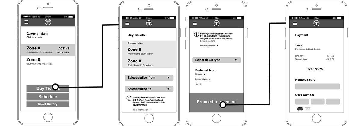
To make important information more accessible to users, tickets already bought are placed on the front page to easily access and activate them. The "Buy Tickets" and "Schedule" pages are the main use of the app, so they have been emphasized.
To make important information more accessible to users, tickets already bought are placed on the front page to easily access and activate them. The "Buy Tickets" and "Schedule" pages are the main use of the app, so they have been emphasized.
Since there aren't many important settings to change in this app, the link to the "Settings" page has been placed under the hamburger menu on the side. This hamburger menu will stay on all pages, except when buying tickets. This allows quick navigation between pages if the user needs it.
Lastly, on the "Schedule" page, the schedule automatically updates when you change selections. All times are flush right, which makes it easier to compare times between stations.

Buying Tickets
Buying tickets is now streamlined, with station selection now on the same page. The "Select station to" field updates depending on the answer given in the "Select station from" field.
Buying tickets is now streamlined, with station selection now on the same page. The "Select station to" field updates depending on the answer given in the "Select station from" field.
Alerts automatically show, depending on the train line you have selected. This removes an extraneous page, and puts the information where the user can react to it.
All prices have been right aligned in a column, to make it easier to compare numbers. Credit card fields are easier to distinguish, and there is in-line validation as credit card information is entered in.
Input Changes
When selecting a station, it uses iOS' built in input for selecting from a list. This makes the app feel more natural to use, and it feels more integrated into the OS.
When selecting a station, it uses iOS' built in input for selecting from a list. This makes the app feel more natural to use, and it feels more integrated into the OS.


Thanks for reading!

