G is for Google.
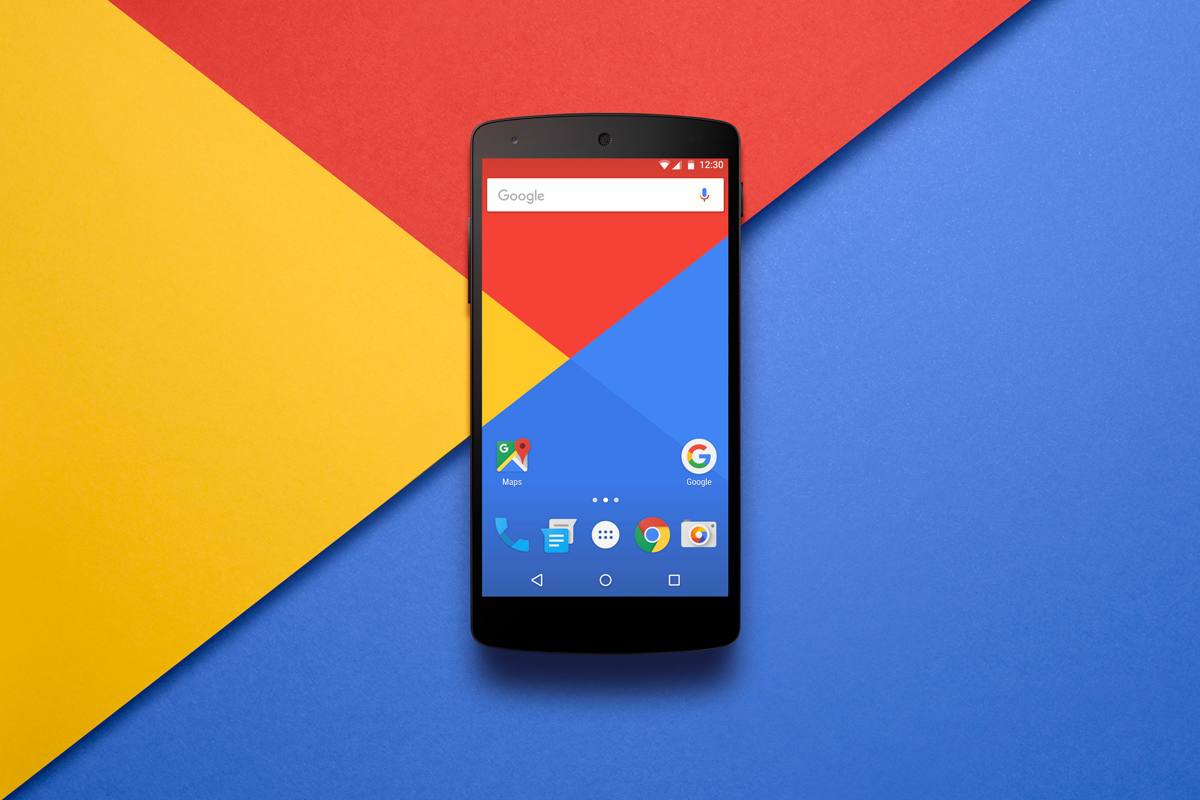
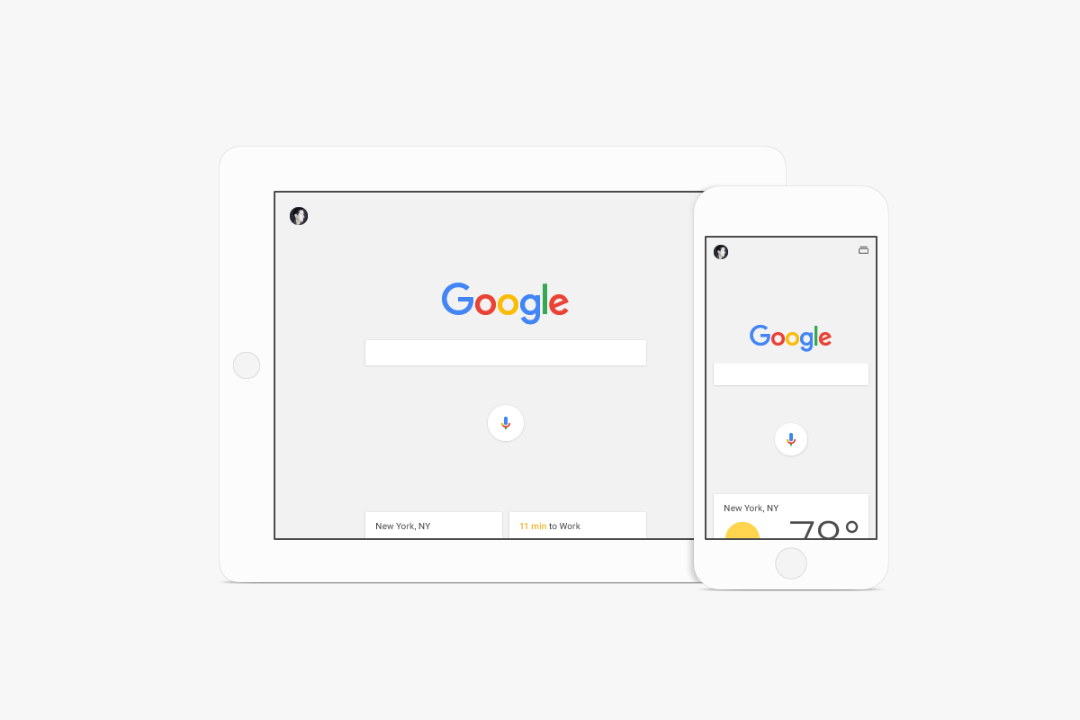
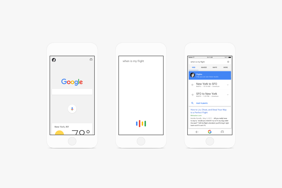
We were invited to create a new visual identity for GOOGLE that would adapt to the ever-evolving multi-screen world, without losing the speed and simplicity users love. No small task with over 12 billion searches made monthly and ~200 GOOGLE products to consider. The result is a dynamic system of components beyond the iconic logo. Our team conceived the primary logotype and icons, designed the custom Product Sans typeface, developed a set of comprehensive visual identity guidelines and created an assortment of branded materials.
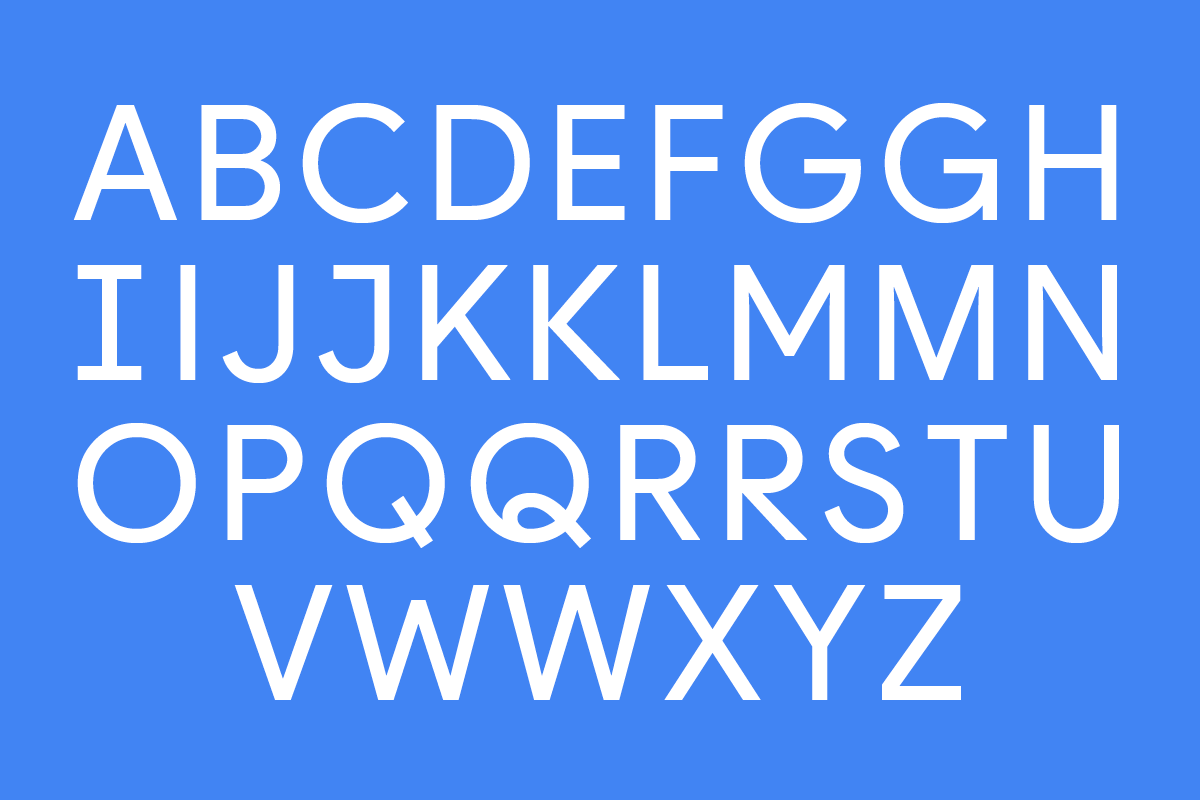
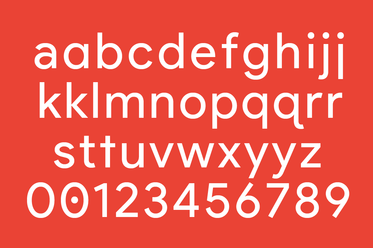
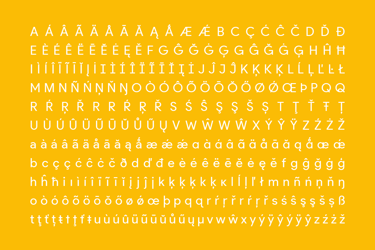
PRODUCT SANS TYPEFACE
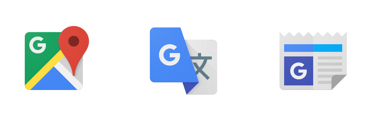
PRODUCT LOGOS
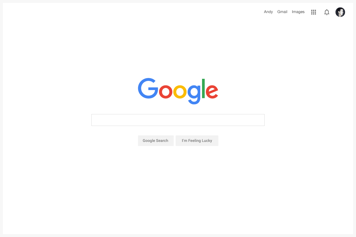
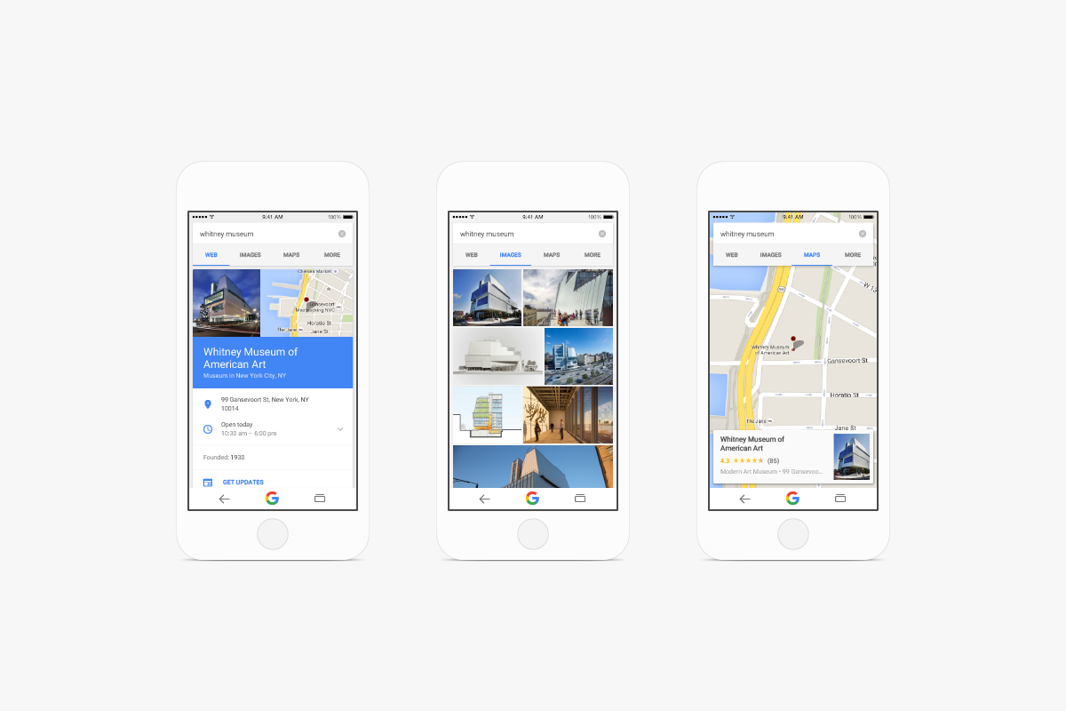
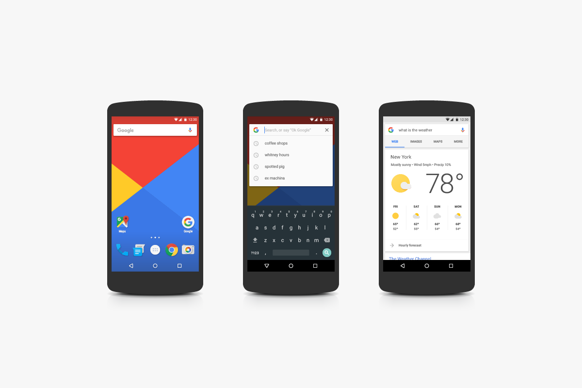
PRODUCT UI
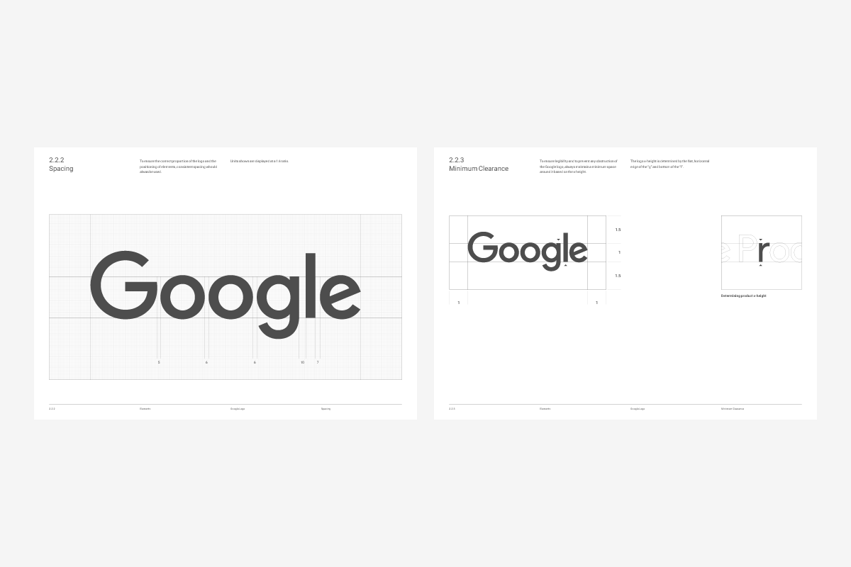
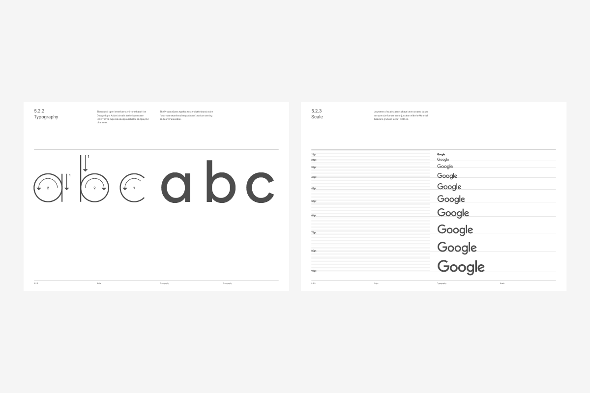
VISUAL IDENTITY GUIDELINES

Commissioned by Google Material and Google Creative Lab.


